Become a MacRumors Supporter for $50/year with no ads, ability to filter front page stories, and private forums.
Status
Not open for further replies.
Autodetect? What do you mean by that? It is a responsive xxxx adaptive design. NOT a desktop site and a mobile site with some kind of “detection”. This is the way going forward!

Actually just checked on desktop browser. I was wondering if it is responsive, or adaptive. It’s a bit of a hybrid. It adapts to the device/window width, up to a maximum where it then has a fixed width layout. “Responsive” is now becoming old school and passé. Responsive implies fixed break points. The design with changes smoothly over the range where it adapts.

I think he's talking about Dark / Light mode autodetect.

We do max out the width, but if you really want to there's a "Fluid HD" link at the bottom of the home page that lets you go wider. I think it looks bad, but it's an option.

Am I correct that the site is now (or maybe always was?) basically a SPA? So then all those scripts get loaded only once, and then not loaded again, not even from cache?

No the website is still a traditional website.

I see there are a bunch of iFrames (I am very “meh” on the iFrames... they aren‘t needed to make a SPA) I’m assuming they are filled with content with some Ajax?

Those are all inserted by ads. we don't use any iframe for the native site itself.

The whole site before was a bit of a mess. We did optimize this for better performance but also make it easier to iterate on in the backend.

We are still tweaking ad density.

arn
 
Red should generally be used only to indicate error/danger. (Of course, accompanied with an additional clue, such as an icon). Users might think he user is on suspension, etc. Obviously, MR users are accustomed to the way it was, though.
So you think every user here has spent the last dozen years thinking they were on suspension? When their name was red, and so was everyone else's? So they thought both they and everyone else was on suspension? That seems like a horribly flawed argument. As to red only being used to indicate error/danger, that's hardly a universal thing. Wikipedia gives a whole bunch of meanings for red, only one of which is danger. It's not even the top of the list:

Symbolism:​
- Courage and sacrifice​
- Courtly love, the red rose, and Saint Valentine's Day​
- Happiness, celebration and ceremony​
- Hatred, anger, aggression, passion, heat and war​
- Warning and danger​
- The color that attracts attention​
- Seduction, sexuality and sin​
 
  • Like
Reactions: yaxomoxay
So you think every user here has spent the last dozen years thinking they were on suspension?

No.

I explicitly acknowledged that existing users would not think that.

But, mea culpa. Sure, other uses. For example, like/favorites with a heart icon.

in this case, though, I don’t think any “meaning” is intended. It was not meant to bring special attention. Just a design choice. Personally, I‘m fine with the current choice.
 
Last edited:
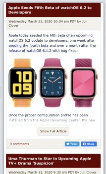
@arn - to follow up on a previous post, have checked the CSS today and I would suggest this change to improve uniformity and give slightly more room for the content (helpful on mobile):

all the elements of an article on the home page have :
Code:
    padding: 10px 15px;

I would suggest changing this to padding: 10px in all directions, but then also adding a little extra vertical padding on the content block ( so padding: 15px 10px)

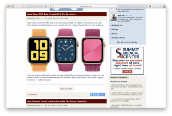
Screenshot 2020-03-11 at 18.52.20.png
 
@arn - to follow up on a previous post, have checked the CSS today and I would suggest this change to improve uniformity and give slightly more room for the content (helpful on mobile):

all the elements of an article on the home page have :
Code:
    padding: 10px 15px;

I would suggest changing this to padding: 10px in all directions, but then also adding a little extra vertical padding on the content block ( so padding: 15px 10px)

View attachment 898633

I think it looks more unbalanced at 10px 10px - def on desktop
 

Attachments

  • Screen Shot 2020-03-11 at 3.01.23 PM.png
    Screen Shot 2020-03-11 at 3.01.23 PM.png
    1.8 MB · Views: 126
  • Screen Shot 2020-03-11 at 3.01.42 PM.png
    Screen Shot 2020-03-11 at 3.01.42 PM.png
    787.4 KB · Views: 132
maybe just for mobile then ? it's the 10px black padding near the edge before that that's uneven i think as you end up with
10px | 15px CONTENT
 
  • Like
Reactions: arn
...

As always, there are minor bugs here and there we are fixing. Let us know if there are any specific issues.

arn

Just a suggestion: I'd like an easier link between the Buyer's Guide and the Apple Deals roundup. They belong together.
 
Overall it seems more responsive for sure on my devices. Especially my G5. Still haven't got on here on a G4 yet but the faster G4s usually feel as fast as this thing does so I'm sure it'll be fine.

I do have a question though, since the changes I see a gray bar at the top of the page. On all my computers Intel Macs and PCs too. Is this supposed to be an ad? I have adblock at the DNS level (pfblockerng), so if it is an ad that may be why I see the gray bar.
MR gray bar.jpg
 
Overall it seems more responsive for sure on my devices. Especially my G5. Still haven't got on here on a G4 yet but the faster G4s usually feel as fast as this thing does so I'm sure it'll be fine.

I do have a question though, since the changes I see a gray bar at the top of the page. On all my computers Intel Macs and PCs too. Is this supposed to be an ad? I have adblock at the DNS level (pfblockerng), so if it is an ad that may be why I see the gray bar.
View attachment 898662

Yes, but it's not supposed to be that color. I fixed it.

arn
 
  • Like
Reactions: BigMcGuire
yes, if it has all the front page feed. How do I get this?

We don’t have this right now. That’s just popular stories attached to the end of an article.
 
The underhood changes are nice, however I'm not a fan of the info block up top, yet it has to remain on since the right side navigation is now gone. That's a downgrade in my book.
 
The underhood changes are nice, however I'm not a fan of the info block up top, yet it has to remain on since the right side navigation is now gone. That's a downgrade in my book.
You can turn the block off it you want. All of the stories listed in it are included in the main story feed on the front page. It's just a "highlights" block.
 
You can turn the block off it you want. All of the stories listed in it are included in the main story feed on the front page. It's just a "highlights" block.

Right, I understand it's purpose, but the sidebar was easier to navigate for catching up between site visits.
 
@arn what was the link to force all the stories on the front page to be fully visible? You posted it when you initially truncated the articles and it worked, but now has gone back to the truncated version. I'd like to not have to click each article.

(I apologize if I missed it posted somewhere else.)
 
Probably not part of the redesign, but I get frustrated occasionally when a post of mine gets deleted because it's a reply to a post that gets deleted, and I get told "your post was deleted" and nothing else - I have no way to know which of half a dozen was deleted, and no way to get that text back. It can be quite frustrating, if you spent some time figuring out an apt way to make some point, and then <poof> it's gone.
 
Probably not part of the redesign, but I get frustrated occasionally when a post of mine gets deleted because it's a reply to a post that gets deleted, and I get told "your post was deleted" and nothing else - I have no way to know which of half a dozen was deleted, and no way to get that text back. It can be quite frustrating, if you spent some time figuring out an apt way to make some point, and then <poof> it's gone.
I suggest using the Contact Us form, and asking to retrieve the deleted text.

Please be sure to identify which thread it was in: the thread URL will do nicely, or the plain text title and forum name. Also identify roughly when it was posted, or an approximate post-number (pre-deletion). That will probably be enough to narrow things down, and if you can provide a few keywords of what to look for in the posts, that would be an additional help.
Thank you, but it's not so much the text I lost this particular time, but the numerous times this has happened. Sometimes I know what was deleted and really want it back. Other times I'm mystified as to exactly what was deleted (if it's a thread with several hundred posts and a dozen of them are mine, it's basically impossible to know what was deleted - unless you're really good at the game "here's the numbers from 1 to 100 in random order, but one is missing, find which one").

It'd be a lot more helpful if the same mechanism that sends out the "Your post in the thread XYZ was deleted. Reason: Reply to moderated post" (I also see "off topic" or similar on occasion) notification to the user's alerts, also provided the text, or a link to the text. I don't want the mods to have to do any additional work looking up posts for me - but at the time they hit whatever button to delete the post, the code that implements that button has the message/text right there in hand.
 
Status
Not open for further replies.
Register on MacRumors! This sidebar will go away, and you'll see fewer ads.