Become a MacRumors Supporter for $50/year with no ads, ability to filter front page stories, and private forums.
Of course I would like to see platform-optimized harmony of function and consistency of features and design...

But before any of that, I'd like:
- for my new Mac mini to download email as quickly as my 2 1/2 year old iPhone 4S does;
- the newly occurring, and highly frustrating, "Try Again / Revert to Server" box to never have to appear when I update an iCal entry. (Only solution here seems to be to create, not duplicate, a new entry and delete the existing entry, and hope that the copies in the calendars of followed invitees also delete themselves, which they don't always do...)
- the osx safari keychain panel to allow for additional columns so users could store additional content there (and sync this thru to iOS);
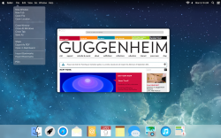
- would like to be able to stretch the safari bookmarks column wider so as I can read all content on each line (which is a lot because of the missing user-definable additional columns in the osx safari keychain panel);

Else the rest of this is nice to have cosmetic Schlick-schnack and not need-to-improve functional refinement.
 
The current version of Apple's system software is OS X, 10.9.1.

You would pronounce this "Oh Ess Ten, Ten, Dot Nine, Dot 1.

The name of the OS is OS X.

The version of OS X is 10.9.1

The reason that Apple used an X and not a 10 is that OS 9 and earlier were built on a totally different core.

When OS X came out, it had at its core the Darwin Unix kernel. The "X" in OS X was a play on words/numbers reflecting that it is a UniX derivative.

If there was a major jump in functionality we might see such a thing as OS X, 11, but we will never see an OS XI because that would be stupid.

If Apple made an OS that had a non-unix kernel then we would go back to OS 11, 1.0.

So, OS X is unlikely to go away any time in the near future, but OS X may one day go all the way to 11.

/Rant
 
I wouldn't mind something like this but I don't want anything too crazy. :)

Oh my, that looks horrible. I know people can be resistant to change, and I don't want to be one of those people... But seriously. I never look at my phone running iOS 7 and think to myself, "How beautiful and functional my phone is! It's just grand!" It's just there. It's bland. It's boring. It's overly bright. And sometime, I don't know if somethings a button or a heading, or just a colored word...

Whenever I see a phone running iOS 6, it's jarring now. Its unexpected because I'm not used to it anymore, but it's beautiful. It's intuitive. Buttons look like buttons. Applications have their own personality. The only variance in iOS 7 is the color scheme. I miss the character that iOS 6 had.

I think OS X has come a long way, and I love it a lot. I was always worried that I wouldn't like changes, but they've always ended up being great. Mavericks is simply elegant, refined, and mature from my point of view. I really don't want them to throw that all away. A little bit of change is a good thing, but I sincerely hope they don't go all the way like that mock up, throw out everything and pretend that it's iOS 7 on a big screen. That would be a tragedy!

(Sorry for the rant. I hope it's not offensive. I apparently just feel strongly about this...)
 
Whenever I see 10.10 I cringe, 10.10=10.1

Actually, it depends on how precise you need to be and how you are rounding. For these applications, 10.1 could potentially work for a value anywhere from 10.05 to ~10.14. However, the same can not be said for 10.10 or even 10.1000000 (which both have greater degrees of precision).

Also, this is a version number, not high school math.

Also, 10.9.1 must give you an aneurism.

----------

OS X X seem any better?

I hear OS XXX will have Private Browsing mode system-wide.:D
 
I honestly like the idea... OS X usually gets a design change every few updates, and as long as the core "look" to the UI is the same I'm cool with it. I really liked the change from Snow Leopard to Lion, and before that, Tiger to Leopard. I don't see this as any different... although I am hoping that Apple will do some redesigning of the default set of icons to a more flat theme (maybe like some of the ideas from here I'm not so sure I dig the sharp corners though... They seem more dangerous :p
 
It'd be nice to see a new UI to go along with Mavericks kind of mixed bag of icons, though at the same time I really don't like iOS 7's overly colourful icons so I'm not sure I want to see all the icons go the way some of Mavericks' ones are hinting towards.


Personally what I'd like to see is a UI that uses the desktop to as a kind of theme, basically showing through a "frosted" version of the desktop but only partially (e.g - 20% or so) so a dark background will result in a darker overall UI (though not too much), thick similar to how the transparent menubar looks now, but with the image blurred more and maybe a little less visible. It'd be much more subtle than Windows 7's see-through look, but essentially eliminate the need for custom themes since it just uses a user's desktop image, so it's up to them whether their OS takes on elements of a natural scene, or a galaxy image or whatever. Since not all backgrounds will work perfectly, an option to simply set a colour for the UI "background" might be a good alternative, as this could allow users to just go for white for a "plain" UI.

To go with this icons should be a bit more monochrome in appearance, possibly with a consistent light edge and dark shadow so they look good on any background. Not completely devoid of colour either, just not as garish as iOS 7; IMO a good icon should convey what it does from the shape of what it depicts, and shouldn't really need colour, which should just be to enhance it. I know not everyone liked the loss of coloured icons on say, the Finder sidebar, but personally I love how it looks. Personally I'm of the opinion that the less colours in the OS the better, as too many just looks chaotic and distracting.
 
When you download an app you get something that looks like a hard drive and you have to click on that to open up an icon that you have to lick on in order to install it. Then you have 2 things on your desktop to trash.
I know it confuses a lot of people. My brother in law has these things all over the place because he's afraid to delete them.
Just automate the process to leave just what you need to click on to install it

They already did this. It’s called the Mac App Store.
 
I think the cross-platform apps like Calender, Mail, Notes, Reminders etc need to be identical in theme, but that would make the guts of the window look out of place compared to the frame of OSX window styles.

So I can see the need if ios7 is the preferred style, then some bridging needs to be made to the overall look and feel of OSX.

However, grey is still ideal for working environments so I hope they maintain this traditional desktop feel.

What ever they do, I hope some of the animations are ditched or sped up because OSX feels sluggish to operate compared to any version of Windows. I usually turn off the fade effects in Windows 7/8 to make the desktop environment snappy and instant.

OSXs animations are pretty the first time, and just unnecessary after that.
 
I don't get it, why won't they flatten the icons? Windows 8 doesn't flatten them either, is this some sort of agreement to make it easier to design icons.
 
The biggest thing Apple need to do with OSX isn't to tweak the design; it's to modernise AppKit.

If Apple released a new UI framework, let's call it AppKit2, with modern programming conventions developers are used to from UIKit, Mac application development will explode.

The programming environment is very important. It should be easy to let developers and designers experiment and implement their ideas, and it should be closer to UIKit to encourage porting.
 
I like it when buttons look like buttons, indicating that they can be interacted with, and not just flat text. I though that Apple once excelled in making obvious (intuitive) user-interfaces... :-(
 
Bells and whistles. This is like car's changing the trim each year. Useless.

I want legacy support. That would be useful.

Apple could approach 100% if they would do better programming and offer backward compatibility. The original iOS devices could all run iOS7 with some very minor exceptions. Features that truly can't be supported could be held out in the compile for older devices and then everyone could upgrade to iOS7.

Same goes for all of the Macintosh computers (desktop, iMac, notbooke) produced since about 1999. MacOSX could be tweeked with compiler specific to machine adjustments so that all Macs of the last 15 years would be able to still run the latest OSX10.10 when it comes out.

It is environmentally bad of Apple to make hardware obsolete when it could still be used. Apple's got almost $160BILLION dollars in cash on hand. They could devote some of that to this legacy support and that would pay back in the long run.

We also need legacy support and into the future so that we can continue to access our data. To do that we need to be able to run our software.

That doesn't necessarily make business sense though. They give away the OS to sell the hardware. Why would they want to prolong the life of the existing hardware?

I do wish they would bring rosetta back. As it turns out, they were licensing the software from another company, so once again, I don't know if it makes business sense to keep licensing that technology for an OS they give away for free when only a handful of people still use PPC apps. It would be amazing though!
 
Behold!!!
 

Attachments

  • OS 11.png
    OS 11.png
    1.7 MB · Views: 267
How about something like this?

Image

I think that looks awesome. :)

I really like the concept of background windows (meaning one that is partially obstructed by another) being translucent. If they are both in the foreground (side by side) they should both be opaque, but when one overlaps another it should be translucent. They could make it tied to app nap for a dead obvious indication as to what apps are currently in a dormant state.
 
Last edited:
Register on MacRumors! This sidebar will go away, and you'll see fewer ads.