Become a MacRumors Supporter for $50/year with no ads, ability to filter front page stories, and private forums.
Exactly. Not sure why MR is reporting on opinion pieces from other websites. :confused:

I think this is legit. The one thing that no one has brought up is the mention of the project' code name "Syrah". Internally Apple code names the Mac OS version after wines. (For instance "Chardonnay" for Mavericks.)

The very fact that we have learned this code name suggests it's a real internal leak.

...Unless Syrah is also made up...
 
I don't want a flatter look but I do wish they would borrow something else from ios 7, namely bring back some color to os x. I really hate the almost monochrome Finder on 10.7-10.9. I am not color blind.
 
I'd like to see OSX revert to the simplicity that is supposed to be the Mac.
The OS is too bloated and unintuitive for new users.
Ditch the DMG download nonsense and automate it
Get rid of features that most people don't use
Make it faster
Make Safari compatible with every website
Make Quicktime work with all video formats
Bring back up and down arrows
 
One thing from iOS7 I'd like to see on OSX is the frost glass effect. Cool effect.

OS X already has an effect fairly similar to that one, doesn't it?
 

Attachments

  • frost.jpg
    frost.jpg
    50.1 KB · Views: 89
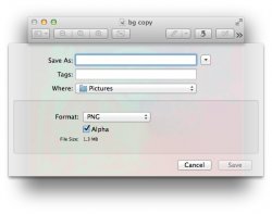
We can already see some direction to this in XCode 5.


XCode 4 looks better IMO.

That's absolutely hideous, not to mention doesn't break up the monotony and give the text input fields an obvious distinction between the header and itself.

----------

Actually, I'd quite like that. This rendering isn't nearly as garish and loud as most people in the anti-flat camp are mocking up.

Then again, as I've said before, I'm more interested in functionality, not whether my icons have flat colors, smooth gradients or faux textures.

That's hideous as well. If I wanted to be inside a slightly contrasting AutoCAD layout I'd rather just find another platform.
 
What do you mean by this?

When you download an app you get something that looks like a hard drive and you have to click on that to open up an icon that you have to lick on in order to install it. Then you have 2 things on your desktop to trash.
I know it confuses a lot of people. My brother in law has these things all over the place because he's afraid to delete them.
Just automate the process to leave just what you need to click on to install it
 
"Ugh...this OS is terrible! I want my money back! ..... oh, all OS updates are free as of the Mavericks release?"

:cool:

They are only `free' for current revisions of hardware, which one invests thousands to purchase. In essence, you've paid handsomely for the right to download it without additional cost to you, the consumer.
 
I'd like to see OSX revert to the simplicity that is supposed to be the Mac.
The OS is too bloated and unintuitive for new users.
Ditch the DMG download nonsense and automate it
Get rid of features that most people don't use
Make it faster
Make Safari compatible with every website
Make Quicktime work with all video formats
Bring back up and down arrows


What features are you referring to? I don't think OS X is bloated! You don't have to use all features, just choose whatever you need.
My father is 72 years old and can use a Mac with no issues. OS X is simple to use and hides a lot of the complexity from its users.
Actually Apple has improved OS X so much, that it offers features found in iOS, so that users can easily adapt.

Safari is great. I don't understand what you mean. Of course no browser can be 100% compatible with all websites! but this is mostly a problem for web designers that make these sites..

QuickTime will work with m4v format and almost nothing else. If you are hoping to see mkv support, then you will be disappointed. I don't see any reason for Apple to do that .

Up and down arrows for what exactly? I don't get it.
 
This is the best example I could find regarding the flat vs skeuomorphic design (aka iOS 7 vs iOS 6), that explains how I feel about it:

Image
Nope, that's both skeuomorphism. Only one a little more sophisticated.
This is what you really get without any skeuomorphism.

non-skeuo.png


iOS 7 is a text adventure.
 
Nope, that's both skeuomorphism. Only one a little more sophisticated.

This is what you really get without any skeuomorphism.


Image


iOS 7 is a text adventure.


You guys still don't get it, do you? iOS 7 had one goal: to give content center stage, become chrome less and provide more space for apps. Text buttons replaced normal buttons just because that way there is more space for content.
 
I'm okay with this. Why am I always in the minority with UI changes and Apple. I'm kinda sick of the round bubbly icons. The age of the Aqua interface is dead people, get over it. :cool:

If anything, be more upset that they're releasing the OS with the 10.10 stepping. Ugh.

Maybe in the minority but not alone. I got used to iOS7 in about ten minutes (or maybe that should be 10.11 minutes :D), and it works fine for me. I just needed to learn some of the new icons.

Seriously though, product versioning, be it software, or mechanical parts is not decimal. It's Major Part Number.Significant Revision.Minor Tweak. I've been working with software and mechanical parts, and other components for most of my life and that's the way it's always been.
 
Will we ever see OS 11? Or is it gonna go as far as OS X 10.99?

They'll change the numbering system away from OS X when they do another huge overhaul and completely rewrite the OS, which won't be happening anytime in the near future, so while I'm sure something better will come along in the next 90 years so we wouldn't get to 10.99.x I don't think we will see a change to os 11 anytime in the forceable future.
 
You guys still don't get it, do you? iOS 7 had one goal: to give content center stage, become chrome less and provide more space for apps. Text buttons replaced normal buttons just because that way there is more space for content.
Icons are much more space efficient than text buttons. And we both know that, because we are Germans.

Rindfleischetikettierungsüberwachungsaufgabenübertragungsgesetz
 
I imagine it will be somehow like iWork for Mavericks.

But seriously, now everyone with access to Photoshop thinks is a UI designer and has the right to criticise... :rolleyes:

Also, adapt or die.
 
Didn't have to do anything. The neon colors come from the picture I had open, so that's not part of the effect (unlike on iOS).

Interesting. Anyway I'd like to see the full iOS7 effect on the OSX Notification Center. Any maybe some swipe up/down from the bottom/top of screen effects.
 
I don't give a **** about all the colors and other shine nonsense. It is a shame that so much effort is put into nonessential cosmetics instead of into the development of the core system. Looking at all to complaints risen as of Lion, Apple should have its priorities at existing bugs, new filesystems and graphic performance etc.
 
Register on MacRumors! This sidebar will go away, and you'll see fewer ads.