Got a tip for us?
Let us know
Become a MacRumors Supporter for $50/year with no ads, ability to filter front page stories, and private forums.
Phone Calls Will Finally Stop Taking Up the Entire Screen in iOS 14
- Thread starter MacRumors
- Start date
- Sort by reaction score
You are using an out of date browser. It may not display this or other websites correctly.
You should upgrade or use an alternative browser.
You should upgrade or use an alternative browser.
I‘m gonna get a lot of flak for this as this is an Apple forum...a lot of the features I didn’t even think about as I’m on a Pixel 3a phone for the last 7 months. I just though, whats the big deal, I have that on my sub $300 phone.
Like Android has instant apps for a while (app clips in ios14), phone notifications being just a small banner and not taking over entire screen (old news). Pixel has another real cool feature called Call Screening I think, that I love. It even detects spam and allows you to block the number in one sequence. I suppose Apple will ”innovate” that feature next with their couragiousness")
I’m part teasing btw. I love the improvements being brought to IpadOS, as that is the only apple thing I have. Its just funny how both Google and Apple rip each other constantly, and yet most features are shamelesy “borrowed” from the other.
Its all a win for us in the end though as the customers👍
Like Android has instant apps for a while (app clips in ios14), phone notifications being just a small banner and not taking over entire screen (old news). Pixel has another real cool feature called Call Screening I think, that I love. It even detects spam and allows you to block the number in one sequence. I suppose Apple will ”innovate” that feature next with their couragiousness
I’m part teasing btw. I love the improvements being brought to IpadOS, as that is the only apple thing I have. Its just funny how both Google and Apple rip each other constantly, and yet most features are shamelesy “borrowed” from the other.
Its all a win for us in the end though as the customers👍
Yes, you can swipe up like in the keynote and it will no longer cause the call to go straight to voicemail thus won't notify the caller you rejected them and will have a smaller ringing icon in top left in case you wish to return to it to answer. This has been something I've wanted for as long as I can remember. Normally when a person calls I have to wait until it finishes ringing so I can return to my work, when I'm not able to pickup the phone but don't want to notify the user that I am choosing not to answer their call at that moment.Hopefully we can just swipe up to get rid of it like the current banner notifications. Keep it ringing on the caller's end / don't send them straight to voicemail but get rid of the notification for me.
The original full screen design never bothered me but I still think this is a good change.
I just hope the stability is there. It's been kinda dicey lately!iOS 14 has got me excited like when iOS 7 came about. Looks great.
How about a much more valuable change: call blocking? You have to go third-party if you want to block entire area codes and/or prefixes to keep the spam callers and testers at bay, and even then they have limitations on how many numbers can be blocked.
I certainly hope not. If this happens, I will report it as a bug on the beta. If you decline a call, it should immediately send it to voicemail instead of wasting the caller’s time waiting on an answer that is now an impossibility. This would be a UX disaster.Hopefully we can just swipe up to get rid of it like the current banner notifications. Keep it ringing on the caller's end / don't send them straight to voicemail but get rid of the notification for me.
There’s a big red button if you want to decline, and I think the option to swipe to ignore can be useful for many. This gives the user both options and both are intuitive.I certainly hope not. If this happens, I will report it as a bug on the beta. If you decline a call, it should immediately send it to voicemail instead of wasting the caller’s time waiting on an answer that is now an impossibility. This would be a UX disaster.
I welcome this, personally.
Declining and dismissing are different things. There's an option to decline that's there in the notification, so dismissing the notification shouldn't take any action as is normally the case when any notification is dismissed.I certainly hope not. If this happens, I will report it as a bug on the beta. If you decline a call, it should immediately send it to voicemail instead of wasting the caller’s time waiting on an answer that is now an impossibility. This would be a UX disaster.
Demean much?
You seem to not know that’s what I said - all first to do it RIGHT.
Now that we can agree.
If you’re in the lock screen it still shows as a full screen notification.
Thank you ! Just what I was hoping to hear ..If you’re in the lock screen it still shows as a full screen notification.
Why are accept and decline switched?
My guess:
Old order was based on reading order, left to right, with the most important button (acccept) on the left. So that's tied to your visual system, reading the message.
New order is more in line with the preferred reaction (accept). The button on the extreme right of the screen is easier to hit than one to the left of it (right side of phone is a tactile reference point). So that's tied to your finger motions, reacting to the message.
Me too, for a very long timeFinally, been waiting for this feature since 2010, one less reason to Jailbreak my iPhone now lol.
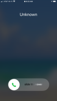
It is full screen when woken up by a call.Please let there be an option to still have it full screen when locked!!!
unfortunately it can’t be moved to the bottom. Swiping down opens the call in full screen.One thing I'm wondering is that with this being a notification at the top is whether or not this will be as easy to use especially one handed and especially on larger phones.
Exactly. Spammers use a declined call to put you on the active phone number list to give you more spam calls. The only way to stay off their radar is to ignore the call and let it go to voicemail by itself. Swiping up on the call banner silences the call and let’s it keep ringing in the background. The status bar turns grey and it shows a nice little phone icon that rings in the status bar.Some of us don't want to send people straight to voicemail to get back to a video we are watching or a game we are playing. It's a thing I promise.
Taking a call in banner form just has the call in the banner. If you tap the speaker button it takes you to full screen with all the options.So only the incoming call UI becomes a banner? What about when you make a call, does it take full screen? What about the during a call screen?
Attachments
Last edited:
Android has had this for a long time. Not the first to do this. Makes multi tasking more intuitive
[automerge]1592928697[/automerge]
Androids have this. You get options to customize what the swipe will do. Also can access a drop down to send message or set up schedule call back through intuitive reminders app. Apple late to the multi-tasking options. It amazes me how people use the IOS platform for business.
[automerge]1592928697[/automerge]
Hopefully we can just swipe up to get rid of it like the current banner notifications. Keep it ringing on the caller's end / don't send them straight to voicemail but get rid of the notification for me.
Androids have this. You get options to customize what the swipe will do. Also can access a drop down to send message or set up schedule call back through intuitive reminders app. Apple late to the multi-tasking options. It amazes me how people use the IOS platform for business.
Why does it matter what Android had or has for those who use Apple devices?Android has had this for a long time. Not the first to do this. Makes multi tasking more intuitive
[automerge]1592928697[/automerge]
Androids have this. You get options to customize what the swipe will do. Also can access a drop down to send message or set up schedule call back through intuitive reminders app. Apple late to the multi-tasking options. It amazes me how people use the IOS platform for business.
Big phones would be a lot more usable if Apple just designed the software to put the controls in the lower half. Even Samsung has figured this out, I'm surprised Apple still hasn't yet.If only the phones weren’t all monstrosities.
I don't get why this is a thing? When I use the phone I have to use the keypad to enter account numbers or pins, or selections of the voice menu.
Well, there's Reachability.Big phones would be a lot more usable if Apple just designed the software to put the controls in the lower half. Even Samsung has figured this out, I'm surprised Apple still hasn't yet.
[automerge]1592935192[/automerge]
And that's fine and isn't affected by this -- this change is only related to how an incoming call is handled when it's ringing (and the device is unlocked).I don't get why this is a thing? When I use the phone I have to use the keypad to enter account numbers or pins, or selections of the voice menu.
Well, there's Reachability.
True, but that's more of a band-aid than a solution. If I bought a house where all the light switches were on the ceiling, I wouldn't install ladders, I'd just lower the switches.
Last edited:
Well, there's Reachability.
Reachability is extremely hard to use now. A lot of apps have buttons where you need to start you drag down, and it takes some effort to get it "right".
Reachability is extremely hard to use now. A lot of apps have buttons where you need to start you drag down, and it takes some effort to get it "right".
Agreed, when I get iOS 14 I’m gonna set a back-tap to invoke reachability
Register on MacRumors! This sidebar will go away, and you'll see fewer ads.