Got a tip for us?
Let us know
Become a MacRumors Supporter for $50/year with no ads, ability to filter front page stories, and private forums.
Photo of the Day: April 2013
- Thread starter fitshaced
- Start date
- Sort by reaction score
You are using an out of date browser. It may not display this or other websites correctly.
You should upgrade or use an alternative browser.
You should upgrade or use an alternative browser.


Click for larger...

Love the reflection of light surrounding the ice. Creates, what seemingly looks like, a light source under the island.

Rolling Water (Click for larger image)


Love the reflection of light surrounding the ice. Creates, what seemingly looks like, a light source under the island.
Rolling Water (Click for larger image)
Thanks, Hankster. It was quite an ordeal to hike the scuba gear out there and place all of those glowsticks beneath the island.

Great macro shot from you here. I love how the two leaves seem to be holding that big water droplet like a pair of tweezers.


First...very beautiful picture.
Please forgive my ignorance...but how was it created?
First...very beautiful picture.
Please forgive my ignorance...but how was it created?
Thank you. I went out to a little creek near my house and used a blue LED flashlight and a green laser to light the creek. It was a long exposure too. (30 seconds)

Thank you. I went out to a little creek near my house and used a blue LED flashlight and a green laser to light the creek. It was a long exposure too. (30 seconds)
Thanks for taking the time to explain.
It looks, to me, either like a totally electronically produced effect, or an astronomical photograph of some obscure place in the Universe!
Knowing that it is actually an earth bound photograph of a real place makes it even more interesting.
Nice stuff, Mate


Went up to Mount Lofty Botanic Park on Tuesday looking for exquisite Autumn colours, but was sadly disappointed. I'll have to go back in a few weeks time to catch it at its peak.
This was taken whilst there.

Canon 60D, Tamron 90mm f/2.8 SP macro Di, ISO 100, 1/250, f/2.8, 90mm
This was taken whilst there.
Canon 60D, Tamron 90mm f/2.8 SP macro Di, ISO 100, 1/250, f/2.8, 90mm
^Summer is still with us it seems, the beach is still nice
I was going to head out to the Blue Mountains tomorrow but the like down there Autumn colours still haven't happened.
This is one of my favourite places on the NSW coast, the rocky outcrops and huge cliffs are surreal! - Cathedral Rocks, Kiama, NSW.
(I wasn't in this cave for long... it was full of mozzies )
(As always click for larger)
![]()
I was going to head out to the Blue Mountains tomorrow but the like down there Autumn colours still haven't happened.
This is one of my favourite places on the NSW coast, the rocky outcrops and huge cliffs are surreal! - Cathedral Rocks, Kiama, NSW.
(I wasn't in this cave for long... it was full of mozzies
)(As always click for larger
)
Very creative. It's like the photographic equivalent of a Jackson Pollock painting. If light painting in water like this is your idea, you should run with it; it's a great idea.
Very nice, Reef. The channel of water leading out creates a great sense of depth, and the shape of the cave opening has a striking symmetry about it. I must say that is one psychedelic fuschia sky!
Very nice, Reef. The channel of water leading out creates a great sense of depth, and the shape of the cave opening has a striking symmetry about it. I must say that is one psychedelic fuschia sky!
Thank you P, it's a really nice place.
And yes a bit more psychedelic than usual... I liked the way the vibrant pink looked against the blue, with the very contrasty black hourglass frame it felt right to keep it punchy like that. I do have a toned down version as well which I like too.
It's sometimes a hard decision to make. I'm getting into selling prints (building a website with shopping cart right now), and a lot of people like punchy colours. Another consideration is it being a location photograph vs art... is there really a right answer? I don't know... it's often a hard decision.
Last edited:
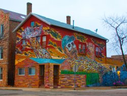
Pilsen is a mostly mexican neighborhood where murals are everywhere, some are done by professional muralists others by neighborhood kids. But art is everywhere hope i can capture some of my neighborhood soul with my camera.
I took a Spanish class in college my senior year and we took a field trip through Pilsen. Great place.

Thank you P, it's a really nice place.
And yes a bit more psychedelic than usual... I liked the way the vibrant pink looked against the blue, with the very contrasty black hourglass frame it felt right to keep it punchy like that. I do have a toned down version as well which I like too.
It's sometimes a hard decision to make. I'm getting into selling prints (building a website with shopping cart right now), and a lot of people like punchy colours. Another consideration is it being a location photograph vs art... is there really a right answer? I don't know... it's often a hard decision.
Oh, believe me, I know...it's an issue I grapple with every time I process a photo. My modus operandi used to be to get a photo to a point that pleased me and then push the saturation a notch further--you know, to pimp it out a bit for commercial appeal. It's no secret that saturation sells; just look at the "Best Sellers" section of any big websites that sell prints...some of the best selling images are downright garish, but that's what people want on their walls. Lately, however, I've been going back through my catalog and reprocessing a lot of photos (for various reasons), and I'm being more conservative with them. Maybe I'm just getting old and stubborn!
Register on MacRumors! This sidebar will go away, and you'll see fewer ads.