Got a tip for us?
Let us know
Become a MacRumors Supporter for $50/year with no ads, ability to filter front page stories, and private forums.
Photo of the Day: July 2010
- Thread starter Phrasikleia
- Start date
- Sort by reaction score
You are using an out of date browser. It may not display this or other websites correctly.
You should upgrade or use an alternative browser.
You should upgrade or use an alternative browser.

Intriguing shot: a really original idea... Youve left space on the left; I wonder whether the balance of the pic might have been improved by having the space to the right, instead. The guys looking straight out, but his leg and guitar neck are pointing to the right. Id have preferred them to be pointing into the picture area... rather than out. And is the whole pic a tad too dark? Id be interested to know how you put the shot together: ie how you lit it and how you got the sky like that
Doylem beat me to it with his comments, namely about the framing and the darkness. It is a super idea, and I'm sure your model was very happy with it. However, I think the darkness and framing are robbing it of some visual impact. It's a train engine, right? I see the train tracks, and this big black thing is rather engine-like, but I don't see the iconic bits (steam pipe, cowcatcher, etc.) that would confirm what exactly it is. Is this maybe the rear end of a train? The completely black parts of the machinery read as crushed shadows to me; knowing your work, I'm going to guess you painted them black to add some drama, but I'd rather see some shadow detail on this one. I'm also going to guess that the train and its setting are a composite, since the two don't quite seem to go together.
Anyway, I too feel as though elements of the image direct my eye to the right, and I therefore get a sense of unbalance with all of that space at the left. Actually, I feel as though your photo is really the part nearest the figure, where there is some wonderful tonality and color. All of that moody sky and space around the engine(?) make the figure rather small in the frame, and I find myself squinting a bit to appreciate the photo. I think you could crop in a lot at the left and the top, bring back some shadow detail, and have one humdinger of a photograph.")
Just the kind of feedback I've come to expect from the both of you. Many thanks! The photograph is a composite which means I'll never be able to marry up the background and foreground in a way that would come across as matched. I've included the original shot below with my updated shot (tweaked to your suggestions) so you can see what I was working with. Getting to two components of the picture to somewhat jive with each other was a major struggle. Lighting on the train was with an Elinchrom Ranger Quadra--two lights, each 45 degrees off the subject. (Not enough power for what I did--would have been a job better suited for a Ranger RX).
Changes made:
1. Cropped from the left and top(didn't even notice the body/space orientation until you mentioned it)
2. Shadow detail allowed through
3. Overall pic lightened
4. Added some warmth
5. Sky--this, and the rest of the background, was punched up in Photoshop through the use of some neutral gradients and warming filters.

Original


Snap...

This is pretty epic. I like it alot. I'm going out for an appointment across town and don't have a car and am debating on running there in my running shorts and ipod... or going on a little photo hike on the way.
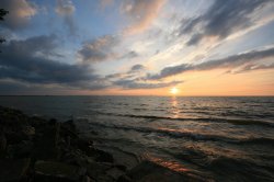
Sunset over Coast Mountains and Baffen Island
![]()
The sun sets over the Coast Mountains and Baffen Island behind a still Kitsilano Beach Pool in Vancouver Canada.

The sun sets over the Coast Mountains and Baffen Island behind a still Kitsilano Beach Pool in Vancouver Canada.
Sitar Painting (by Mandy Adams)
![]()
I hope I'm not "breaking any rules" by posting this. It's a painting of a photo I took that my mum did for me to hang up next to my musical instruments shelf, I really want people to see it as I think it's simply amazing, my mums a fantastic artist who's talent is hidden behind lots of modesty. I hope you like the painting as much as I do.

I hope I'm not "breaking any rules" by posting this. It's a painting of a photo I took that my mum did for me to hang up next to my musical instruments shelf, I really want people to see it as I think it's simply amazing, my mums a fantastic artist who's talent is hidden behind lots of modesty. I hope you like the painting as much as I do.
Just the kind of feedback I've come to expect from the both of you. Many thanks! The photograph is a composite which means I'll never be able to marry up the background and foreground in a way that would come across as matched. I've included the original shot below with my updated shot (tweaked to your suggestions) so you can see what I was working with. Getting to two components of the picture to somewhat jive with each other was a major struggle. Lighting on the train was with an Elinchrom Ranger Quadra--two lights, each 45 degrees off the subject. (Not enough power for what I did--would have been a job better suited for a Ranger RX).
Changes made:
1. Cropped from the left and top(didn't even notice the body/space orientation until you mentioned it)
2. Shadow detail allowed through
3. Overall pic lightened
4. Added some warmth
5. Sky--this, and the rest of the background, was punched up in Photoshop through the use of some neutral gradients and warming filters.
Original
About a year ago I was walking through Odgen and stumbled upon that engine. It was my first time seeing one up close, truly gigantic machines. I didn't have a camera then, someday I'll make it back there.
.jpg")


WHAT the puck ?
Hey... that puck look like it's NOT regulation size! I'm blowin' the whistle right now !
Nice shot. No tilt lens there eh ??
BJ

Hey... that puck look like it's NOT regulation size! I'm blowin' the whistle right now !
Nice shot. No tilt lens there eh ??
BJ
Sure looks that way ... youthinks right....Now I gotta go out into the Meadowlands and find the other ones !!
I had the same thought, but I was thinking of the 1885 version.
Opps my bad

I'm no pro and this is one of my first pics with my D90 - kit lens

Welcome SchneiderMan. Very nice signature espresso drink. What cafe' put that together for you?
Dale


What a beautiful shot: the composition, the turn of the bird’s head, the direct ‘eye contact’, the bokeh, the restricted colour ‘palette’, the simple background that sets off the subtle colours of the bird, and even the yellow in some of the ‘needles’ that echo the yellow in the stripe over the bird’s eye.
The stripe is the distinguishing feature, I imagine. In UK we have little birds like this: linnets, twites, redpolls, finches, buntings... all in the ‘finch family’. This shot would look great in a book or calendar (the sort of shot you’d be happy to look at for a month)...
My first thought when viewing this shot was "Wow that is so Sunday Afternoon on La Grande Jatte by George Seraut (circa 1985)....
Nice shot.
As always in blown away by your work. Cheers
Thanks for this... and for bringing a bit of culture to the forum...
Register on MacRumors! This sidebar will go away, and you'll see fewer ads.