Become a MacRumors Supporter for $50/year with no ads, ability to filter front page stories, and private forums.
people on this board are out of their minds, ios7 overall looks pretty damn nice. if you really can't deal with it, have fun on android where everything looks like hell.

or just keep complaining and working yourself up, hoping someone who can influence the design is listening to you bitch...which they aren't.

it's getting so old already.
 
The second screen is quite confusing. I wouldn't know what to do in such a situation.

Earlier iOS was much more intuitive:

Ignore
Hold Call + Answer
End Call + Answer

Simple and easy to understand.
 
No, I like it.

And what's so confusing about the second screen? The first button literally means end current call and accept incoming one, the second button literally means send incoming caller to voicemail, and the third button literally means hold current caller and accept incoming one. Not that difficult.
 
The second screen has always been a bit confusing, especially because you unexpectedly have to react quickly. The goal is to make it the least confusing as possible.

The iOS 7.0 version has too much small text, iOS 6 and 7.1 versions are better.
 
I think the new slider is ugly, the current one is great. And I think it's a shame that there is no more edge-to-edge photo. That being said, I think all of these changes do improve usability. :eek:
 
The second screen is quite confusing. I wouldn't know what to do in such a situation.

Then the world must be a very difficult place for you. It REALLY isn't that complicated. You still have the same exact options as before just in a more intuitive layout. I much prefer 7.1 over 7.0.6. And don't even get me started on the stability aspect.
 
It must be even more difficult for older people. My mom probably doesn't know what "Send to Voicemail" is.
 
It must be even more difficult for older people. My mom probably doesn't know what "Send to Voicemail" is.

In all honesty, what is apple supposed to do about that? Do you want them to completely dumb down the entire OS because 1% of people don't know what "send to voicemail" means? You can only simplify things so much before you start irritating the majority of people who have no problem with the phrase "send to voicemail"
 
While the full screen pictures were nice, well they were nice if you had the correct resolution photo, I think the changes in 7.1 are a step in the right direction. They are trying to unify the design and bring more consistency to the design in iOS 7
 
I'm actually surprised with the second screenshot. Apple has always used simple designs and layouts where everything is clear so I'm trying to understand wtf is up with the overlapping icons...

That is the only one that I have an issue with. Less because of any sense of 'ugly' but that it won't be accessibility compatible. Which is the feedback I gave them when I sent my developer report
 
People will quit complaining when the iWatch comes out and has these buttons, then all will be consistent. The iPhone is the perfect test to make sure it's graphically easy while in the phone app. Think about it peeps.
 
Seriously?

Are you all serious about this? Do you not understand that these are concept photos? Some dude drew these and thought they looked cool. They have nothing to do with Apple, and Apple won't use them in their OS. If Apple were to implement these designs, you'd see a big fat article on this site that the guy who made these were hired. Trust me when I tell you this, you can stop bothering the Apple feedback team, and not worry.
 
lol i dont even understand whats going on in the 2nd picture. how do you click on the overlapping icon.

i also dont understand why anything has to be overlapped with so much wasted space in the center

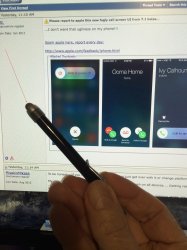
This is how.....
 

Attachments

  • IMG_0017.jpg
    IMG_0017.jpg
    2.8 MB · Views: 168
The new changes in 7.1 are terrible. A few refinements were needed, however this is not what I had in mind. Also, the circular form is being over used now, it needs to be balanced.
 
Are you all serious about this? Do you not understand that these are concept photos? Some dude drew these and thought they looked cool. They have nothing to do with Apple, and Apple won't use them in their OS. If Apple were to implement these designs, you'd see a big fat article on this site that the guy who made these were hired. Trust me when I tell you this, you can stop bothering the Apple feedback team, and not worry.
I've Had 7.1 installed and that's not what it looks like
Fairly certain I came across that in at least the latest iOS 7.1 beta 5 when I had a call waiting (which doesn't happen all that often for me).
 
I thought they were just concepts

Fairly certain I came across that in at least the latest iOS 7.1 beta 5 when I had a call waiting (which doesn't happen all that often for me).

Fair enough, I thought these were concepts, however, if these have been in an iOS 7.1 beta, I'm fairly confident they are not in the newer betas. When did you have the beta installed+
 
It's beautiful. Don't tell us what to do because of your own personal opinion, we're not your slaves.
 
Fair enough, I thought these were concepts, however, if these have been in an iOS 7.1 beta, I'm fairly confident they are not in the newer betas. When did you have the beta installed+
As I mentioned, the latest beta 5. I recall seeing it about a couple of weeks ago, and beta 5 has been out for a bit longer than that at this point.
 
I like the new design. The iOS 7.04 one had too much text for my taste. I like the icons telling me what my options are.

And to the person asking how to select the overlapping icons: Are you serious? On the off chance you actually are serious, the obvious answer is that you don't. The overlapping icons are all part of one icon.
 
Register on MacRumors! This sidebar will go away, and you'll see fewer ads.