Here is one for you and also of it in notification centre.
DUDE check your mails

Here is one for you and also of it in notification centre.
DUDE check your mails
Unfortunately, it just comes up with a question mark.
Beta installed.
I really wonder why Apple hates bold type so much. Why is it so hard to make unread mail messages bold? like pretty much any other client in the whole world?
Having just the blue marvel is NOT enough to easily identify unread messages. They went the same route a few OSX versions ago and that's why I DONT USE the default Mail.app in osx.
That's my only gripe with iOS7. Pretty much everything else is OK.
Safari tab view in private mode. I turned private on to finally get some contrast in the UI, but the Private button is really sloppily put in every random screen in Safari. However, the best part is probably using the motion; you can tilt your phone downwards and see more of the tabs, it's pretty neat.
You can also flick tabs to the left to close. Many people, including myself previously, were not aware of this. I would always end up opening the page trying to tap the X in the left corner.
Yeah, I know. Its kind of strange that you can only flick to the left, but I guess it's consistent with everywhere else. You can also rearrange the tabs.
I'll get used to it. I've finally gotten used to the lockscreen. That up arrow had me opening control center almost every time I tried unlocking my phone.I've got a request: Can someone post some screenshots with lots of folders on a fairly plain dark and/or light wallpaper?
My home screen is mostly folders. Since the new design has *light* folders instead of dark ones I'm curious how they would look both on the home screen and when the Control Center overlay is active. I usually use a simple background since all those miniature icons in the folder already add lots of random color.
Thanks in advance!

....I'm curious how they would look both on the home screen and when the Control Center overlay is active. I usually use a simple background since all those miniature icons in the folder already add lots of random color.
Thanks in advance!

Image
I think it's very interesting how Instagram pops on this page and everything else just sort of drops out...
If that's not high quality enough (posted from iPhone) you can get it here.
iar7.deviantart.com/art/OS-X-10-9-Mavericks-Wallpaper-377157536
My dock glitched so half was transparent. I really like the transparent look over the current beta.
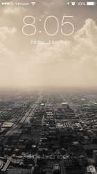
Lock screen