Got a tip for us?
Let us know
Become a MacRumors Supporter for $50/year with no ads, ability to filter front page stories, and private forums.
Post your iOS 7 screenshots here! [Some NSFW]
- Thread starter nhlfreak98
- Start date
- Sort by reaction score
You are using an out of date browser. It may not display this or other websites correctly.
You should upgrade or use an alternative browser.
You should upgrade or use an alternative browser.
LOVE this. Apple could have used this image as their marketing. It looks beautiful with the font, color, and feel of the UI. Nice choice.
Thanks. Love it to. Fits great especially on the black iphone 5.
Here ya go.
Looks so much better with a darker background that the pastel mess they used at the introduction.
----------
Here is one for you and also of it in notification centre.
OMG! Read your emails.
My dock glitched so half was transparent. I really like the transparent look over the current beta.
I had something similar where the 'grey' background of my folders went much more translucent, looked 1,000,000 times better and less cartoony
")
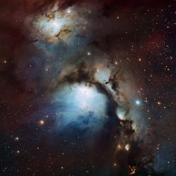
That walpaper! \m/ May I ask for it please?
I second that

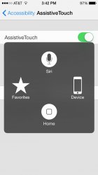
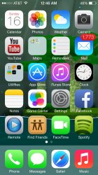
Can someone Please post a screenshots for Assistive Touch .
Not much different.
Attachments
Black typography against a white background. Looks like it's content-aware.
It's definitely content aware but the black typography isn't limited to a light background - here is a comparison of my prior and current background. The darker one is a panorama with some lighter portions in it so maybe it looks at the whole image to decide typography. Not sure.

Black typography against a white background. Looks like it's content-aware.


Can you share these walls?
This looks so slick.Black typography against a white background. Looks like it's content-aware.
The home screen would look good with these colors. Simple icons with black/silver outlines and perhaps some subtle/soft colors like this background.
Black typography against a white background. Looks like it's content-aware.
Can you share the white wallpaper? Thanks.
Can you share the white wallpaper? Thanks.
I second it. SchneiderMan, very nice wallpaper. Pls share?

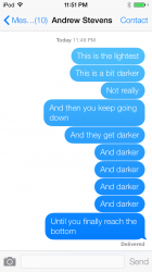
I don't know if any of you guys noticed, but your side of the conversation while iMessaging (idk about sms), the higher up messages are, the lighter they are, and vice versa.
That's only iMessage I suppose? Does regular text (green text) get lighter & darker or no?
That's only iMessage I suppose? Does regular text (green text) get lighter & darker or no?
I have no idea. I'm on an iPod Touch, so I can't tell or not. Im kinda poor, so I can't afford an iPhone... Yet.
That's only iMessage I suppose? Does regular text (green text) get lighter & darker or no?
Yes the same for regular text messages as well.
----------
Are regular text bubbles still green for SMS and blue for iMessage?
correct
Are regular text bubbles still green for SMS and blue for iMessage?
Yes they are. I know that for a fact.
I went with the Mavericks theme. Love it so far.
It confuses me that you have all those folders, especially Social, Finance, and Entertainment, yet you don't have Music inside Entertainment. Facebook, Vine, Tweetbot and Instagram inside Social, and then Mint inside Finance. Why?
Register on MacRumors! This sidebar will go away, and you'll see fewer ads.