Become a MacRumors Supporter for $50/year with no ads, ability to filter front page stories, and private forums.
I miss cover flow. I didn't use it for browsing (I used it to take 1/3 of the screen above list) but I liked the visual summary of the current album cover and the others surrounding it.

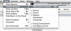
How can I see album art now? The picture in the main bar is tiny and unrecognizable. Can I at least show the art in the sidebar again while in list view?
 
Best iTunes version I’ve used so far (and I’m using iTunes since I bought the first iPod nano years ago, the one that scratched too easily :p)

The only thing I miss: Dark background, and the possibility to view the album covers in "Songs" view:

apple_itunes_10.html_664578_g2.jpg
 
Also getting random freezes like it's a beta version. Haven't seen iTunes this laggy since the 7.x days

----------

Another big gripe..... not being able to open playlists in a new window means I can't put the visualizer and songs list on different monitors. (for example projecting the viz while picking songs on the computer)
 
maybe I miss coverflow BUT seriously:
Really shocked at how many people here liked and used Coverflow. I never liked it; never used it.

1. SONGS VIEW: where's the "artwork" ???
I have thousands of albums and now all looks list a lonnnnnnng list! with no separation!
AGREED! This should be a "library management" view, where we can sort, edit, and see everything.

2. ALBUMS VIEW: where's "groups albums by artist" ???
again I have thousands of albums and now all looks list a lonnnnnnng list! with no separation by artist
Good point. Although, I don't have this issue. I think it may be because, for most of my albums, I had already manually edited the Sort Album Artist tag. (I hate selecting an artist and having iTunes organize the albums alphabetically. For instance, Abbey Road being listed first under the Beatles is just annoying. Thus, in my iTunes library, Please, Please Me is sorted as "Beatles 01," With The Beatles is "Beatles 02," A Hard Days Night is "Beatles 03," and so forth.

3. BLACK background option on Album, Artist, ang Genre Views ???
Missed, but not a huge deal for me.
 
And I found another bug:

The Column Browser is available for old Playlists in List View where I had the Column Browser activated before the update. However, the Column Browser cannot be switched on and off anymore after the update.

For new Playlists created after the update and for old Playlists with the Column Browser deactivated before the update, the Column Browser cannot be switched on at all anymore after the update.

Eddy Cue should be fired next!

Umm....
 

Attachments

  • Screen Shot 2012-11-29 at 10.22.28 PM.png
    Screen Shot 2012-11-29 at 10.22.28 PM.png
    93.8 KB · Views: 92
I'm gonna lose my mind! They took away the item count at the bottom of each list/playlist. Like total apps, total songs, total videos, etc. I RELIED HEAVILY on that :(

- EDIT
Ok, nvm, I didn't even look thoroughly to see that they added it at the top of each playlist, but I still can't see my count on Apps and Music (not playlists).

Click on View > Show Status Bar.

EDIT: Apologies for being the FOURTH person to point it out. :p
 
Last edited:
Also...

1. The genre icons are hideous. Even worse, custom genres have no icon. This has always been the case, but the icons are a more conspicuous part of the new interface, and there is still no easy way to edit them.

2. I'm having some weird issues with album art - as in its not displaying for many albums on my "main computer" and not downloading from iTunes Match my "satellite" computers.
 
I think it's a great update, it seems to showcase the artist a lot better, and there are a lot of very refreshing visual changes. I was slightly worried that i'd get lost using the new iTunes Store but its very easy and intuitive to use.
 
Goodbye coverflow!

Yay CoverFlow is gone! I can only hope that Finder is next (QuickLook is better in almost all regards). CoverFlow was way too hyped and found itself in everything! I think it's a gimmicky inefficient interface. Let me see and use my entire screen. CoverFlow consumed more space than it was worth.

For those that are missing it, what did you find appealing about it? Can you not see MORE albums with the current view allowing you to more quickly scan the library? Isn't the point of iTunes to find the Album, TV Show, Movie you want to play and play it? Those that sit in their library to scroll via CoverFlow need to get a hobby instead of stroking off to their cover art.

If this new iTunes is any influence of Ive I can't wait for the upcoming changes!
 

Dude, go to a Playlist and then try to hide/show the Column Browser in List View. Doesn't work!

----------

Also...

1. The genre icons are hideous. Even worse, custom genres have no icon. This has always been the case, but the icons are a more conspicuous part of the new interface, and there is still no easy way to edit them.

Wow, I have only now seen the genre icons. UGGGGGLEEEEEEEEE!
 
What has changed for apps? I cannot see anything that is different.

Just general clean up.

Checking for app-updates is now a button instead of a web-like link of blue text. That was always weird in a desktop application.

And I don't remember exactly how they displayed the 'iPhone / iPad' selection before, but I don't think it was as nice as the current tabs.
 
I like it, especially with the album view, very intuitive. A fresh look was badly needed and Apple has done that! Also, I'm surprised at how smooth it is, considering I have a Pentium 4 (3.40 GHz) and 1 GB of RAM on a 2005 Dell OptiPlex! Soon upgrading to a Mac though! :cool:
 
Just saw this in Software Update. Rejoice, fellow Snow Leopard users, for we have not been left behind ... yet.
:D

I may miss Coverflow a little, but not too much. I do like the new icon; it matches both my nanos. :) I must say I'm not a fan of the Albums or Genres screen appearances; I'll be doing most of my maintenance in the Songs section, as I usually do. Not much seems to have changed from a workflow point of view, IMO.

One MAJOR warning: Apple has completely changed the way you do media file management in iTunes 11.0 on your iPod. Good thing I have an old iPod nano (3G 8 GB) to "practice" on learning how to use it.

How so? what are the changes?

I agree with diazj3; I don't see any changes. That is, unless "Manually manage" functions differently now. I've always synced my media, so I'm admittedly not a fan of manual management.
 
I really quite like this new look. It's appealing to the eyes, and very snappy. The only fault I can find with it is that you can't search by composer anymore. For example, I had "Morrissey" listed as the composer for both his solo songs and his stuff with The Smiths, so if I was in the kind of mood where I want to listen to his body of work, I'd type "Morrissey" into the search bar and it would yield songs by both artists. The only workaround I can find is making a playlist which isn't as ideal.
 
Great update!

It's about time Apple has done a major refresh of iTunes. It was getting old and severely outdated. Nicely done in my opinion.
 
How do you guys play multiple albums at the same time without using Up Next, and how do you get those albums to shuffle their songs.

Used to be able to do this on the old iTunes but I can't figure out how to do it here :(

I was puzzling about this. You now do it in Songs view. You can set the column browser up for say 'artists' and 'albums', then select which albums you want to play as you would have before. Shuffle option is up in the top bar.

Sorry for the non technical terms!
 
As seen earlier in this thread:

File -> Show Status Bar (or command-/)

Omfg, Thanks!! :D

----------

Seriously though, I thought the separate Downloads window was killed off. I hate it! Why would they bring that crap to iTunes? They coulda at least made it attached like in Safari.
 
Register on MacRumors! This sidebar will go away, and you'll see fewer ads.