Become a MacRumors Supporter for $50/year with no ads, ability to filter front page stories, and private forums.
The universal menubar is probably the one thing I really don't like about OSX. If you've got one window or app maximized, it's okay, but if you want to get to it from one small window, you have to go to it, click it, then move all the way back up to the top to do your thing.

I think Windows tagging the menu bar on each window works far, far better here. And like dude guy said above, with the ribbon taking over everything, you end up with with a bunch of larger icons that are easier to hit without as much travelling.
Not sure why you toss the Ribbon into the discussion about the menu, as it is a different interface element altogether. (It would better be compared to the toolbar in certain Apps). And yes, this is an element I agree has some merit.

How on earth anyone find it hard to move the cursor to the top of the screen with Apple's pointer acceleration is frankly beyond me. Traditionally the menu elements in Windows (and MacOS) have been quite small targets making it somewhat of a pain in Windows especially. (As you have to accurately find the right spot with the pointer rather than the aforementioned flick of a mouse). In later Windows iterations it seems like MS has somewhat "solved" the problem by creating larger menus(!) Pretty much an example of trying to cure the symptoms rather than fixing the underlying illness...

But hey, I guess we won't agree on this either way, but I for one hope Apple stick by the (one?) remaining element that has been a key part of every MacOS since 1984.
 
According to Ars you no longer have the option of getting it on a physical media? Ok, so 5 years from now I buy a used Mac and want to install ML on it. Oh sorry, we're now on OS X Calico Feline and oh by the way, it won't install on the Mac you own.

Pathetic. The death of physical media in any form (Operating sytems, music, movies etc.) is the first step towards fascism!

Just create your own disk image. You have that option. Keep it on a thumb drive or external HD like I do.
 
Jesus Diaz is trolling this time around - based on my 4-5 hr testing it looks like ML is a decent, stable update (may be it should've been $9.99 given it is a bug fix for Lion but it's arguable that it contains many new features enough to justify the $19.99 price.)
 
Dug my iMac out from the dust, and by dust. I mean I can't stand 10.7's instability, I've been 100% on my G5, Macbook and my GAMEPC Gaming Tower for a long time now.

Downloading 10.8 as we speak. I don't mind the iOSafation so much on my Mac, I don't use it for serious work ( thats what my retarded powerful workstation is for ).

As long as it can fix all the stability and errors that I had with 10.7, my iMac will turn back into my relax and chill out surfing, and listen to music and watch movies machine.

And for you people complaining about download speeds. Go use another computer until its done.

As big as Apple is, their data center capacity is lacking, which is kinda why they built new ones. I would assume they are building more.

Maybe they could buy some space/bandwidth from Microsoft ( they built some of the largest and most technology sophisticated Data centers in existence )
 
i am so disappointed the my relatively new 2010 mid year iMac cannot do Airplay to my ATV3.

Apple is getting nasty and hungry....

I was in the same boat with my mid-2010 MacBook Pro.

I requested, and received, a refund of $19.99. They responded with the refund in less than an hour after contacting support.
 
Truthfully, the OS fixes Lion's faults. Lion is slow compared to ML but I agree with Gizmodo on the fullscreen and wasted real estate. The Safari giant tabs look weird as well. What could possibly be the reason of scaling tabs across? (look at it on a 27"). Then we have reader on Safari that still has not changed and won't go truly fullscreen. I appreciate the tidbits, but it is not very innovative when compared to Windows 8. A new filesystem + a new finder would be great.
 
"Uh uh, skeumorphism this and skeumorphic that."
They finally came up with a fancy word to throw back at Apple.

Also, please bring back the downvoting. I'm pretty sure lot's of people wouldn't agree with what I said...

Mac'on

Yeah, it's really weird to hear tech reporters get all huffy, like some kind of aesthetic mortal sin has been committed. Hey, smart guys, you've got Address Book (now Contacts) on a dock and in the Applications folder. How do you propose a clear icon that has a meaning pre-established with 90% of the audience. If they're reading a book, how about a... book icon? It's appalling how dubious commands from the oh-so-clever tech journalists become gospel. Yeah, that's what I want: an icon that has no reference to the real world use of the program: it's like a book, see? And it has page numbers and type and all that. Duh. You want a icon that shows it as a big computer? Go back to the beginning of icons. OF COURSE icons speak non-verbally. You're not criticizing fine art. This is a computer program with visual signals. I'm sure users are very grateful for this visual clue.
 
haha are you serious, c'mon why you saying that, I mean if someone get the chance to get it 4 free why I should buy it now :roll eyes: but maybe I have to when it doesn't come into my inbox soon ;( or I take a call to the Apple Store :p

Free is free, I got you. Still. Anyone whimpering like a poor mutt just because something wasn't working out (e.g. no codes), shouldn't be telling their misfortune to us forum members. If you can buy a mac computer, you can buy hello kitty software (mountain lion).

----------

Since this is MacRumors, I'd prefer a fanboy over a pessimistic, anti-Apple, anti-iOS, anti-Mac know-it-alls.

I'd prefer people to think for themselves, but that's asking for too much.

I'd also prefer winning the lotto and being able to buy more Mac stuff.

Trust me, I'm not an anti-apple. I don't believe you ever think for yourself.
 
They should change the troll face comic to Jesus Diaz picture. Looks like Gizmodo is still butthurt about that whole iPhone prototype dust up.
 
Not sure why you toss the Ribbon into the discussion about the menu, as it is a different interface element altogether. (It would better be compared to the toolbar in certain Apps). And yes, this is an element I agree has some merit.

Because it's the one thing that's replacing the traditional menu bar in Windows. OSX still has the nested menus, whereas you won't see them much at all on the desktop when in Vista and above.

How on earth anyone find it hard to move the cursor to the top of the screen with Apple's pointer acceleration is frankly beyond me. Traditionally the menu elements in Windows (and MacOS) have been quite small targets making it somewhat of a pain in Windows especially. (As you have to accurately find the right spot with the pointer rather than the aforementioned flick of a mouse). In later Windows iterations it seems like MS has somewhat "solved" the problem by creating larger menus(!) Pretty much an example of trying to cure the symptoms rather than fixing the underlying illness...

Actually, I'd say MS tried curing the illness by toning down the chrome as much as they could. Windows 7 hid the menu bars away completely, and replaced them task specific buttons that'd change depending on what was highlighted. It was all grouped together pretty nicely, and easy to use.

I guess they switched gears and replaced it in Windows 8 with the ribbons, because (I'm assuming) the desktop is transitioning to be the pro user environment, where features and discoverability are more important. And that is one thing you can say about the ribbon. It isn't the nicest looking UI around, but it makes finding stuff so much easier than the old nested menu setup.

Oh, and mouse acceleration? That's the other thing I can't stand. It's okay when I'm on the trackpad, but it drives me bat**** crazy when I'm using a good ole regular mouse.

But hey, I guess we won't agree on this either way, but I for one hope Apple stick by the (one?) remaining element that has been a key part of every MacOS since 1984.

It all depends on what you're used to. I've used Windows a lot more than OSX, and I'm more comfortable with some of the ways it does things.
 
Yeah, it's really weird to hear tech reporters get all huffy, like some kind of aesthetic mortal sin has been committed. Hey, smart guys, you've got Address Book (now Contacts) on a dock and in the Applications folder. How do you propose a clear icon that has a meaning pre-established with 90% of the audience. If they're reading a book, how about a... book icon? It's appalling how dubious commands from the oh-so-clever tech journalists become gospel. Yeah, that's what I want: an icon that has no reference to the real world use of the program: it's like a book, see? And it has page numbers and type and all that. Duh. You want a icon that shows it as a big computer? Go back to the beginning of icons. OF COURSE icons speak non-verbally. You're not criticizing fine art. This is a computer program with visual signals. I'm sure users are very grateful for this visual clue.

I think people doesn't criticise the icons, but the way the programs look like faux notepads, calendars, etc
 
Yeah, it's really weird to hear tech reporters get all huffy, like some kind of aesthetic mortal sin has been committed. Hey, smart guys, you've got Address Book (now Contacts) on a dock and in the Applications folder. How do you propose a clear icon that has a meaning pre-established with 90% of the audience. If they're reading a book, how about a... book icon? It's appalling how dubious commands from the oh-so-clever tech journalists become gospel. Yeah, that's what I want: an icon that has no reference to the real world use of the program: it's like a book, see? And it has page numbers and type and all that. Duh. You want a icon that shows it as a big computer? Go back to the beginning of icons. OF COURSE icons speak non-verbally. You're not criticizing fine art. This is a computer program with visual signals. I'm sure users are very grateful for this visual clue.

Wow, you totally miss the point, did you even read the reviews? It has nothing to do with the icons for any of those apps.

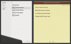
The complaints are about the things like fake leather stitching, fake torn pages, and a window that looks like a book that locks out the ability to resize the individual panes in contacts. Partly it's ugly, and partly it's wasted screen space and lost functionality.

The guys complaining are absolutely right.
 

Attachments

  • notes-full-screen-big.png
    notes-full-screen-big.png
    460 KB · Views: 212
I don't need to, I just installed the OS and its great. Why wait for someone to give you their opinion when you can try yourself? LOL.

Heck, if you don't want to spend the 20 bucks you can probably test it out in an Apple store.

----------


awesome pic : )

You can still think something is good and be critical. And you should actually read my post before posting a response that has nothing to do with it; the Gizmodo article points on how stupid iMessage looks in fullscreen. It is a complete waste of real estate; it looks like they shoe-horned it into fullscreen.

LOL.
 
They should change the troll face comic to Jesus Diaz picture. Looks like Gizmodo is still butthurt about that whole iPhone prototype dust up.

Possibly...I guess he just hates smartphones in general? Gizmodo recently published an article on how the Android app store is so rampant with piracy that developers make their games free. Unless he's secretly a microsoft fan? :eek:
 
I'm actually back to using my trackpad to try out all the new gestures. It works really good with ML, didn't have this same experience with Lion.
 
Ideas

I have an idea, how about making an iBooks Apps for OSX so that I can read my ibooks that I purchased :)

I just finished downloading and upgraded Mountain Lion. It was so simple and painless. I'm playing around with the Notification. It's awesome!!!
 
best os to date
The test of time will reveal what it's really like.

Gushing reviews are the norm with any new Apple product.

It's not until much later that the truth is revealed.

There's a lot to be said for the well proven wait and see approach.

It hasn't let me down yet. :)


(posted using my ever so swift and reliable Snow Leopard)
 
Yes it is VERY LATE. when you remember that Mac OS X was not written at Apple but at "NEXT" and was called "NEXTstep". But going back further NEXTstep was just BSD UNIX with a graphical point and click front end. BSD came from the University or California at Berkley and they got it from Bell Labs.

Mac OS X's birthday is if you trace it back to Bell Labs is 1969. [...]

Well aware of OS X's UNIX, NeXTSTEP, and Mach kernel roots. (Briefly played with a NeXT machine when they were first released, and saw Steve Jobs when he visited my company to try and encourage us to build best-of-breed software for the machine.)

I was referring to OS X's overall look-and-feel and user experience. The whole '80s desktop productivity metaphor served to make an OS's file system more user-friendly. By representing its hierarchical directory system in a way that most users could understand immediately.

But as iOS has shown us, there may not be a need to expose the average user to the file system at all any more. Not even on desktop machines. And I'm thinking that the next-gen OS, maybe "OS 11" will make Finder and the file system an "expert option."

----------

lol
Jim Dalrymple != Jesus Diaz

Oops. My bad. Not used to seeing that particular "quote syntax." :(
 
I installed on my 2007 MacBook Pro and it feels like a new computer compared to Lion. So much faster. I run a 24" 1920x1200 monitor and it's butter smooth.

I am actually sort of amazed, but they were selling the Core 2 Duo for a long time after I bought it, makes sense that we are still optimized even now. It really screams.

Next step is to install an SSD and I'll just keep rolling along. 5 years and counting on this old hog.
 
I wouldn't worry about Lion no longer appearing on the Mac App Store.

If anything I'd say it's temporary.
1. To avoid confusion in consumers who want (or can only handle) things to 'just work.' Especially after the somewhat 'dumbing down/simple and elegant design' of Apple products as of late.
2. To cut down on the number of support calls about not seeing anything different when they download lion instead of mountain lion
3. To make the search for lion in the mac app store show the new OS only

I'm sure it will be back so that those who require it can still use it.
 
So far.. I'm quite impressed with ML. As others have said, its what Lion should have been. Apple should have given more time for Lion development. After Snow Leopard, Lion was a basket case.

Still, IMO, Contacts and Calendar really do not need the crap theming going on as per Lion. It adds nothing. People know what an Address Book and Calendar are. This isn't the 80s when this type of theming was popular. Time Apple drops it.

I really like Growl, hopefully Notifications will be adopted widely. Shame Messaging doesn't have MSN support. As much as I like Adium, I'd drop it.. One messaging App is enough.
 
There's also the matter of the menu bar only being on on monitor. How RIDICULOUS is it in 2012 to have a setup with 4 monitors and having to move the mouse at LEAST 2 monitors over to get to the freaking menu bar controls??? WTF can't they have an option to put the menu bar on EACH SCREEN? :confused: (a Dock option per screen wouldn't hurt either)

This is where Windows has always been LIGHT YEARS ahead of OSX in that its menu bar controls are on each windows title bar rather than at the top of the screen. Microsoft even figured out it'd be handier yet to have the controls where you can get to them even faster (ribbons). People think Apple is out of ideas? Hell, they can't even get the BASICS right in many regards. I don't care for Windows for many things, but OSX SUCKS for multiple monitors by comparison. Even Linux lets you put the start menus and/or menu bars on each screen if you so desire.

The menu bar will now come up on whatever screen you put the full screen app on. Of course this is more of an insult to injury kind of things.

----------


Going to have to ask Apple that question.

AirPlay Mirroring
Requires a second-generation Apple TV or later. Supports the following Mac models:

iMac (Mid 2011 or newer)
Mac mini (Mid 2011 or newer)
MacBook Air (Mid 2011 or newer)
MacBook Pro (Early 2011 or newer)

http://www.apple.com/osx/specs/

----------

Don't really use messages, would use iCloud though, is it more stable? Is it faster?

It seems faster on my 2010 MBP and iMac, but I cant prove it.

It feels better. I am starting to like the new iCloud document integration too (especially using two macs).
 
Quick dictionary look-up of a highlighted word is now a three-finger, single-tap gesture (used to be a three-finger double tap).
 
Register on MacRumors! This sidebar will go away, and you'll see fewer ads.