Funny Apple Man
macrumors 6502a
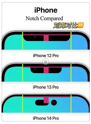
Looks better imo, now I don't know why Apple made the two cutouts in the first place if they're going to go with one wide pill anyways.
Looks way worse unified. Should keep them separated or at least give the option.
Maybe run a wide pill and then turn off pixels above to create a fake notchWhy bother make it a hole+pill then turn off the pixels between when Apple can just make a wide pill shape instead
Have you seen the Fold 4 under display camera? The quality sucks.What Apple needs to implement is an Under-Screen Display Camera. I wish Apple had invested the money and went with that route.
I don’t know, but is a step back IMO.The only reason I can think of is the space above is used-up internally for larger camera and sensor hardware?
If the image is correct, the pill shape on the 14 Pro protrudes down into the screen quite a bit more. Either way, I'm not going to sweat any of this too much.A pill shape design would be ideal however my money is on the pole-punch design. Whichever one we are going to get. We are bound to receive more space around the screen. Hopefully, Apple will utilize the extra screen.

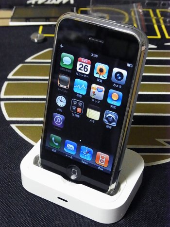
Wow good call there, didn't think of that.Kind of a throwback to the speaker placement on the OG iPhones. I like it
do you really think those bezels will be slimmer? That would mean both Pro models , keeping 6.1 and 6.7 same display size, would make the devices a little bit more compact, maybe close tot the 11 pro dimensionsIf the image is correct, the pill shape on the 14 Pro protrudes down in to the screen quite a bit more. But since the bezel is narrower, the pill takes less real estate overall. Either way, I'm not going to sweat any of this too much.
When you're a leader, you don't look to follow others.Why not going to an under display Touch ID like everyone in the cellphone industry.
They’ll use the space above the slot for icons.Looks better but I do t know why they just simply haven’t reduced the notch width instead of putting it in the middle of the screen, much more invasive.
The space above it is totally useless.
Don’t understand this movement from apple if is finally true, honestly.
I wouldn't mind the pill cutout if it was very smol, but it's larger than I thought and it goes lower into the screen than the notch.I still can't believe they're going for such disgusting solution. Neither of these two is practical, its more distracting than notch and it's an obvious waste of space (the gap with the top). I hoped for notch of this size, still do.
I'm sure it does. That's why I said Apple should have invested the money in the under-display camera tech. Maybe one day! One thing for sure is Apple will take it's time to make it right.Have you seen the Fold 4 under display camera? The quality sucks.
Nah, they’ll just make the font size even bigger.Hopefully, Apple will utilize the extra screen.
It'd look exactly the same so it would not work for the conspiracy theory of Apple changing the look to push new models.Or is that for the iPhone 15?