Become a MacRumors Supporter for $50/year with no ads, ability to filter front page stories, and private forums.
If you walk away from your computer and come back hours later, can you still remember the last bloody fricken tab you were using?

Yes. It’s right there on the screen.

It’s also in History menu.

And my memory does work after a few hours.

Sorry if your brain is broken and can’t work that out.
 
When I turn on the Safari preference: tab/show color in tab window then the active tab is also highlighted.
Screen Shot 2021-10-06 at 8.07.30 AM.jpg
 
  • Like
Reactions: DesertDrummer
Yes. It’s right there on the screen.

It’s also in History menu.

And my memory does work after a few hours.

Sorry if your brain is broken and can’t work that out.
Oh yeah, it totally makes sense to use the "History menu" to figure out which tab is currently selected. I don't think you even know what we're discussing here. And yet my brain is supposedly the one that's broken. 😂
 
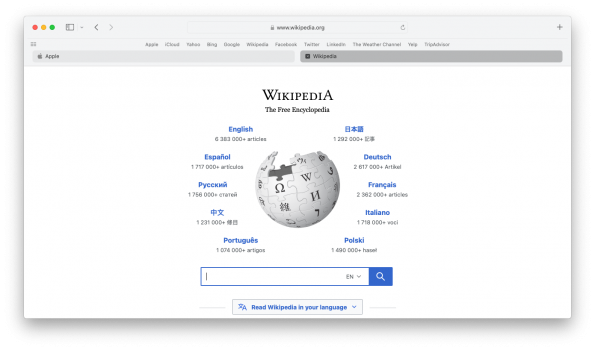
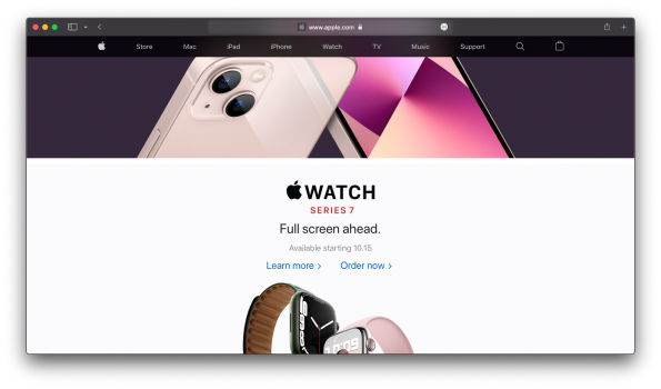
I believe this reveals the essence of what happened here. Apple simply kept that same exact styling that they developed for Compact Mode and applied it to Separate Mode. The problem is that the use of a "hover state" to indicate "active state" doesn't make much sense from a UX standpoint, because "hover state" assumes you're looking at the content. This is why the text contrast is reduced. That also explains why the "close icon [x]" appears; when you are hovering over content, your mouse is very nearby, so it makes sense to reveal actions you can take on that content.

You can see similar behavior when you mouse over the active tab in Compact Mode; Additional buttons reveal themselves only at that moment.

In summary, this is a simple (and clear) case of building a well-thought-out UX and UI spec, and then applying it to an interface that it was not designed for. That is why it appears to be shockingly substandard. I think Apple *can* fix this, but it is going to require that they create some amount of visual design language difference between Compact Mode and Separate Mode. The two cannot simply use the same spec.

EDIT: The user that originally clued me in on this was @mazz0 in this post: https://forums.macrumors.com/thread...ign-is-counterintuitive.2315360/post-30394675

Excellent analysis, nicely presented, and persuasive.

I don't draw the conclusions you do. Actually, I don't draw any conclusion regarding Apple's process in coming up with this. I only have the suspicion that they carefully weighed both layouts and came up with something that they felt worked for both. But, I can see that would be hard to believe if you feel what they came up with doesn't really work for one of the layouts.

You say they need a different visual design language for the two layouts. They do have a different design language for each, though they are very similar. I think you feel the Separate layout design language is just a tweaked copy of the Compact one and not up to the job. That might be because you don't like it. I do like it and find it plausible that they considered that layout just as carefully as the compact layout.

One of your criticisms is valid. For Separate mode, Apple decided to use a visual cue for the active tab which is very close to the visual cue they used to indicate the hover. You say that the two cues are bit different but not noticeably so. I can easily see the difference, but I wouldn't have noticed it if you hadn't brought it up. So, I agree with you completely. When I look at the tabs under "Forum List" on the forums page of MacRumors, I see that darkening is used for the selected tab and darkening is used for the tab you hover over; but the two darkenings are quite different and that difference is pleasing.

The fact that similar darkenings means two completely different things doesn't throw me at all. The fact that they didn't darken the active tab in compact mode makes sense since the widening serves the same purpose. And, the widened tab is a completely different beast since it has other controls in it (e.g. refresh button). In all case the darkening (or widening) just means "Hey, look at me. I'm currently more important." That consistency works for me.

My main takeaway from your post is that you find faults in one of the layouts, so you conclude that it's just a flawed tweak of the other. Your arguments didn't get me to that point.
 
I didn't love it but i didn't hate it. Then again, Firefox is my primary browser.

I know this is only slightly related, but I have been enjoying the new layout for safari on iOS. I find window management to be easier.
Firefox? How retro!
 
  • Haha
Reactions: mashdots
Excellent analysis, nicely presented, and persuasive.

I don't draw the conclusions you do. Actually, I don't draw any conclusion regarding Apple's process in coming up with this. I only have the suspicion that they carefully weighed both layouts and came up with something that they felt worked for both. But, I can see that would be hard to believe if you feel what they came up with doesn't really work for one of the layouts.

You say they need a different visual design language for the two layouts. They do have a different design language for each, though they are very similar. I think you feel the Separate layout design language is just a tweaked copy of the Compact one and not up to the job. That might be because you don't like it. I do like it and find it plausible that they considered that layout just as carefully as the compact layout.

One of your criticisms is valid. For Separate mode, Apple decided to use a visual cue for the active tab which is very close to the visual cue they used to indicate the hover. You say that the two cues are bit different but not noticeably so. I can easily see the difference, but I wouldn't have noticed it if you hadn't brought it up. So, I agree with you completely. When I look at the tabs under "Forum List" on the forums page of MacRumors, I see that darkening is used for the selected tab and darkening is used for the tab you hover over; but the two darkenings are quite different and that difference is pleasing.

The fact that similar darkenings means two completely different things doesn't throw me at all. The fact that they didn't darken the active tab in compact mode makes sense since the widening serves the same purpose. And, the widened tab is a completely different beast since it has other controls in it (e.g. refresh button). In all case the darkening (or widening) just means "Hey, look at me. I'm currently more important." That consistency works for me.

My main takeaway from your post is that you find faults in one of the layouts, so you conclude that it's just a flawed tweak of the other. Your arguments didn't get me to that point.
They copied the app version of chrome. Doesn’t mean I like it.
 
No issues here. Maybe y'all should consider important issues, like Google Chrome selling your privacy down the river to the highest bidders.

Whatever, it will all be different in a future version so look on the bright side. Without a doubt there will be something new to complain about.
 
Last edited:
Why is this surprising anyone?

Since MacOS X Lion and iOS 7 we've seen ample evidence, repeatedly, over and over and over again, ad nauseam, that Apple no longer has any clue whatsoever how to build a good UI. It's been nothing but a long slow degradation toward unusability, or at the very least utter, abject, pathetic mediocrity.
 
  • Like
Reactions: vddobrev
or CMD + Shift + T, as there is no "Apple" button on macOS keyboards...
That's old school from when the key had an Apple logo and the ⌘. Even more old school is when someone refers to the Command key as the "open apple" and the Option key as the "closed apple".

open-apple-closed-apple-01-100540405-large.jpg
 
  • Like
Reactions: vddobrev
Why is this surprising anyone?

Since MacOS X Lion and iOS 7 we've seen ample evidence, repeatedly, over and over and over again, ad nauseam, that Apple no longer has any clue whatsoever how to build a good UI. It's been nothing but a long slow degradation toward unusability, or at the very least utter, abject, pathetic mediocrity.
Sez you!
 
Why is this surprising anyone?

Since MacOS X Lion and iOS 7 we've seen ample evidence, repeatedly, over and over and over again, ad nauseam, that Apple no longer has any clue whatsoever how to build a good UI. It's been nothing but a long slow degradation toward unusability, or at the very least utter, abject, pathetic mediocrity.

Even though I don't find an issue with the tab shading, I still agree with the usability point of this post. I can think of some astonishing oversights that prove the point.

If I use compact layout and have a lot of tabs open, I really can't find any place in the tab bar for dragging the window. I have to leave the favorites bar open to have a spot. All they had to do was provide (fixed) "Space" in "Customize Toolbar..."; they only provide "Flexible Space". In Apple Mail I count on fixed space to reserve a drag spot.

I really can't see the border of the Search field in Apple Mail. That's a general flaw in the visibility of a lot of their stuff.

It's hard sometimes to deal with the new unmovable model dialogs (like the Save As... dialog). MacOS had always allowed you to move those dialogs to see what's in the underlying window. I find myself cancelling dialogs to remember things that are covered up.

I give Apple an A+ in pretty. But, I don't think they really focus on usability.
 
No issues here. Maybe y'all should consider important issues, like Google Chrome selling your privacy down the river to the highest bidders.

Whatever, it will all be different in a future version so look on the bright side. Without a doubt there will be something new to complain about.

You should raise the Google issue in a different thread. This thread is discussing a very particular UI feature in the new Safari.

I was going to just give you a thumbs down. But, I've decided to always spend the time crafting criticism, even when the post being criticized doesn't deserve the time.
 
I give Apple an A+ in pretty. But, I don't think they really focus on usability.

They used to. They really used to. They were among the pioneers of it, honestly.

Jef Raskin, who designed the original Mac interface, wrote a book called "The Humane Interface" that flipped my understanding of UI upside-down. Understanding usability was a foundational principle of these UIs. Something has started to drift, though. They're starting to move away from core usability principles. Simple example: Having the "reload" button always live on the current tab rather than in a fixed place (as it did when it was in the fixed URL bar) means you can no longer develop a single gesture for "reload", but now have to think "which tab is selected" to reload it. The reload button essentially is always in a different place now, so your gesture has to adapt every time. Some people in this thread may think I'm just making garbage up, but that really is a core UX principle and they got it wrong here. You should not have to interact with "which tab is selected" to "reload the current page". There are others, too.

("The Humane Interface": https://www.amazon.com/Humane-Interface-Directions-Designing-Interactive/dp/0201379376 )
 
As an Amazon Associate, MacRumors earns a commission from qualifying purchases made through links in this post.
  • Like
Reactions: vddobrev
For those curious on how favourites bar would look above tab bar.
Throwing in pre Big Sur toolbar size as bonus (seems like they're hardcoding sidebar button size?).
 

Attachments

  • Screen Shot 2021-10-10 at 04.43.45.png
    Screen Shot 2021-10-10 at 04.43.45.png
    213 KB · Views: 69
  • Screen Shot 2021-10-10 at 04.54.43.png
    Screen Shot 2021-10-10 at 04.54.43.png
    423.7 KB · Views: 73
Last edited:
They used to. They really used to. They were among the pioneers of it, honestly.

Jef Raskin, who designed the original Mac interface, wrote a book called "The Humane Interface" that flipped my understanding of UI upside-down. Understanding usability was a foundational principle of these UIs. Something has started to drift, though. They're starting to move away from core usability principles. Simple example: Having the "reload" button always live on the current tab rather than in a fixed place (as it did when it was in the fixed URL bar) means you can no longer develop a single gesture for "reload", but now have to think "which tab is selected" to reload it. The reload button essentially is always in a different place now, so your gesture has to adapt every time. Some people in this thread may think I'm just making garbage up, but that really is a core UX principle and they got it wrong here. You should not have to interact with "which tab is selected" to "reload the current page". There are others, too.

("The Humane Interface": https://www.amazon.com/Humane-Interface-Directions-Designing-Interactive/dp/0201379376 )

Yeah, so true.

I worry that they've forgotten the motivation behind their past good decisions and we'll lose some of the important things that remain. Can you imagine that they decide it would look prettier to get rid of the menu bar at the top of the screen? I remember a friend of mine telling me about a basic design principle that the menu bar satisfies (something about ease of targeting). Does Apple even still care about such things?
 
As an Amazon Associate, MacRumors earns a commission from qualifying purchases made through links in this post.
  • Like
Reactions: DesertDrummer
Yeah, so true.

I worry that they've forgotten the motivation behind their past good decisions and we'll lose some of the important things that remain. Can you imagine that they decide it would look prettier to get rid of the menu bar at the top of the screen? I remember a friend of mine telling me about a basic design principle that the menu bar satisfies (something about ease of targeting). Does Apple even still care about such things?
Great example! Ease of targeting because a button that is flush to the top is essentially infinitely tall in terms of click targeting. This is EXACTLY the sort of thing I worry they’ve forgotten lately.
 
Totally agree. It's clear that they wanted the design to recall the iOS version. The new design is really neat on the iPhone, but - guess what? - it doesn't make any sense in an interface where you see more than one tab at a time. Just an example of how bad things can go if you stubbornly and hastily follow an iPhone-first approach where it doesn't belong.

Also - but maybe this is my opinion -, after 7 years Apple hasn't yet managed to fully handle the fallout from the introduction of iOS 7 in terms of clarity and intuitiveness. The old designs (of both iOS and then Mac OS X) surely had become cluttered with excessive skeuomorphism, but the skeuomorphism was the one enabling the user to tell infallibly what was a label, what was a button and what was a tab. The minimalistic paradigm imposed by iOS 7 and then propagated to macOS undoubtedly improved the aesthetics and brought a much needed breath of fresh air, but also gave the overall interface a sense of vagueness and intangibility that sometimes still creates ambiguities like this one. Is the darker tab the selected one? Is that a tab at all? How do I tell it's not a bookmark instead? Oh yes, that slightly darker grey 1-pixel line separates tabs and bookmarks...
 
Register on MacRumors! This sidebar will go away, and you'll see fewer ads.