Lol...yep they busted that UI out over the last few days since the launch of FF 89 to steel their thunder.UI copied from Firefox 89.
Got a tip for us?
Let us know
Become a MacRumors Supporter for $50/year with no ads, ability to filter front page stories, and private forums.
Safari Browser to Get UI Overhaul and New Features Including Tab Groups
- Thread starter MacRumors
- Start date
- Sort by reaction score
You are using an out of date browser. It may not display this or other websites correctly.
You should upgrade or use an alternative browser.
You should upgrade or use an alternative browser.
The SINGLE reason I will not use Safari anymore.Still won’t allow ublock origin.
Yep, I paid for it, no it is not better and in fact its needs the occasional manual update, even though its set to automatic update. Also on YouTube you have to click on skip ad on the white screen. Ublock on FF or MS Edge just blocks the ads in the videos all the time.Have you ever tried Wipr from the App Store? Works as well if not better, in my opinion.
With the difference that Firefox doesn't actively make the tab bar barely stand out by blending it into the background and that it's not moving crucial interface elements (the adress bar) around as it pleases.
Seriously, this might look good, but this is terrible from an useability point of view. The trend of design over clarity which started with Big Sur continues.
This! Amen!
But, more like, started with ios7 and Yosemite.
great - more space for content, less UI clutter
It looks somewhat similar, I’ll give you that. But to say it’s copied is a gross misunderstanding of how long developing these interfaces take. Besides, I don’t really see much similarities besides rectangular tabs on the top.UI copied from Firefox 89.
Ugh, I was kind of good with the current version of Safari!
Hopefully the ad and pop up blockers will work properly again. I am now using Edge because Safari is useless at handling ad blockers and pop up blockers.
For its new mobile and desktop OSes, Apple is redesigning the Safari browser user interface to be more compact and allow for better organization of multiple open tabs, specifically with a new feature called Tab Groups.
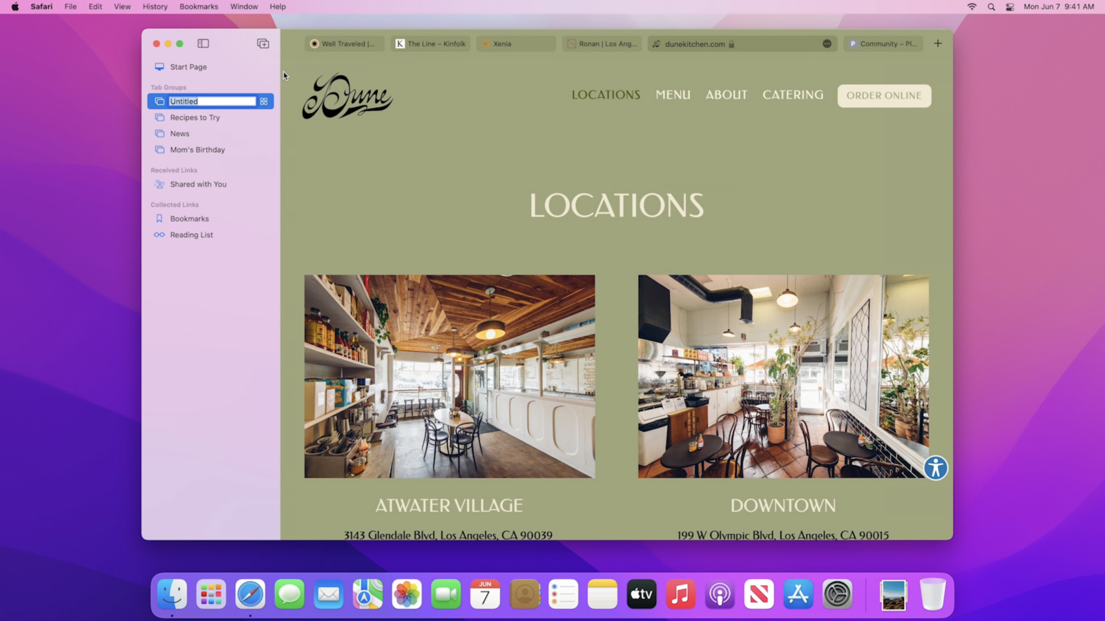
Tab Groups aim to offer a new way to easily save and manage related tabs, such as those used when planning trips or shopping, or groups can be used to store the tabs you visit daily.
In addition, a new tab design on macOS puts your active tabs front and center, allowing you to see more of the page as you scroll. At the same time, the new tab bar takes on the color of the webpage and combines tabs, the tool bar, and the search field into a single compact appearance.
On iPad, the new tabs design and tab groups work just like on Mac, with instant syncing across devices. On iPhone, the new tab bar appears at the bottom under your thumb with a tap, and it's possible to swipe between them, or swipe up into a grid view.
Meanwhile new extensions for iPhone and iPad also add to the native functionality of Apple's web browser, with shared code with existing Safari Web Extensions to make it easier for developers to create new ones.
Article Link: Safari Browser to Get UI Overhaul and New Features Including Tab Groups

Yup - you can switch off the color bar in the settings. I thought it might look quite good, but having just installed it, it looks like it will look terrible on too many sights, and actually be quite distracting.Hopefully they allow opting out of the color bar & tabs, and leave the bookmarks bar alive. Never been a fan of the transparency and other fluff that changes based on the page or photo that you are scrolling over, app that is behind it, …
Smart tabs sounds great.
Can’t wait for extensions I use in other browsers to also become Safari compatible.
The way the tab groups work seems quite unintuitive - there doesn't seem to be an option to 'add to tab group in the same way that there is to add to a bookmark folder.
So again, it looked like it could be really useful, ie swapping out groups depending on current usage, it seems let down in a practical sense, because if you switch to a group you have set up, and then happen to add other unrelated tabs in a browsing session, it adds them to the group, even though you maybe you wouldn't want to.
It is still an early beta though, so they may change some of how it functions before the official release.
Those look like narrow tabs...? I sure hope so. I despise wide tabs, they are so ugly. And I hope tabs taking on the color of the site you're visiting can be turned off.
From looking at the photos, I can’t say I love the design. It seems like a busy UI. But then again I’m only seeing photos and not using the browser yet.
I like the graphical change, but I also like having certain functions available with a single click of the mouse. I don’t like going to sub-menus for items previously available with one click.
Yes, but Firefox is so awful when it comes to bookmark navigation on iOS.So Firef...uh, Safari looks a little bit better and worse at the same time with the website color matching. On iOS the design is straight up bad.

Yes, Yosemite/Safari 6-ish is when the downhill slide really started.This! Amen!
But, more like, started with ios7 and Yosemite.
Yup, agree completely with this. During the keynote, I thought it looked like it could potentially be useful, but having played around with it, I just don’t get it.With the difference that Firefox doesn't actively make the tab bar barely stand out by blending it into the background and that it's not moving crucial interface elements (the adress bar) around as it pleases.
Seriously, this might look good, but this is terrible from an useability point of view. The trend of design over clarity which started with Big Sur continues.
Everything here comes with the caveat that of course different people have different ways of using software, but my two cents is that, as you say, it’s terrible UX.
Not sure if you know the Neilson Norman Group Heuristics, but it seems totally at odds with the one about system status, ie that things should be in a consistent place, and if consistent appearance that a user expects.
That both the tabs and search bar change position and size in such an arbitrary way is actually really annoying.
And thinking about it, I’m not sure there’s much value in organising tabs into groups, because many browsing sessions are pretty random, so not necessarily the sort of thing there is much value in organising in the same way that you might organise favourites.
If anything, I’d maybe find it useful if you could create multiple favourite groups, so that I could swap out my favourites bar, even just to swap out work stuff and non work stuff.
Agree with this too. Having the reload icon in the search bar was handy, and something I use sometimes. Now it’s two clicks instead of one.Please please no more disappearing controls in iOS. Screens keeps getting bigger and bigger, we can live with a few mm of controls on the screen so we don’t always have to tap to unhide what used to be there at the ready.
And yes, I know it’s not that big a deal at all, but I’m not sure there’s much benefit in the change.
Even less space to click and move the window around without clicking a button instead
I'm a power user. I can't stand when engineers take tools from the UI and bunch them up into one spot. I don't like having the share sheet stuck behind three dots that I now have to make an extra click for to get into. It needs to be fully customizable. Considering I still use the favorites bar it's not like it's going to save me that much space on the desktop UI, maybe on iOS, but hiding the share sheet is worse there.Power users are going to love this, but I can see this confusing so many people - especially the new iOS layout. I can't wait though!
Trying it out on an 11.9" iPad, I've got to say that the new tabs, in practice, are kind of a UI mess
You have several problems; the cognitive overload of "is it an address bar or a tab or both" coupled with the fact that choosing a new tab causes everything to move around a bit, and the colour blending is NOT helpful to distinguishing the tab/location-bar region from the page region. And, of course, you end up with less room for tabs, as they are now sharing space with the location bar.
Still, it's (very!) early days, so maybe you get used to it? But... the initial feeling is that this looks good in a screenshot but may actually be meaningfully worse in-use. (And I learned my lesson last year about installing developer betas of macOS, so I'm leaving that well alone until it is officially released!)
On the positive side, tab groups are a nice feature.
Like pushing the share sheet into some dots with all of the other useful shortcuts?I like the graphical change, but I also like having certain functions available with a single click of the mouse. I don’t like going to sub-menus for items previously available with one click.
Apple is going crazy with colors, first menu bar that doesn't follow light/dark mode, now browser that gets colored by whatever colors website uses. What is even the point of dark mode at this point.This is certainly not going to go down well. They will have to tweak the design aspects of this.
- reload button needs to be available all the time
Fortunately you can turn off the color blending in Settings > Safari > AdvancedApple is going crazy with colors, first menu bar that doesn't follow light/dark mode, now browser that gets colored by whatever colors website uses. What is even the point of dark mode at this point.
Register on MacRumors! This sidebar will go away, and you'll see fewer ads.