any idea when the new colors will be available for the sport bands?
Is there actually a rumor of new colors?
any idea when the new colors will be available for the sport bands?
I'd love to see different shades of the link bracelet. It's beautiful but some prefer shinier, some prefer a more brushed look, some prefer something along the lines of the space grey back of the iPhone 6. That would be beautiful. But having high hopes for that is probably uselessany idea when the new colors will be available for the sport bands?
That Panerai though!
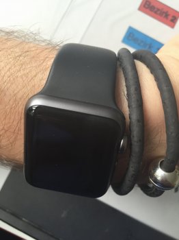
That looks really ace! Can I ask where you got the band from?
User map1978 from macrumors shared this originally and I went to check it out and got it from eBay seller: bandfeverThat looks really ace! Can I ask where you got the band from?
Well i guess I'm glad I didn't get a copper colored one. I ordered from ivapo us.I have the same band coming my way from Amazon for my SG Sport.
I hope I get a black one....people have been complaining about getting copper colored bands when they ordered black...
What seller was yours? Mine was Biao Ge.
Nice collection.I am a watch guy too, however since late April i have yet to take any of these out of the box...
Nice collection.Since I received my SS AW using HOCO SS Band ordered from Amazon, my Breitling Skyland Avenger gets no wrist time. I do use an Orbita Sparta Winder to keep it running. The AW is an amazing piece of technology with lots of potential.
Same for me on square/rectangular watch faces. I have the 42mm so it's a bit more rectangular. Now that I've had mine for a while it just seems normal. I do think when you want to do something other than tell the time, the rectangular face is the way to go. I've seen a number of the smart watches trying to fit text onto their round faces and it just looks so bad. Not esthetically pleasing at all, many times truncated and a form factor that an inexperienced person would think to design. Reminds me of when scalable fonts came out on the Mac and then PC and the masses would mix tons of fonts on one page and clearly inappropriate type sizes for text and headlines. One ugly mess.
I agree circular smart watches don't work at all.However when using the circular watch faces on my apple watch it looks odd, too much dead space on the edges if no complications are used. So Modular has been my main watch face for a while now. Occasionally switching to Large Font watch face with my colorful bands.


You can nitpick as much as you want and try to be Mr Supersmart and you're still wrong in this thread with your topics posted before.Perhaps you're unfamiliar with the actual definition of moan.
Just for your convenience I'll detail it below.
Moan
Complain or grumble, typically about something trivial.
Source: Google
As you can obviously see I have not been moaning. Your post is nothing more than an attempt to get rid of me of which won't be happening quite as easily as you may like. So, good day sir!
View attachment 569262 My current favorite screen set up. Simple with only time and date. Along with the current temp outside. Still loving my watch! Been wearing it everyday since I received it on May 8th.

