Got a tip for us?
Let us know
Become a MacRumors Supporter for $50/year with no ads, ability to filter front page stories, and private forums.
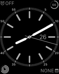
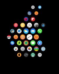
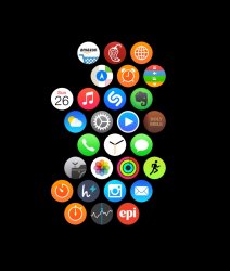
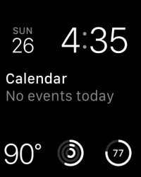
Show Off Your Watch Face and Home Screen!
- Thread starter Flow39
- Start date
- Sort by reaction score
You are using an out of date browser. It may not display this or other websites correctly.
You should upgrade or use an alternative browser.
You should upgrade or use an alternative browser.
Just wait until the black void can be your custom wallpaper, or better yet, an animated background!
Jus like how the original iPod touch was.
Love that look. Is it aluminum? Or Space Grey?
Also, noticed you went with 38. I'm torn between the 38 and 42. Both looked fine on my wrist, but yours looks perfect. Hmmmm...
Last edited:
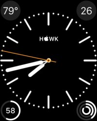
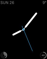
I panicked for a second at the sight of your temperature, then I remembered you guys use Fahrenheit - still, quite toasty!And current watch face.
Love that look. Is it aluminum? Or Space Grey?
Also, noticed you went with 38. I'm torn between the 38 and 42. Both looked fine on my wrist, but yours looks perfect. Hmmmm...
It's space grey. Thanks
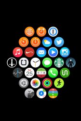
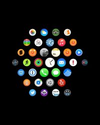
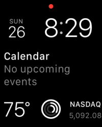
Here are mine! I'm loving the motion watch face, especially with the jellyfish. The vibrancy of the AMOLED display is amazing! With my home screen, my apps are sorted in the basic hexagon format but are sorted in a way that the most important apps are closer to the Watch app. The more important the app is to me, the closer to the center it is.
Screen shots taken directly from my Watch!
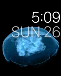
Screen shots taken directly from my Watch!

Register on MacRumors! This sidebar will go away, and you'll see fewer ads.


