Got a tip for us?
Let us know
Become a MacRumors Supporter for $50/year with no ads, ability to filter front page stories, and private forums.
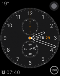
Show Off Your Watch Face and Home Screen!
- Thread starter Flow39
- Start date
- Sort by reaction score
You are using an out of date browser. It may not display this or other websites correctly.
You should upgrade or use an alternative browser.
You should upgrade or use an alternative browser.
Where does the  watch save screenshots at? Built in Photo app that would sync with the iphone photo app? icloud photo?
 watch save screenshots at? Built in Photo app that would sync with the iphone photo app? icloud photo?
Now I just need the apple logo on the monogram ��
You can do that easy. Just copy it and paste it on the Apple Watch app.
You can do that easy. Just copy it and paste it on the Apple Watch app.
Thanks , I didn't know how to do it lol
Thanks , I didn't know how to do it lol
On the iPhone app for the Apple Watch, just go on the Clock, then tap Monogram and paste the logo there.
Wanted mine to match my BMW i3View attachment 546789
Why didn't you stopped the car for the photo? It's dangerous
I originally just had a big grid of apps, but I've decided to go with apple apps on the right, 3rd party on the left.
Totally borrowed your idea - it makes so much sense! Thank you for the inspiration


Awesome! I'm glad it works for you as well. It makes sense for me because I know the general area of everything instead of having to memorize another home screen.
Awesome! I'm glad it works for you as well. It makes sense for me because I know the general area of everything instead of having to memorize another home screen.
100% agree - I'm using stock apps more than 3rd party - much easier to find!
I got my watch face as simple as possible, and the main menu colour coded..
That's awesome! The only thing holding me back from using the Simple face is the lack of being able to have a stock showing on the face. Other than that, I love it!
Only a little question,
It is possible to chose a custom photo for the background of any face?
Thank you!
It is possible to chose a custom photo for the background of any face?
Thank you!
Only a little question,
It is possible to chose a custom photo for the background of any face?
Thank you!
Not currently, but Apple may add this feature in a future Watch OS update.
http://9to5mac.com/2015/04/28/apple-watch-face-app-policy/
Not sure if anyone has pointed this out yet. In the Apple Watch app and can change the city abbreviations for the world clock complication to anything you want.
Apple Watch app > Clock > City Abbreviations

Apple Watch app > Clock > City Abbreviations

Loving the ability to branch out on the home screen instead of just have everything as a big blob, it's better than fiddling around in a large mesh to find the app you want, just swipe in the general direction you want and you're there!
I've gone for:
Top: Fitness related apps
Bottom: Communication
Left: General organisation and miscellaneous
Right: Media (with all the "time" related apps as a branching block)
Still not finished yet but an enjoyable start
This is the best home screen I've seen. Branching makes much more sense than trying to make a symmetrical shape.
This is the best home screen I've seen. Branching makes much more sense than trying to make a symmetrical shape.
Thanks! It's a tiny bit bigger and more organised now but still largely the same. Thinking about it, the main aspect of its usefulness is the maximised surface area - almost every app is on the "edge" of the shape, making accidental tapping of the wrong app much less likely, especially with massive fingers like mine!
Last edited:
I keep trying to arrange my apps and I just don't get it. LOL
Wanted mine to match my BMW i3View attachment 546789
Looks cool!
Slightly off topic; how are you finding the i3? And what were your motivations for getting it?
Why wouldn't you just treat all apps equal? Also, Shazam is 3rd party.
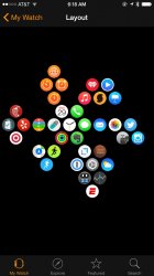
Here's my home screen. I hope I never have to change it because it is very touchy and not easy to get the app icons placed like this. It would be nice if Apple allowed a more free form and flexible home screen layout that would allow separate groupings of app icons, rather then requiring all apps to be "stuck" together.

Attachments
Here's my home screen. I hope I never have to change it because it is very touchy and not easy to get the app icons placed like this. It would be nice if Apple allowed a more free form and flexible home screen layout that would allow separate groupings of app icons, rather then requiring all apps to be "stuck" together.
Image
Be careful of what app you delete. It can ruin your life, I mean layout. I learned the hard way.
Be careful of what app you delete. It can ruin your life, I mean layout. I learned the hard way.
Thanks, I do have minor anxiety over that.
Register on MacRumors! This sidebar will go away, and you'll see fewer ads.


