Become a MacRumors Supporter for $50/year with no ads, ability to filter front page stories, and private forums.

MacRumors

macrumors bot
Original poster
Apr 12, 2001
63,560
30,892


iOS 18 and iPadOS 18 will feature visionOS-inspired design elements, according to a rumor shared this week by Israeli website The Verifier.
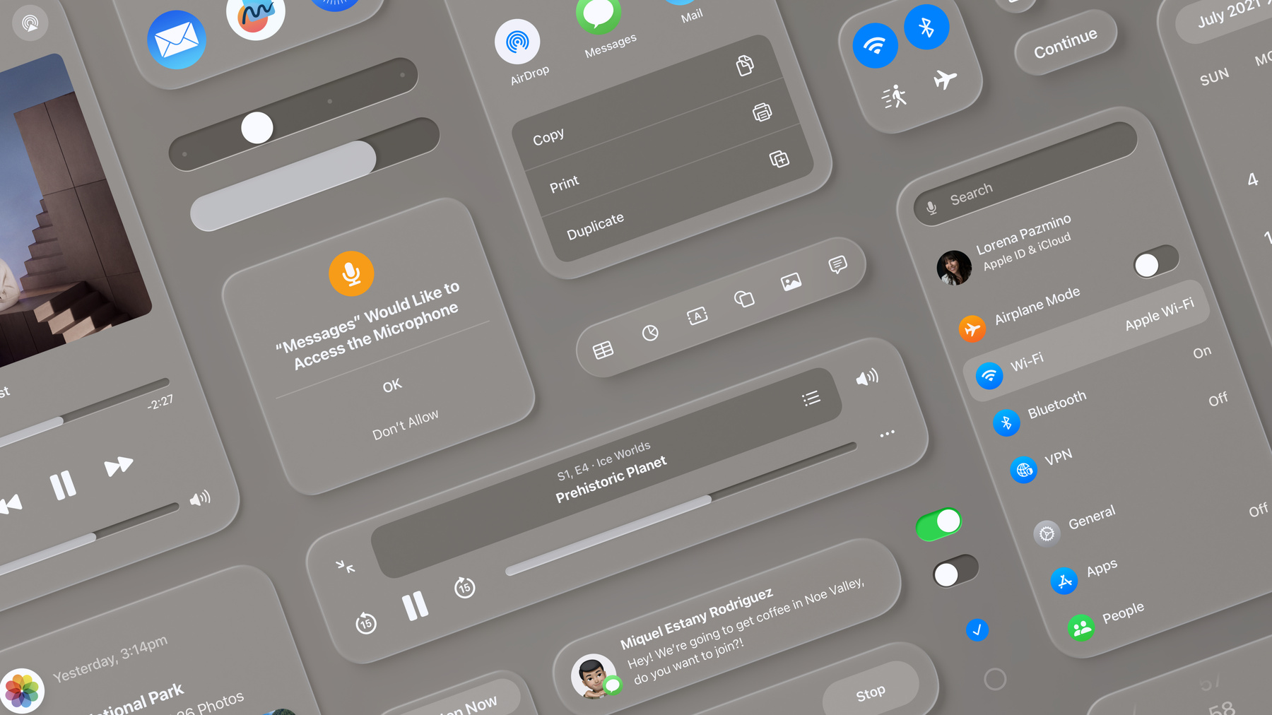
visionOS-design.jpeg

For example, the report claims that the Apple TV app on iPadOS 18 will feature the same translucent navigation bar that was introduced in the tvOS 17.2 version of the app last year. The design of this menu draws similarities to visionOS, the operating system that runs on Apple's new Vision Pro headset, which launched in the U.S. last week.

Apple also plans to redesign various other system menus and built-in apps on iOS 18, including Safari, according to the report.
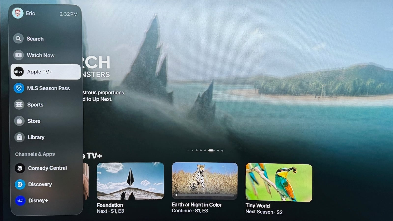
apple-tv-app-redesign.jpg
Apple TV app menu bar on tvOS 17.2

We consider this rumor to be "sketchy" because The Verifier has a mixed track record with Apple rumors over the years.

Apple will introduce iOS 18 at its annual developers conference WWDC in June, and the first beta should be available shortly after the announcement. The update will be released to all users in September alongside the iPhone 16 lineup. For more details about the upcoming software update, read our iOS 18 roundup.

Article Link: Sketchy Rumor Says iOS 18 Will Have visionOS-Inspired Design Changes
 

CarAnalogy

macrumors 601
Jun 9, 2021
4,204
7,737
I believe it, because if the Mac is any indication they care more about consistency than the UI making sense for the platform. There’s nothing wrong with consistency, but things like the notifications on the Mac clearly need to be re-thought and not just copied from iOS.
 

city_17

macrumors regular
Oct 25, 2021
129
251
I believe it, because if the Mac is any indication they care more about consistency than the UI making sense for the platform. There’s nothing wrong with consistency, but things like the notifications on the Mac clearly need to be re-thought and not just copied from iOS.
Exactly, the settings menu and user switching Lock Screen are great examples of bad UX purely for the sake of consistency.

They need to bring back good UX tailored to the Mac instead of just lazily porting everything new from iOS.
 

szw-mapple fan

macrumors 68040
Jul 28, 2012
3,482
4,343
There will be options to control contrast and translucency I'm sure (as always) but based on that screenshot alone (if that means anything) that looks like a nightmare. Even for people with good vision the UI contrast in that image is extremely low.

I agree. Apple already tried the heavily frosted glass look in iOS 9 and it didn’t look all that great. I much prefer the more solid/contrasty looking UI elements (with only a touch of translucency) that we currently have.


IMG_2928.jpeg
 
Last edited:
Register on MacRumors! This sidebar will go away, and you'll see fewer ads.