Become a MacRumors Supporter for $50/year with no ads, ability to filter front page stories, and private forums.
None of us were in the room. All we know is his signature wasn't on the apology and he left shortly after. We've been stuck in iOS-7 purgatory for 10 years since then. It's time for a bit of a refresh.

Well, we also know, according to reports obviously, that his downfall was widely celebrated in the company.
But yes, I agree, it’s time for iOS to have its Big Sur/watchOS 10 moment.
Although I still highly doubt it’ll be as dramatic as the difference between iOS 6 and seven
 
  • Like
Reactions: _Mitchan1999
Well, we also know, according to reports obviously, that his downfall was widely celebrated in the company.
But yes, I agree, it’s time for iOS to have its Big Sur/watchOS 10 moment.
Although I still highly doubt it’ll be as dramatic as the difference between iOS 6 and seven
Wouldn’t it be more meaningful to make those changes for iOS 20, and use that two remaining years to polish the code at a lower level, while integrating AI in the operating system?

If that leads us to two more years with minor changes and only performance/efficiency improvements, I’m okay with that.

That being said, I’m more than happy with the current UI to be fair, as long as they polish the UI bugs that keep appearing on the Notification Center and other places of iOS.
 
  • Like
Reactions: _Mitchan1999
View attachment 2347713

Bring back Aqua

I want to lick my damn UI again
Tom...Tom....TOM...I'm going to need you to step away from the computer sir...


images.png
 
I certainly hope so because iOS ugly AF in my view, and it hasn't changed much aesthetically since 2013. I am so over the flat GUI elements with flat transparent windows, ugly opaque widgets, frustrating little 'x's and links to click on (for those of us with adult sized hands), and so on.

And since everyone copies Apple in one way or another, I've noticed that Android and others use a lot of these awful deign elements too. Even Windows is using godawful, lazy, tile icons in Windows 11 thanks to Apple.

There is a happy medium between leather stitching and flat, lifeless, GUI design with vast, unused blank spaces and frustrating navigation. Perhaps the design language of visionOS is this middle ground.

If they do overhaul iOS, let's hope macOS is next, because Apple's obsession with iOS-ifying macOS has left inconsistent (and head-scratching) design choices that just boggle the mind.
 
It'll be interesting but the only issue I see is those panels only really work when you have lots of space around them, so it might look okay on ipad, but on iphone if you start having to have an area that isn't misty then you'll start eating into screen estate, and you'll end up with borders within borders — harking back to the original skeumorphic issues. Some of the raised and indented features will work nicely though.
 
The talk about frosted glass on iPhone made me think of a phone from Black Mirror, it has an iPhone 4 bumper case and everything.

1707504223776.png
 
View attachment 2347713

Bring back Aqua

I want to lick my damn UI again

We all wanna lick it, I want more transparency, some things, like the dock, are too opaque.

I’ve been thinking ever since we heard there are big changes coming for iOS that it would be inspired by visionOS. Everything not left over from the flat boring iOS 7 days has been inspired by watchOS. Remember all our notification bubbles and other ui elements copied that style. I like how notifications look on android better, more squared off, everything grouped together instead of a million individual bubbles.

visionOS just looks like a grey version of watch os to me, sort of bland bubbly and flat, hoping it looks nothing like it.
 
  • Like
Reactions: gusmula
Not a chance. If you ask an Apple engineer, they'd claim that you can't bring it to iOS/macOS because it's a spatial design with spatial elements, blah blah. Actually, it's the only thing that sets visionOS apart at the moment.
 
  • Like
Reactions: Populus
Skeuomorphism is back baby! Apple secretly working with LoveFrom it seems.
 
Bring back Aqua

I want to lick my damn UI again


I just want affordances again. Ive's brainless MS Metro derivative "anti-skeuomorphic" flat design devastated the usability of iOS. We still haven't recovered from that blunder. We need clearer indications of how to interact with elements on a screen. As it is, you can't really tell what text is and isn't tappable in iOS.


iOS 18 and iPadOS 18 will feature visionOS-inspired design elements, according to a rumor shared this week by Israeli website The Verifier.

visionOS-design.jpeg

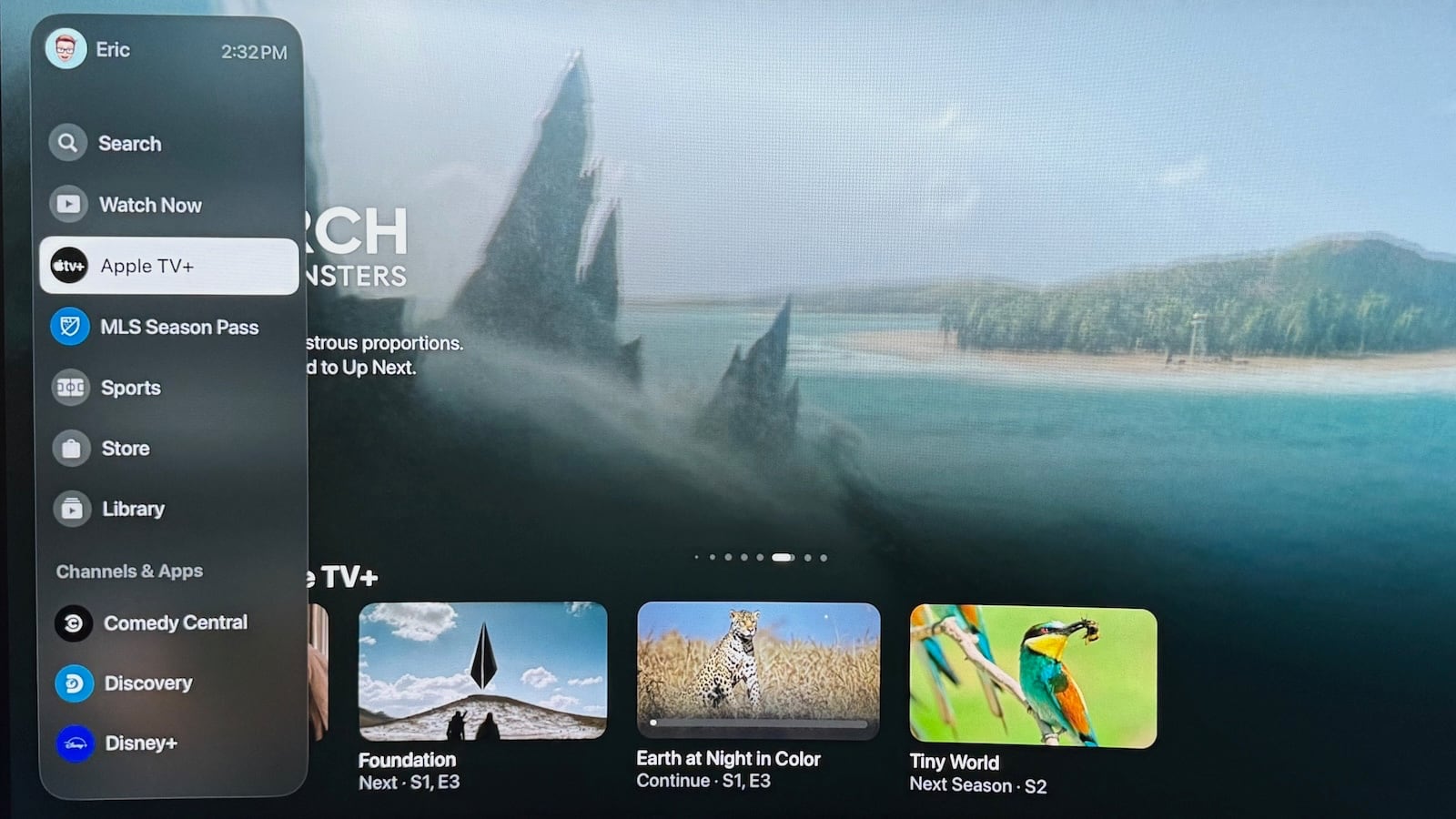
For example, the report claims that the Apple TV app on iPadOS 18 will feature the same translucent navigation bar that was introduced in the tvOS 17.2 version of the app last year. The design of this menu draws similarities to visionOS, the operating system that runs on Apple's new Vision Pro headset, which launched in the U.S. last week.

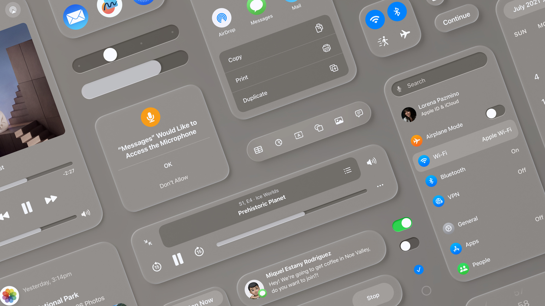
Apple also plans to redesign various other system menus and built-in apps on iOS 18, including Safari, according to the report.

apple-tv-app-redesign.jpg

Apple TV app menu bar on tvOS 17.2

We consider this rumor to be "sketchy" because The Verifier has a mixed track record with Apple rumors over the years.

Apple will introduce iOS 18 at its annual developers conference WWDC in June, and the first beta should be available shortly after the announcement. The update will be released to all users in September alongside the iPhone 16 lineup. For more details about the upcoming software update, read our iOS 18 roundup.

Article Link: Sketchy Rumor Says iOS 18 Will Have visionOS-Inspired Design Changes
To be fair to the rumours the new Apple TV menu bar reminds me of VisionOS
 
the beveling and emboss looks great. though I hate the extra menu click on AppleTV
 
Register on MacRumors! This sidebar will go away, and you'll see fewer ads.