Become a MacRumors Supporter for $50/year with no ads, ability to filter front page stories, and private forums.
To be honest I think this adds more clutter to the iPhone. I think sliding to unlock it and then choosing what to do is fine. Instead of waking up the phone and sliding to view missed calls or something. It also defeats the purpose of wallpaper. Leave the ease of use as it is.

It is good that you are thinking though.
 
Wow, you fixed everything with the updated version. That's a pretty awesome concept (with the added slide to see feature). I'd definitely pay $2-3 (yeah, I'm a cheapo :)) for this app. I love the fact you get to see your appointments, SMS, and everything else on the home screen. Since I use an iPod touch, I would have weather instead of SMS or missed calls. But I'd still buy it!

Great job, and I really hope someone makes this for the App Store
~Austin~
 
Love the update, who cares about the background pic, it's not like you wake your phone up to see the picture, or maybe you do, but I don't. Love it.
 
I think the people that want the intelliscreen or whatever it is should switch to a WM6 phone. I can't wait to see the app for "make your iPhone look like a WM phone" The intelliscreen app is the first step.

Sorry to be harsh, but I hate WM phones. $45 for PDA data plan, crappy interface, IE mobile sucks, need I go on.
 
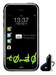
This one is accident-proof and once you slide across, it goes straight to that application, or first brings up the numeric lock if you have a password set. Then it would go to the respective app

It's another take on how to show missed calls, emails, SMS etc. It's not so much the 1 touch saved, so much as showing the information on a locked screen it seems?

Still looks a little clutter (There could a better less cluttered way to indicate multiple slides - e.g. you could touch drag the icon of interest onto a single slider at the bottom (Kind of like drag and drop the icon onto a "do this" icon). We'll see - with multi touch you could pinch the one you wanted to - this would identify the app you want to open immediately, and also stop random keypresses perhaps?

Like the thinking :)

I agree with what your saying, I think that they should be lined up against the side like they are, and then you can push the button and it will give you a little snapshot of the calls you missed, email, sms, etc. Sort of a quicklook, than, you could have a single slider at the bottom to launch into that app, I can try to explain better if you don't get what I'm saying.
 
I can't easily sort the arrow, but it's to show the user to drag the actual icon. I'm sure this is ripping up the Apple UI book, but something similar might be useful.
Could change the text from Drag here to unlock to something else too. Basically multi-touch is your friend. (E.g. didn't WM7 indicate using a shake awake gesture?) I'm quite a fan of the pinch gesture of the icon you want also.
 

Attachments

  • slide_to_unlock_mockup03 copy.jpg
    slide_to_unlock_mockup03 copy.jpg
    149.7 KB · Views: 192
Alright. I have a good new concept in my head. I'll just have to wait a few days to make it. I'm home from college seeing the girlfriend. She's much better than an iPhone :D

I have a friend who was double majoring in business and programming but dropped the programming last year so he could just graduate this May. We talked about this at his grad party today and we might look into actually building it if we can figure out the code. Its been awhile for me.
 
I can't easily sort the arrow, but it's to show the user to drag the actual icon. I'm sure this is ripping up the Apple UI book, but something similar might be useful.
Could change the text from Drag here to unlock to something else too. Basically multi-touch is your friend. (E.g. didn't WM7 indicate using a shake awake gesture?) I'm quite a fan of the pinch gesture of the icon you want also.

1337 :]
 
I haven't got too dirty with Xcode regarding the multi-touch, but i'd readily say that it's highly likely the number of gestures capable will go up.

Whilst it'd be fun to claim finders keepers, by having the iPhone capable of doing them, there may be a decent open source gesture library push.
No need to over clutter the "gesture - space", but by having them up and running over a year before WM7/8, that'd be damn fine.
I have no idea about having flexible recognition of user-created gestures. That's a whole other kettle of fish.
Anyhow, wait till June 9th. Expect big things. Don't be fearful of being let down, be fearful of constraining your expectations and limits.
 
I hate most concepts that people bring to these forums, but this is one of the best things i've seen so far.
 
Don't mean to hijack this thread with my own ideas, but I saw your concepts and ideas started spinning in my head... Here goes.

slideview_mockup1.png


Now, after playing with this concept, I was thinking... IntelliScreen has the weather, which I think is pretty cool. But there isn't really any space left, unless we totally redesign the layout. That could work better, but for now this is what I've come up with.

slideview_mockup2.png


The Weather and Calendar bars are little mini widgets I guess you could call them. The bottom slot could be filled with any number of these little guys for anything and everything. Any type of information could have it's own mini widget.

Now the next step logically is to ask, could every bar just become a mini widget. Could the calls, sms, calendar, mail, weather occupy maybe 3 thicker mini widget styled bars, that could slide to reveal information, as opposed to just sliding to open the actual app. I guess those are the two different directions this app can take. Shortcut vs. actual information display right on unlock.

Let me know what you guys think..
 
Wow!

Rainmanbk, love those concepts! There great!

Is it possible to make an app that can do this though? If so, is there anyone willing to give it a shot?

I really need to learn how to do this stuff!
 
Don't mean to hijack this thread with my own ideas, but I saw your concepts and ideas started spinning in my head... Here goes.

slideview_mockup1.png


Now, after playing with this concept, I was thinking... IntelliScreen has the weather, which I think is pretty cool. But there isn't really any space left, unless we totally redesign the layout. That could work better, but for now this is what I've come up with.

slideview_mockup2.png


The Weather and Calendar bars are little mini widgets I guess you could call them. The bottom slot could be filled with any number of these little guys for anything and everything. Any type of information could have it's own mini widget.

Now the next step logically is to ask, could every bar just become a mini widget. Could the calls, sms, calendar, mail, weather occupy maybe 3 thicker mini widget styled bars, that could slide to reveal information, as opposed to just sliding to open the actual app. I guess those are the two different directions this app can take. Shortcut vs. actual information display right on unlock.

Let me know what you guys think..

This is absolutely an amazing idea.
 
I love the progression that i've seen. It looks great. Very clean.
 
Is this progression? It's more like enlightenment :cool:

Hey, rainmanbk, have you thought about only placing the "slide to view" apps if its just been updated? An example could be if the call icon shows when its the only missed/unread item. It could be an option for less clutter.
 
...have you thought about only placing the "slide to view" apps if its just been updated? An example could be if the call icon shows when its the only missed/unread item. It could be an option for less clutter.
'

Mmm.. Less clutter. Tasty.

slideview_mockup3.png


In this design, things would only show when they have new items. I'd imagine some sort of vertical scrolling could reveal more than 4 items?
 
Register on MacRumors! This sidebar will go away, and you'll see fewer ads.