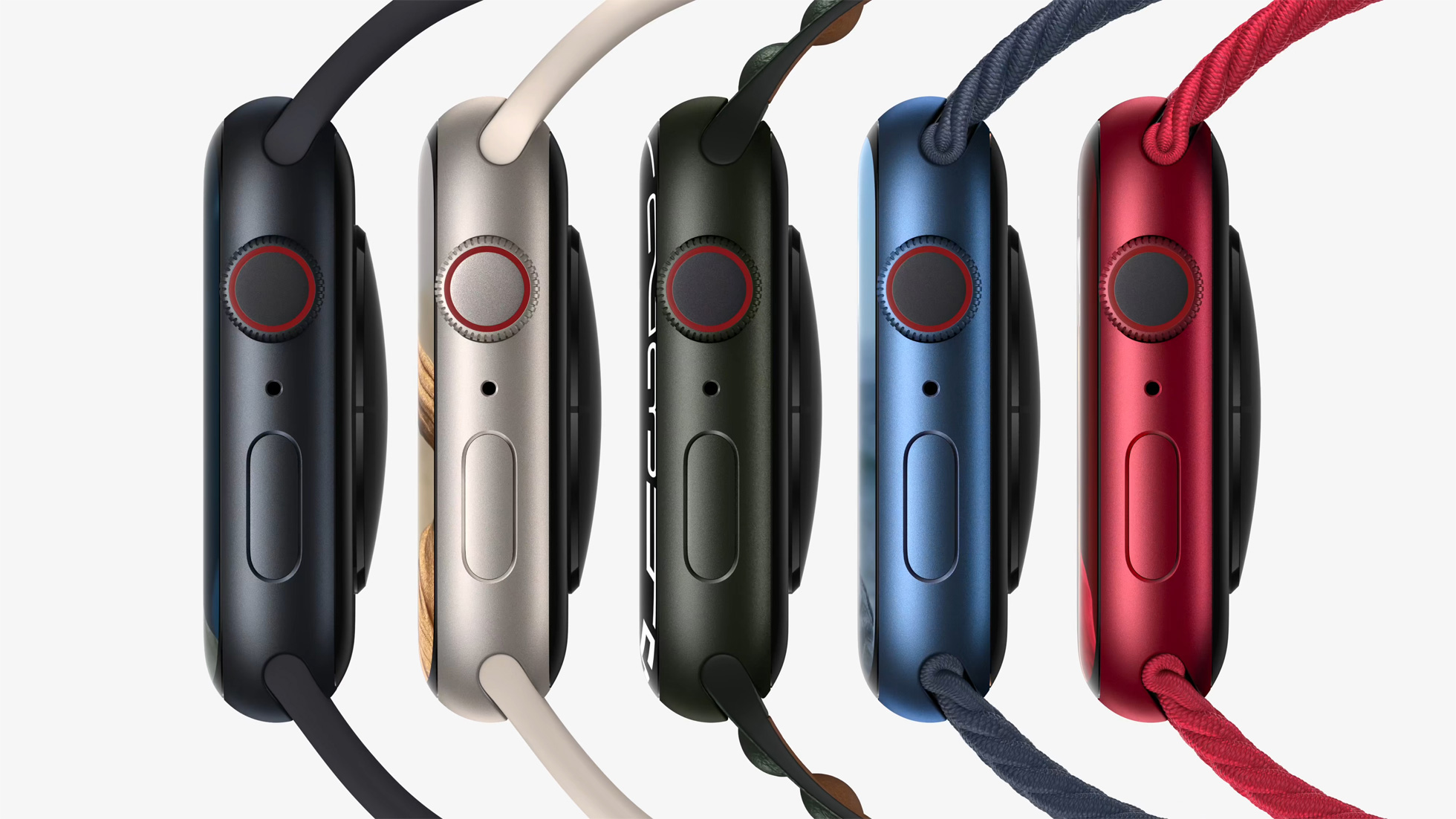
With pre-orders for the Apple Watch Series 7 opening today, dissatisfaction with Apple's new color options has been expressed by some customers and pundits on social media.

The aluminum Apple Watch Series 6 was available in Space Gray, Silver, Gold, Blue, and (PRODUCT)RED aluminum color options, while the aluminum Apple Watch Series 7 overhauled the lineup of colors, and is available in Midnight, Starlight, Green, Blue, and (PRODUCT)RED.
These are the same colors offered with the iPhone 13 mini and iPhone 13, except there is a Pink option instead of Green. The new iPad mini is also available in a mix of colors, mirroring Starlight and Pink from the Apple Watch Series 7 and iPhone 13, carrying over Space Gray, and introducing a new Purple color.
The Apple Watch's Blue and Red tones have been slightly tweaked from last year's offerings, while Green is a totally new option. Midnight replaces Space Gray with a very dark navy, while Starlight replaces Silver and Gold with a subtle champagne color.
With such significant changes coming to the Apple Watch's color options this year, some customers have expressed confusion and irritation with the new hues. The replacement of Silver and Gold with Starlight has attracted particular ire, with some fans of the previous options being disappointed with the single new champagne-style color. Some fans of Silver have criticized Starlight for being too warm, while some fans of Gold have found it to be too desaturated.
While there are still Silver and Gold stainless steel Apple Watch options this year, Space Black has been replaced by Graphite, except on the Hermés models.
Stainless steel Link Bracelet users have also noted incongruity with some Series 7 models. This is particularly evident with the Graphite Stainless Steel Apple Watch, which no longer matches its accompanying Link Bracelet.
Although the Link Bracelet is a stainless steel band designed to twin with a stainless steel Apple Watch, some users have enjoyed using the band with the Silver aluminum Apple Watch in previous years. With Starlight replacing Silver, some users have noted that the cool silver of the Link bracelet now clashes with the warm tone of Starlight.
Other mismatching band and casing combinations have been noted by users across various social media platforms and websites, with some claiming that the Series 7's colors mismatch with more bands, more severely compared to the color options offered in previous years.
There is now an unprecedented level of fragmentation with Apple's color options across its product lines. The iPhone 13 and Apple Watch Series 7 now contrast with the iPad Air and AirPods Max models, as well as the 24-inch iMac and iPhone 12, with other devices like the iPad mini overlapping the divide.
Apple effectively now has three separate color palettes for its devices, in addition to the pre-existing tonal differences with the same shade that was common to see with the likes of Space Gray. Other product lines, such as the iPad Pro, MacBook Pro, and HomePod mini, also no longer have any matching colors with the aluminum Apple Watch Series 7 or standard iPhone 13 models. This appears to have irked some users who like to have matching colors across multiple Apple devices.
As yet, there are no rumors about what colors Apple's redesigned MacBook Pro and Mac mini machines could be available in. When they do arrive, likely at an event later this month, there may be some more clarity about Apple's plans for color options going forward.
Article Link: Some Customers Unhappy With Apple Watch Series 7 Color Options
Last edited:

