I bought and returned an apple watch 7 because I couldn't handle the color choices, I tried the blue and hated it. I ended up getting a 6 because I wanted the "gold/pink" color... Apple got these colors so so wrong!
Got a tip for us?
Let us know
Become a MacRumors Supporter for $50/year with no ads, ability to filter front page stories, and private forums.
Some Customers Unhappy With Apple Watch Series 7 Color Options
- Thread starter MacRumors
- Start date
- Sort by reaction score
You are using an out of date browser. It may not display this or other websites correctly.
You should upgrade or use an alternative browser.
You should upgrade or use an alternative browser.

Apple should always keep a black or dark gray in every aluminum lineup as they have done with their iPhones for a while now. I went in for a Midnight which was nice but it looks blue and I wanted a solid color so I ended up ordering a SS Silver and would have gone with the Graphite if it had the DLC coating.
I just got the Starlight on Monday and I love it. It looks very rich to me. Very different. This is my first Apple Watch so I have nothing else to compare it to, but I think it looks stunning.
I’m sure this opinion will not be popular but silver, (space) gray and black are so boring I don’t know how they can be considered color, they’re all shades of gray. I understand some people just want a "safe" choice but some of us want something a little different. I would love to get stainless steel but until Apple releases one with a color(gold doesn’t count unless it’s actual gold) I have to stay with aluminum.
Well, well, guess who bought an Apple Watch S7 in, of all colours, Starlight… 🤦♂️ As you may guess, some self-claim-chowder is in order. 😬
This, I'm totally not backtracking on. When it comes to really bold colours, it would be nice if they could at least match those across product lines. For instance, I love my new blue (whatever the name of the shade is, I don't care) iPhone 13 Mini, but even if I didn't have any issues with the inherent “scratchability” of a blue S7 Apple Watch, I still wouldn't get it because the stupid shades don't match. 😡
At the moment, they are now available, but with insaaaaane waiting times, much like my mum's iPad Mini… I'm guessing that also comes down to just how screwed up supply chains are right now, alas. As for the Titanium model, it's still completely MIA in Portugal, including on Apple's online store (where they still keep some exclusives even on the other, lower-priced ranges), which is just a big f.u. from Apple to our market.
Now, here I have to do an about-face and admit that judging an SKU from online photos alone, colour-accurate as my 5K iMac's P3-capable screen may be, was in fact, and will always be, a bit stupid and premature. Once the darned things reached stores, I could take out my stainless steel LUVVITT band adapters and make proper, side-by-side comparisons, and guess what, while they sit somewhere along the Silver Aluminium–Starlight spectrum, they do skew a lot more towards the latter. They actually look like a slightly darker variation of the Starlight shade, which does make them match better with the S7 than with the S0 (now permanently stuck with the classic, white fluoroelastomer sport band by Apple which came bundled with it).

As for this much maligned colour choice itself, I was a bit wary of being fooled by the lighting on the Apple Stores-within-a-store where I saw the demo units, because it did look much better in person, but it is extremely subtle in all lighting conditions. It doesn't look gold, or champagne or, for that matter, beige at all. As a matter of fact, as a material and when compared to the neutral Aluminium shade they used before (and I should know that, as I still have my S0 to compare it to), it's even more subtle than the difference between the colour temperature of warm white, cool white and neutral LEDs/incandescent bulbs/CFLs/fluorescent tubes. It's more like comparing different shades of arguably “white” paper and, when set against my mostly saturated colour sweaters, or even the black and grey ones, it still looks perfectly neutral.
Yep, still standing by it, and I'm happy with staying on that theme.
I like the always-on watch faces, but I've been considering turning them off. I've been working from home and am constantly surrounded by screens, and would much rather preserve the life span of both its battery and OLED screen. I just wish WatchOS had a shortcut to toggle that (other than brute-forcing it by using Theatre Mode, which just throws out the baby with the bathwater and disables sound notifications), and automatic sleeve detection. Why the always-on face is still active even while covered by clothing and fully invisible is just beyond me (maybe because the Watch only has a light sensor, and not a proximity one?). Well, to my credit, I did leave the door open to changing my mind…
… and change my mind I did. The only one “losing” €469 in this equation ended up being me… but hey, at least I got a new Watch out of it. 😂
Thanks for putting it in a “reasonable” manner. I'm still sticking to my emotional rant because, as of late, Apple really seems to have been taken over by arrogant people.
That's the thing that gets me: they've been so successful (and rightly so, they are still the most innovative company around) that it seems they are now convinced they cannot fail, no matter what, and end up making some really, REALLY questionable (and sometimes outright dumb) decisions.
This, I'm totally not backtracking on. When it comes to really bold colours, it would be nice if they could at least match those across product lines. For instance, I love my new blue (whatever the name of the shade is, I don't care) iPhone 13 Mini, but even if I didn't have any issues with the inherent “scratchability” of a blue S7 Apple Watch, I still wouldn't get it because the stupid shades don't match. 😡
I, for one, am voting with my wallet, because the silver Stainless Steel version is expensive as hell (and, as far as I could tell, not even available for purchase in my country… so nice of them! [not])…
At the moment, they are now available, but with insaaaaane waiting times, much like my mum's iPad Mini… I'm guessing that also comes down to just how screwed up supply chains are right now, alas. As for the Titanium model, it's still completely MIA in Portugal, including on Apple's online store (where they still keep some exclusives even on the other, lower-priced ranges), which is just a big f.u. from Apple to our market.
… and there's no way I'm getting a watch thatdoesn't match any of my already purchased band adapters, my other Apple products or, more importantly, ANY OF MY CLOTHES (I just don't do pastel, and there's enough of shades there to make any colour matching with high-tech gadgets a veritable – and expensive! – nightmare).
Now, here I have to do an about-face and admit that judging an SKU from online photos alone, colour-accurate as my 5K iMac's P3-capable screen may be, was in fact, and will always be, a bit stupid and premature. Once the darned things reached stores, I could take out my stainless steel LUVVITT band adapters and make proper, side-by-side comparisons, and guess what, while they sit somewhere along the Silver Aluminium–Starlight spectrum, they do skew a lot more towards the latter. They actually look like a slightly darker variation of the Starlight shade, which does make them match better with the S7 than with the S0 (now permanently stuck with the classic, white fluoroelastomer sport band by Apple which came bundled with it).
As for this much maligned colour choice itself, I was a bit wary of being fooled by the lighting on the Apple Stores-within-a-store where I saw the demo units, because it did look much better in person, but it is extremely subtle in all lighting conditions. It doesn't look gold, or champagne or, for that matter, beige at all. As a matter of fact, as a material and when compared to the neutral Aluminium shade they used before (and I should know that, as I still have my S0 to compare it to), it's even more subtle than the difference between the colour temperature of warm white, cool white and neutral LEDs/incandescent bulbs/CFLs/fluorescent tubes. It's more like comparing different shades of arguably “white” paper and, when set against my mostly saturated colour sweaters, or even the black and grey ones, it still looks perfectly neutral.
Besides, as I said before, scratches and nicks on dark colour casings objectively and undeniably show more, and I like the contrast between the black screen and light casing, which would look extra cool with the new screen; a dark Apple Watch just looks like a generic, black blob on the wrist,…
Yep, still standing by it, and I'm happy with staying on that theme.
… and the only thing that might make me reconsider would be if the always-on watch faces could make up for it (I'm saving definitive judgement until I see them in person, of course), but I highly doubt it.
I like the always-on watch faces, but I've been considering turning them off. I've been working from home and am constantly surrounded by screens, and would much rather preserve the life span of both its battery and OLED screen. I just wish WatchOS had a shortcut to toggle that (other than brute-forcing it by using Theatre Mode, which just throws out the baby with the bathwater and disables sound notifications), and automatic sleeve detection. Why the always-on face is still active even while covered by clothing and fully invisible is just beyond me (maybe because the Watch only has a light sensor, and not a proximity one?). Well, to my credit, I did leave the door open to changing my mind…
Apple likely just lost €469 (from a very loyal customer who's bought a crap ton of products from them over the years, including a Series 0 Watch way back when, mind you).
… and change my mind I did. The only one “losing” €469 in this equation ended up being me… but hey, at least I got a new Watch out of it. 😂
Last edited:
I just bought Apple Watch Series 6 Stainless Steel with the price of Series 7 Aluminum in Thailand for 12.12 Sale event from Apple Authorized dealer. At least, I can get away with Silver Stainless Steel instead of Starlight. Even thought I got iPad Mini 6 in Starlight.
For me, a watch is like wearing jewelry.. I have been very hesitant to buy any Apple Watch because of its shape alone. A few months ago I finally gave in, and got one for me and my wife. The fitness features are good and fun, and it motivates us. But as something to wear every day, along with all other accessories, it’s simply not nice! One may be able to find a color combination that is to one’s personal style and liking, but it will never be my favorite watch to wear at all times. And I’m sure it’s not even intended that way. But for me to really hit levels of excitement, they could start by making a round option, in just silver, black and gold, with cool wristbands in a classic design. They could even be a bit heavy and oversized like many conventional watches of current time. That feel of mechanic quality. I miss that!
With pre-orders for the Apple Watch Series 7 opening today, dissatisfaction with Apple's new color options has been expressed by some customers and pundits on social media.
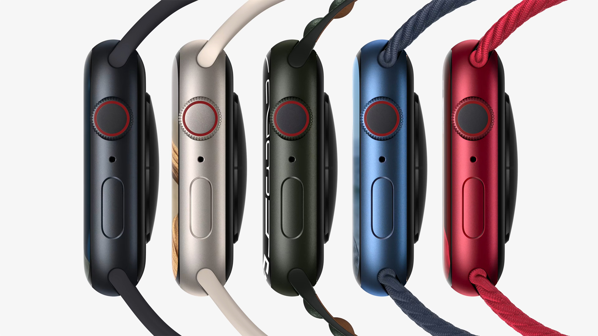
The aluminum Apple Watch Series 6 was available in Space Gray, Silver, Gold, Blue, and (PRODUCT)RED aluminum color options, while the aluminum Apple Watch Series 7 overhauled the lineup of colors, and is available in Midnight, Starlight, Green, Blue, and (PRODUCT)RED.
These are the same colors offered with the iPhone 13 mini and iPhone 13, except there is a Pink option instead of Green. The new iPad mini is also available in a mix of colors, mirroring Starlight and Pink from the Apple Watch Series 7 and iPhone 13, carrying over Space Gray, and introducing a new Purple color.
The Apple Watch's Blue and Red tones have been slightly tweaked from last year's offerings, while Green is a totally new option. Midnight replaces Space Gray with a very dark navy, while Starlight replaces Silver and Gold with a subtle champagne color.
With such significant changes coming to the Apple Watch's color options this year, some customers have expressed confusion and irritation with the new hues. The replacement of Silver and Gold with Starlight has attracted particular ire, with some fans of the previous options being disappointed with the single new champagne-style color. Some fans of Silver have criticized Starlight for being too warm, while some fans of Gold have found it to be too desaturated.
While there are still Silver and Gold stainless steel Apple Watch options this year, Space Black has been replaced by Graphite, except on the Hermés models.
Stainless steel Link Bracelet users have also noted incongruity with some Series 7 models. This is particularly evident with the Graphite Stainless Steel Apple Watch, which no longer matches its accompanying Link Bracelet.
Although the Link Bracelet is a stainless steel band designed to twin with a stainless steel Apple Watch, some users have enjoyed using the band with the Silver aluminum Apple Watch in previous years. With Starlight replacing Silver, some users have noted that the cool silver of the Link bracelet now clashes with the warm tone of Starlight.
Other mismatching band and casing combinations have been noted by users across various social media platforms and websites, with some claiming that the Series 7's colors mismatch with more bands, more severely compared to the color options offered in previous years.
There is now an unprecedented level of fragmentation with Apple's color options across its product lines. The iPhone 13 and Apple Watch Series 7 now contrast with the iPad Air and AirPods Max models, as well as the 24-inch iMac and iPhone 12, with other devices like the iPad mini overlapping the divide.
Apple effectively now has three separate color palettes for its devices, in addition to the pre-existing tonal differences with the same shade that was common to see with the likes of Space Gray. Other product lines, such as the iPad Pro, MacBook Pro, and HomePod mini, also no longer have any matching colors with the aluminum Apple Watch Series 7 or standard iPhone 13 models. This appears to have irked some users who like to have matching colors across multiple Apple devices.
As yet, there are no rumors about what colors Apple's redesigned MacBook Pro and Mac mini machines could be available in. When they do arrive, likely at an event later this month, there may be some more clarity about Apple's plans for color options going forward.
Article Link: Some Customers Unhappy With Apple Watch Series 7 Color Options

Register on MacRumors! This sidebar will go away, and you'll see fewer ads.