Got a tip for us?
Let us know
Become a MacRumors Supporter for $50/year with no ads, ability to filter front page stories, and private forums.
Some Customers Unhappy With Apple Watch Series 7 Color Options
- Thread starter MacRumors
- Start date
- Sort by reaction score
You are using an out of date browser. It may not display this or other websites correctly.
You should upgrade or use an alternative browser.
You should upgrade or use an alternative browser.
Some people are never happy.It’s not even out and people are unhappy loli
I don't mind the colors, I just wish Apple would have let us pre-configure the watch before pre-ordering this morning.

4jasontv
Suspended
What? Why? I am so on the fence to changing my order to gold. Why did you hate it?I can get some being unhappy. I got a gold Apple Watch in the past and pretty much hated it after a month.
I got midnight aluminum this time. Space gray 5 last time. These colors work with more band options for me.
jz0309
macrumors P6
yep, MR and social media ...It’s not even out and people are unhappy loli
neuropsychguy
macrumors 68040
Breaking News: people/bots on Twitter complain!
kerr
macrumors 65816
Apple’s color options across all products is a mess
norbinhouston
macrumors 6502a
Why get rid of the most popular color of all time on Apple Watch, the silver aluminum? All my bands are based of the true silver since watch 1!
kevinpdoyle
macrumors member
Waiting to see in person before I buy it.Still trying to figure out what color midnight is. Seems like it has a blue tint to it?
Swetsenegger
macrumors newbie
Why? They have been sold in silver since the first Apple Watch and space grey since Apple Watch 2 I think?It seems reasonable that aluminum would get ford focus color options while the premium materials would be the more classic neutral colors.
4jasontv
Suspended
It is strange because I swear I remember them packing the bands and body separately and then wrapping them with a sleeve. As long as all the boxes are the same size it should be fairly easy to do custom orders, even at the scale they sell at.Some people are never happy.
I don't mind the colors, I just wish Apple would have let us pre-configure the watch before pre-ordering this morning.
jbachandouris
macrumors 603
Rafterman
macrumors 604
From September, but a closer look at colors:

 9to5mac.com
How Apple's new starlight and midnight colors compare to the classic silver and space gray - 9to5Mac
With the new products introduced on Tuesday, Apple retired silver and space gray/black for some devices and replaced them with...
9to5mac.com
I hate to say it, but I think silver and space gray were probably axed so people who want a neutral color will move up to the stainless model. Midnight is definitely navy blue. See the midnight Nike paired with the black sport loop:

usagora
macrumors 601
Still trying to figure out what color midnight is. Seems like it has a blue tint to it?
Yes, it's a very dark navy blue color. I got a Midnight Apple leather MagSafe case for my 13 Pro Max, and it looks just like black to me except under direct, bright light.
Is the new team color-blind? The iPhone 13 Pro is atrocious. The blue and green look like they were left out in the sun.
4jasontv
Suspended
They still are, but now they call them midnight and starlight. It's the same marketing team that names iMacs.Why? They have been sold in silver since the first Apple Watch and space grey since Apple Watch 2 I think?
4jasontv
Suspended
Yes, it's a very dark navy blue color.
So dark it's gray. I don't see blue.I hate to say it, but I think silver and space gray were probably axed so people who want a neutral color will move up to the stainless model. Midnight is definitely navy blue. See the midnight Nike paired with the black sport loop:
How’s this even newsworthy? Karen didn’t like her cappuccino. So what?
I wasn’t thrilled with the color options. I was hoping that space gray or something similar was an option. I almost went with graphite stainless but didn’t want cellular. Decided on midnight. FYI… midnight is not black. To see the difference between black and midnight, add the black leather band in creator. It’s a very dark blue that borders on being black.
AF_APPLETALK
Suspended
This is funny.
Apple sent me a survey about the iPhone 13. One of the questions was about what I liked the least about the new iPhones. I said that the color options were horrible on both the iPhone 13 and iPhone 13 Pro, and I was incredibly disappointed.
I don't mind this US patriotic color scheme, but these variants of colors are unpalatable.
I defaulted to my usual (white) anyway.
Brutal to see their ID group getting destroyed over this, but given how they used to pick beautiful colors for their hardware enclosures, I think it's well deserved.
Rafterman
macrumors 604
I hate to say it, but I think silver and space gray were probably axed so people who want a neutral color will move up to the stainless model. Midnight is definitely navy blue. See the midnight Nike paired with the black sport loop:
View attachment 1860159
Still looks black to me. But like with iPad mini jelly, and iPad Pro 12.9 blooming, people have different sensitivities. Plus, pictures don't truly show the colors.
My wife and I had the same reaction watching the keynote live. She was ready for a Watch upgrade, but Starlight is just too much like silver and she doesn't like the idea of a stainless steel watch. Furthermore, the lack of a new chip (effectively, making this the Watch 7S) combined with lackluster colors meant she's going to hold out on her 4 for one more year.
Last year's blue was perfect. While not identical with the 12 and 7, they were close enough to feel in the same family. This year's blue feels off somehow to me, and not impressive in person (almost like they recycled the Pacific Blue from the 12 Pro on the 13). The weird light blue color on the Pro is way less impressive in person, and she doesn't like the super reflective bands on the gold.
I feel like we're being nitpicky, but when the tech you have is already good enough, there needs to be a compelling reason to upgrade. Color was more than enough for me last year. My wife said that the moment she saw my facial reaction through my mask at Apple, she knew I was coming home with a 6 even though I already had a perfectly functioning 5. Once I got the blue watch, I HAD to have the blue phone. I loved the colors last year, and while the tech itself was relatively modest compared to what I had, color 125% sold me.
This years colors, as everyone else has been saying, are big all a big "meh." So to upgrade, the tech has to wow. Her 11 Pro and my 12 are more than sufficient for us, so waiting for the 14/8 it is...
I don't know what's less newsworthy, the fact that a few people are complaining about lack of color options or the fact that someone thought this was tech news worth reporting at all. Slow news day.
With pre-orders for the Apple Watch Series 7 opening today, dissatisfaction with Apple's new color options has been expressed by some customers and pundits on social media.
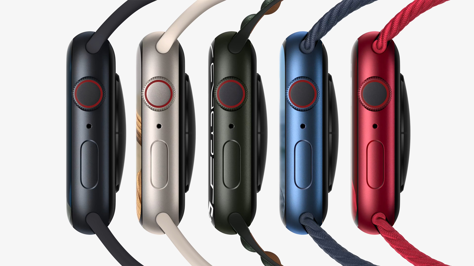
The aluminum Apple Watch Series 6 was available in Space Gray, Silver, Gold, Blue, and (PRODUCT)RED aluminum color options, while the aluminum Apple Watch Series 7 overhauled the lineup of colors, and is available in Midnight, Starlight, Green, Blue, and (PRODUCT)RED.
These are the same colors offered with the iPhone 13 mini and iPhone 13, except there is a Pink option instead of Green. The new iPad mini is also available in a mix of colors, mirroring Starlight and Pink from the Apple Watch Series 7 and iPhone 13, carrying over Space Gray, and introducing a new Purple color.
The Apple Watch's Blue and Red tones have been slightly tweaked from last year's offerings, while Green is a totally new option. Midnight replaces Space Gray with a very dark navy, while Starlight replaces Silver and Gold with a subtle champagne color.
With such significant changes coming to the Apple Watch's color options this year, some customers have expressed confusion and irritation with the new hues. The replacement of Silver and Gold with Starlight has attracted particular ire, with some fans of the previous options being disappointed with the single new champagne-style color. Some fans of Silver have criticized Starlight for being too warm, while some fans of Gold have found it to be too desaturated.
While there are still Silver and Gold stainless steel Apple Watch options this year, Space Black has been replaced by Graphite, except on the Hermés models.
Stainless steel Link Bracelet users have also noted incongruity with some Series 7 models. This is particularly evident with the Graphite Stainless Steel Apple Watch, which no longer matches its accompanying Link Bracelet.
Although the Link Bracelet is a stainless steel band designed to twin with a stainless steel Apple Watch, some users have enjoyed using the band with the Silver aluminum Apple Watch in previous years. With Starlight replacing Silver, some users have noted that the cool silver of the Link bracelet now clashes with the warm tone of Starlight.
Other mismatching band and casing combinations have been noted by users across various social media platforms and websites, with some claiming that the Series 7's colors mismatch with more bands, more severely compared to the color options offered in previous years.
There is now an unprecedented level of fragmentation with Apple's color options across its product lines. The iPhone 13 and Apple Watch Series 7 now contrast with the iPad Air and AirPods Max models, as well as the 24-inch iMac and iPhone 12, with other devices like the iPad mini overlapping the divide.
Apple effectively now has three separate color palettes for its devices, in addition to the pre-existing tonal differences with the same shade that was common to see with the likes of Space Gray. Other product lines, such as the iPad Pro, MacBook Pro, and HomePod mini, also no longer have any matching colors with the aluminum Apple Watch Series 7 or standard iPhone 13 models. This appears to have irked some users who like to have matching colors across multiple Apple devices.
As yet, there are no rumors about what colors Apple's redesigned MacBook Pro and Mac mini machines could be available in. When they do arrive, likely at an event later this month, there may be some more clarity about Apple's plans for color options going forward.
Article Link: Some Customers Unhappy With Apple Watch Series 7 Color Options

Analog Kid
macrumors G3
Breaking News: People disagree about color.
Wrong. Starlight is clearly more champagne than silver was, and midnight is navy blue instead of the charcoal of space gray.They still are, but now they call them midnight and starlight. It's the same marketing team that names iMacs.