Become a MacRumors Supporter for $50/year with no ads, ability to filter front page stories, and private forums.
I think the way they did the edges would make Jony Ive run screaming, LOL.

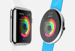
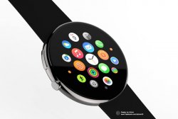
I still want to see the app icon page on round and square watches side by side.

I just don't see how that looks better. I think it would look stupid on someone's wrist because the circle would have to be massive and something thin like that would look like a big flat tire on your wrist.
 
I've noticed all the official marketing/press shots of round Android Wear watches show a traditional analog watch face. Why? Because when they show anything else they all look just as geeky as people claim Watch is. I have yet to see an Android OEM round watch that looks as good in real life as it does in press shots.

28hfvxs.jpg
 
I've noticed all the official marketing/press shots of round Android Wear watches show a traditional analog watch face. Why? Because when they show anything else they all look just as geeky as people claim Watch is.

Exactly

gsmarena_003.jpg


No, you are not a Blancpain! :D
 
Exactly

Image

No, you are not a Blancpain! :D

Yup. None of those look like that IRL. And throw up on the screen anything but a faux traditional watch face and they stop looking like a cheap imitation of a luxury watch real fast.
 
That round one, the way it's presented here, would be a humongous watch on the wrist. The current style is 42mm, so the circular one would end up being who knows what, 52mm, 60mm? Which would be similar to some of the largest watches out there, the ones that look like huge bricks on your wrist, lol.
 
Is there any fan concept that shows a circler Apple Watch?

Just think it would be interesting to see what it would look like had Apple gone the route of the Moro 360 :)
 
I thought the circular one was good until I realized it was thinner (by 2/3?) than the Apple Watch.. The thinness definitely made it look more attractive.
The square one seems practical when it comes to reading info, which is what 99% of us would use a smart watch for.
 
I think they look rather hideous.

Imagine them showing a screen with text on it. I own round watches. I love round watches. But I have not yet seen a round Smartwatch display that displays text in a way that doesn't look thrown together.

No, just...no. For now. I'll keep an open mind on future smart watches but what I'm seeing in reality or concept so far is not appealing to me.
 

The circular design does actually look really good with the new circular icon springboard design. But there are two problems with circular smart watch design:

  1. Currently you can't have a completely circular design (display tech limitation), which means you need a small flat part on the bottom like the Moto 360. Apple doesn't typically like to compromise on design in that way.
  2. If you have a circle the same width and height as a square, it will have less surface area. On a smartwatch this is important because it's displaying text, which is usually in a square and easier to read in a square. When you cut off the corners you leave less room for text, which means you need a bigger watch face. Apple may be unwilling to make huge watches because that market is more limited at the moment.

I think the eventual evolution of the Apple Watch in 5-10 years is more of a band with a flexible display that wraps around your wrist. It would be easier to transition to such a design if you start with a square.

It would still be neat to have a circular model and I typically prefer circular faces. I think it might be possible to make a circle not much larger than the 42mm, perhaps with PPI and UI size the same as the 38mm. So everything would look a little smaller like the 38mm, but the overall dimensions wouldn't be so huge. It's a bit of a compromise, and Apple probably determined that they couldn't make a circular face with UI sizes smaller than the 38mm, so that wouldn't work for people who want a smaller watch. The square fits the design requirements of a smart watch for more wrist sizes.
 
Imagine them showing a screen with text on it. I own round watches. I love round watches. But I have not yet seen a round Smartwatch display that displays text in a way that doesn't look thrown together.

No, just...no. For now. I'll keep an open mind on future smart watches but what I'm seeing in reality or concept so far is not appealing to me.

I like round mechanical watches. I dislike the round smart watches for the same reasons you've mentioned here.
 
That round one, the way it's presented here, would be a humongous watch on the wrist. The current style is 42mm, so the circular one would end up being who knows what, 52mm, 60mm? Which would be similar to some of the largest watches out there, the ones that look like huge bricks on your wrist, lol.
Nope. The 38mm rectangular display fits perfectly inside a round 42mm watch with the frame bezel Jony Ive imposed on it (there's no reason why the display can't go all the way to the edge).

Here's some photoshop mockups I did 1:1. The first is the watch with the usable display area delineated. Note the slight reduction of the 38mm inside the 42mm. Keep in mind Ive chose not to have the image extend under the curved portion of the crystal. The display could absolutely extend to the edge. http://www.newyorker.com/magazine/2015/02/23/shape-things-come

57797


Now we have the round watch overlayed on the Watch, making it only slightly wider, but then slimmer at the top and bottom. Note the inset 42mm display fits perfectly inside the case of the circle. And if Apple chose a flat crystal, they could use all of that space -- remember Ive chose not to extend the display to the edge. But let's stick with Apple's current design, and assume the only space we have is equivalent to the 38mm display including a border. http://www.newyorker.com/magazine/2015/02/23/shape-things-come

57798


So now we have a typical text use overlaid on the round shape as it would appear on the 38mm watch.

57799


But look at this -- in the rectangular shape the Name of the contact and time take up room at the top of the text view. But look what happens when that information is moved to the unused spare areas of the round circle. Now there's not only more information, displayed in the text window, but it can also be enlarged back up to the same size the 42mm watch would have displayed it -- and that's assuming we're stuck with the border. Since we aren't, the 38mm text box doesn't have to be any smaller than it presently is. And, Apple isn't constrained by these sizes. I wouldn't be surprised if they offer a 34mm, or 36mm version to fit more petite wrists, without substantial loss to legibility.

57800


I'm absolutely satisfied that there's absolutely no compromise between presenting text on a rectangle vs. a round watch. In fact, you can have even more text on a round watch, and more information impossible on the Watch without restricting displayed text. And frankly, most of the screen shots I've seen from Apple's apps (aside from straight text) would translate better on a round screen than a square.

The difference between Moto 360 and the Watch boils down to design implementation, and nothing else. Apple would blow this concept out of the water.
 
The difference between Moto 360 and the Watch boils down to design implementation, and nothing else. Apple would blow this concept out of the water.

I agree that the round Android Wear watches are subpar due to their implementation, which is basically a hack of an OS designed for a squared-off screen. Apple could do a better job if they were designing something from the ground up to fit a round screen. The question is, is it worth doing that?

I don't think so. As others have said, the advantage of a round watch is that it works well for an analog time display and (at least to some) it is more attractive. But why is it more attractive? Largely because our ideas of what looks good on the wrist have been influenced by generations of analog watches. Apple's never been one to stick with something just because it's always been done that way.

With regard to skeuomorphism, the digital crown is not skeuomorphic in any way. Not only is it not an on-screen interface designed to mimic a real-world object, it also doesn't really mimic the use of the crown on a mechanical watch.

This. No one really says why round is better. And as you can see from that photo I posted earlier, round smartwatches look just as geeky when they're not displaying a faux analog watch face. There's a reason why Android OEMs always show their round watches with a perfectly rendered faux analog display in press shots. If I wanted my smart watch to look just like a traditional watch I'd just buy a traditional watch. Battery life would be a heck of a lot better.

----------

Oh yeah, clearly. :rolleyes:

The round novelty will wear off. It's cool at first but once every Android OEM goes round how will you tell any of them apart? How will you know someone is wearing an LG watch vs. a Huawei watch? Especially with Android Wear allowing custom watch faces. I think Android Wear OEMs are screwed in many ways. It will be a race to the bottom in hardware and difficult to have any meaningful software differentiation. Meanwhile everyone will know if you're wearing an a Apple Watch.
 
...
Currently you can't have a completely circular design (display tech limitation), which means you need a small flat part on the bottom like the Moto 360.

This isn't a display limitation, it was a design choice Motorola made in order to minimize bezel. The LG Watch R and LG Watch Urbane, for example, have completely round screens. (I have an LG Watch R and like it)

From my childhood onward (and I've lived a while, ::cough:: ) there have been square watches offered as an alternative to traditional round faces. When LED and LCD watches first hit they were more likely to be square too. There have been a number of watches of both shapes I've enjoyed, although if I had to pick a favorite it would be circular.

Ultimately, I'd never rule out any watch solely on shape. It's true the circle is a less efficient use of space, but especially with something as always out there and visible as a watch, aesthetics can sometimes be as important as efficiency and I find a circular shape pleasing, perhaps even more so these days as so many things are rectangular or square for efficiency's sake.

I'm going to enjoy comparing/contrasting my Apple Watch with the LG Watch R. I wish the LG had a smaller bezel, but other than that have been fairly happy with it. However, it in no way feels like a 'necessity' in my life, so I'll be keeping an eye on my reaction to the Apple Watch and see if it feels more compelling.
 
As others have said, the advantage of a round watch is that it works well for an analog time display and (at least to some) it is more attractive. But why is it more attractive? Largely because our ideas of what looks good on the wrist have been influenced by generations of analog watches. Apple's never been one to stick with something just because it's always been done that way.

I think the problem tech people are having with a round watch is that they don't understand, or don't care about the fashion industry. And in fashion, attractive is subjective, and transient. I believe Apple will ultimately release a round watch, because fashion and style will dictate it. Apple is designing watch bands now. They are hob-knobbing with the icons of the fashion world. They have entered the fashion business. Nothing could be farther apart from Apple's core business than designing watch bands and bracelets. We are likely to see all kinds of behaviors from Apple with respect to the watch designs than we have ever seen from Apple before, just look at the product launch itself. In the end, it's not about whether it's always been done a certain way, but what a customer who is going to wear the product wants it to say about them. Jony Ive has already stated that he understands the minute a customer wears a product they have the "expectation of choice". The bands are the easiest thing to customize, but once the black glass square becomes ubiquitous on everyone's arms, there are going to be those who won't have anything to do with it, particularly in fashion circles. The likes of Paul Lagerfeld wearing an exclusive pre-release model of the Watch is very different from what he's going to be wearing a month, or a year from now when everybody around him is wearing them. When Lagerfeld takes that watch off, people are going to notice. When the fashion world tells Apple that square is out, and round is in, they are probably going to pay a lot of attention.
 
For a normal watch, a circular face is fine. All it does is tell the time.

If it's a smart watch, a square makes a lot more sense. It's a screen, it should be square. Do we have circular TV's, laptops? No.

Oh and that mockup of the circular watch looks horrible!!
 
I believe Apple will ultimately release a round watch, because fashion and style will dictate it.

I'm not sure I buy that. I think Apple's hoping to make the current Apple Watch design as iconic as the original iPod was -- to make round watches look old fashioned, in other words.
 
Nope. The 38mm rectangular display fits perfectly inside a round 42mm watch with the frame bezel Jony Ive imposed on it (there's no reason why the display can't go all the way to the edge).

Here's some photoshop mockups I did 1:1. The first is the watch with the usable display area delineated. Note the slight reduction of the 38mm inside the 42mm. Keep in mind Ive chose not to have the image extend under the curved portion of the crystal. The display could absolutely extend to the edge. http://www.newyorker.com/magazine/2015/02/23/shape-things-come

Image

Now we have the round watch overlayed on the Watch, making it only slightly wider, but then slimmer at the top and bottom. Note the inset 42mm display fits perfectly inside the case of the circle. And if Apple chose a flat crystal, they could use all of that space -- remember Ive chose not to extend the display to the edge. But let's stick with Apple's current design, and assume the only space we have is equivalent to the 38mm display including a border. http://www.newyorker.com/magazine/2015/02/23/shape-things-come

Image

So now we have a typical text use overlaid on the round shape as it would appear on the 38mm watch.

Image

But look at this -- in the rectangular shape the Name of the contact and time take up room at the top of the text view. But look what happens when that information is moved to the unused spare areas of the round circle. Now there's not only more information, displayed in the text window, but it can also be enlarged back up to the same size the 42mm watch would have displayed it -- and that's assuming we're stuck with the border. Since we aren't, the 38mm text box doesn't have to be any smaller than it presently is. And, Apple isn't constrained by these sizes. I wouldn't be surprised if they offer a 34mm, or 36mm version to fit more petite wrists, without substantial loss to legibility.

Image

I'm absolutely satisfied that there's absolutely no compromise between presenting text on a rectangle vs. a round watch. In fact, you can have even more text on a round watch, and more information impossible on the Watch without restricting displayed text. And frankly, most of the screen shots I've seen from Apple's apps (aside from straight text) would translate better on a round screen than a square.

The difference between Moto 360 and the Watch boils down to design implementation, and nothing else. Apple would blow this concept out of the water.

I don't understand the point of this. You can draw circles around squares and squares around circles all day, it doesn't really justify anything.
 
Register on MacRumors! This sidebar will go away, and you'll see fewer ads.