Become a MacRumors Supporter for $50/year with no ads, ability to filter front page stories, and private forums.
I swear the circular Android Wear watches were made for men. There's no way the watch below would fit nicely on my female wrist. This thing is massive and it still doesn't look as nice as traditional higher end watch do.

Lmao, that thing looks massive on that wrist. Personally, I think it looks cheap (and plain ugly) in pictures but then again, this is a company who thinks plastic and leather are a good combination.
 
Well we disagree completely, and I don't find your arguments convincing. Developers had to support two different screens for the iPhone 3.5" and 4" screen, which had black bars on each side of the screen until developers designed a full display screen. I don't recall anybody howling how ugly that looked. So there's your fragmentation right there. It's a matter of personal opinion whether a rectangle inside a circle looks bad. I have friends who would rather watch a stretched 4:3 movie on an HD TV rather than see black bars on the side, or watch a widescreen movie cropped rather than watch it letterboxed. So I stand by display appearance as a matter of taste. Apple will offer full screen options for the two different sizes, and I suspect will make it as easy as possible to create an app that appears one way and automatically adapt it for the different shaped screens, or completely customize it. And we're not talking about the same kind of fragmentation that plagued the Android community, we're talking TWO different shapes. It wouldn't be the first time Apple changed the rules for developers, forcing them to conform to some new standard required by their devices, arbitrarily or not. In the end, fashion will drive Apple's choices from the way I see them proceeding at present. And I would not be surprised if Apple completely changes their position, just like they backpedaled on the iPad mini (which did not ship with sandpaper), or the 5.5" iPhone Plus "Phablet" (yet another example of developers now needing to support two different sized screens (if they choose) -- but at the moment I see them going out of their way to be relevant to the fashion world, changing many things about how they will continue to operate in the future.

As for the watch bands, if you see them no differently than the single design utilitarian iPhone case, or iPad cover, then that's how you see it. Never mind that there are already over 7 unique designs of watch bands, with two different means of attachment for a single product, and every indication more are coming. Opening it up to third party designers, with Apple having final approval over the designs, has no impact on Apple's plans. They are responsible for how the watch is perceived by the fashion world, and they will have the burden of keeping it relevant.

Fair enough point about the cases/bands.

I still disagree on the screens, but then again, Apple has changed its boundaries under Cook, so who can say. The iPhone 6+ never would have existed under Steve, but Cook was okay with it. When I say the round would look terrible (which I think is true and not equivalent to rectangular black bars), I can only say for sure that Steve Jobs would never allow it... Cook is more aware of customer requests, and may be willing to make the sacrifice.

I don't personally think so, but I guess we will see.
 
I know many here are keen on saying again and again how round is no good for text, and text gets cut off.

However, upon some quick photoshopping on my part :) the watch as it is now, you may be surprised.

If say the Apple watch had minimal bezel around the screen.
Let's say like a Moto360, and still kept the exact same sized text and graphics is does now.

You may be shocked to see how little physical size difference there would be, to keep all on screen text exactly the same, and when round it actually offers MORE screen real estate to display more text/graphics in, for a watch that is not really any larger at all.

And, if I am brutally honest, I would prefer, myself, the version on the right.

They are both to same scale, no cheating, just changing the screen shape and bezel size.

Image


This only shows ONE thing. The thing it shows is that the bezel on the apple watch is FAR too big. The ONLY reason that you could fit your text on there is because you put the corner of the image being displayed so close to the edge of the display on the round watch. If the apple watch had a bezel of the same thickness it would display far more, even with an asymetical bezel to fit in whatever hardware they need like on the moto 360
 
Please post a link to where Apple has posted sales figures of the Apple Watch. Oh that's right, there aren't any, because Apple hasn't posted one.

I've seen analyst predictions ranging from 1 million (Ibelieve this to be accurate or even a tad low.) And I've seen analysts say over 10 million have been sold with 52 million being sold in 2015 (Gene Munster in particular. But that guy is about as clueless as one can get.)
I've also seen that only around 250,000 units have shipped, because Apple couldn't get more than that built by launch day (thanks to flawed taptic engines and 70% screen failures). And then there is the return rate, that seems to be higher than normal return rates for Apple products (more speculation based on channel inventory.)

All said and done, your statement is a complete and utter load of ...

Your first post in this thread and you decided to quote me? I'm honored that you took the time to dig through and find it. You must be bored.

None the less we know only 720k Android Wear watches sold combined in 2014, and the Moto 360 even less. Therefore even without hard sales numbers from Apple I would place money that the  WATCH has sold more units than the Moto 360 at this point.
 
On the contrary, I think round is a viable choice, if not necessarily the best one. But Apple has already made their choice, so what we're talking about is adding another completely different form factor just to please people who like round watches. Having two differently shaped screens has implications for usability, the operating system, app development, accessories (since they would need another whole line of bands to fit the round screen) and more. So it seems unlikely that they would do this unless they had some very good reasons.

And that is the disconnect that most tech people have with this product. I'm the first to agree that a square is a better shape to convey text. Indeed a true square would make for a more compatible overlay on a round watch than a 4:5 rectangle. That said, what I feel is being discounted by function-over-form traditionalists is fashion. I could be entirely wrong about how Apple will develop this watch, but fashion is the only reason a shoe designer needs to do anything with a shoe. Pleasing people who prefer spiked heels is just as important as how comfortable the shoe is, and in some cases, more important. And I see Apple making great efforts to enter that fickle and often nonsensical business.

As for making two different form factors of the same product, well that doesn't work too well for iPhones and iPads. These are tools that people pick up and use for primarily text based interaction, from reading books, and emails, to typing term papers and grocery lists, as well as watching movies and the like. There's no typing or book reading on a 1" screen, much less movie watching. It's a device which Jony Ive said is intended for "glances" -- anything more involved you should pull out an iPhone.

But the watch is a fashion item. I have friends who have over a dozen different watches, of different shapes and sizes, and styles, to coordinate with different outfits and moods. The watch is the one product Apple makes that encourages people to buy more than one. For those who wear both silver and gold, there's two watch sales right there. 38 stainless & 42 sport for dress and sporting events. Square and round. Two more sales. Unlike the iPad and iPad mini having two different styles of watch will not canibalize sales from each other. People will buy multiple Apple watches to mix it up, just like they do with traditional watches. And having another product with completely different third party accessories is a good thing for everybody, as it means twice the profits.

As I read these forums, I see people discussing the Watch as if it's any other Apple product that you buy one of and upgrade every 1-3 years. But it's not. Ask any watch wearer. They more than likely all own at least two or more. And they won't be identical. Watches make great gifts too, so the parents can buy one for their son's graduation from college and his fiancé can buy him a completely different one for his birthday. And he can buy one for himself, all without duplicating the exact design of the other. And women present a huge expansion market for Apple, who will be the most demanding of this aspect of the watch and its ability to coordinate with their outfits, and looks. It wouldn't do to wear hoop earrings, round belt buckle, round necklace, round buttons, and a square watch.

You and others can discount this opinion all you want. And I may be completely wrong about what Apple intends to do here. But until we see some other behavior pattern from Apple, I don't think it's something that can be easily dismissed, considering what this product represents.

To put it another way, what if the next big wearable was weaving a computer into the threads of clothing, no watch, or phone needed. How will Apple handle this? Would they just make one style of shirt in several sizes and colors, expecting people to wear the same outfit every single day, only changing pants and shoes to mix it up (which Apple offers several complementary styles themselves)? No they would offer many different styles and shapes, from t-shirts to dress shirts, and like the watch bands -- non-tech accessory items to go with them. And this is where I see Apple potentially headed with wearables -- literally getting into the garment business if technology heads that direction, and assuming Apple continues with their current model of designing every aspect about a product. You may not agree, but given their current push into the fashion industry, I don't think we can reject it outright.

----------

Yes, all squares are rectangles, but not all rectangles are squares. The Apple Watch is rectangular but not square.

While true, rectangular has 11 letters to type, square has 6. Since square conveys the meaning and general appearance of the watch, I chose efficiency over accuracy. With the frame bezel and digital crown, these look very square to me.

apple_watch_sizes.jpg
 
Lmao, that thing looks massive on that wrist. Personally, I think it looks cheap (and plain ugly) in pictures but then again, this is a company who thinks plastic and leather are a good combination.

Any watch can look massive in close-up photos or on the wrong arm. We've already seen that a lot with people asking if the Apple 42mm is okay for their wrist :)

As for "plastic and leather", the Moto 360 is brushed stainless steel (and Horween leather). Edit: Ah, never mind. You were referring to LG's phone, not watches.

---- Re: round vs square

Here's the deal. Round works just fine, and looks very stylish in comparison to the 1980s-ish nerd-computer-on-a-wrist black rectangles.

Also remember, the whole point of a watch... especially according to Apple... is NOT to be like a phone, but to be fashionable and show short glances.

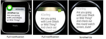
It's also not that different in what you can see. Here's a text shot from the keynote, and the same message captured on a round Android Wear display:

text-compare.png

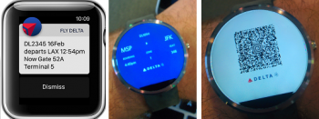
Most apps look just fine in either form factor. E.g. the Delta app:

delta-compare.png

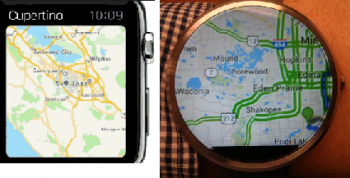
Some apps even make more sense being round, such as maps, since you want to see a constant radius around you:

map-compare.png

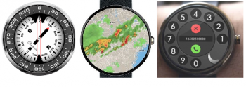
Ditto for some other apps that cry out to be round:

should-be-round.png

For that matter, it's pretty clear that Apple had round on their brain:

apple-round.png

As for long lists, so what. You have to scroll them anyway. OTOH, round watchfaces are really nice to look at on a round screen, and they're what you see the most.

Dissing round is just silly, especially because... just as with larger phones and smaller tablets... Apple will surely bring out a round model if they think it'll boost sales. After all the flip-flops that Apple has done in the past, I don't know how anyone could possibly claim that their current form factor is the "right one" or even one that will last.
 
Last edited:
This only shows ONE thing. The thing it shows is that the bezel on the apple watch is FAR too big. The ONLY reason that you could fit your text on there is because you put the corner of the image being displayed so close to the edge of the display on the round watch. If the apple watch had a bezel of the same thickness it would display far more, even with an asymetical bezel to fit in whatever hardware they need like on the moto 360

I fully agree with your opinion that the current Apple Watch bezels are far too large.
Unfortunately as Apple can only assemble their device, mostly from other companies hardware as opposed to creating their own, they have to reply on what other companies can produce at the price point and quantity Apple want.

Hopefully as time goes on, these companies can offer Apple screens with smaller bezels that Apple can buy to get assembled into their future watch models.

I've no doubt it is possible now, but, as I say, they have to be able to supply Apple with enough volume and at the price Apple wishes to pay to make this happen.

Let's hope for a more bezel free future as I know everyone would love to see them reduce over time.
 
Lmao, that thing looks massive on that wrist. Personally, I think it looks cheap (and plain ugly) in pictures but then again, this is a company who thinks plastic and leather are a good combination.

Another review that lists the design as a con:

http://www.droid-life.com/2015/05/08/lg-watch-urbane-review/
Design: Obviously, design opinion is going to differ greatly from one person to the next, but to me, this watch isn’t a looker in a good way. It’s big, shiny, and somewhat cheap looking. While the Watch Urbane wants to evoke a sense of luxury, it just comes up short in both rose gold and silver options. From a combination of the really uncomfortable leather band (with contrast stitching from the 90s) to the glossy coating on the watch itself, it’s all just a bit cheesy. I can’t think of another way to put it. The Moto 360 and G Watch R are much better, more subtle, classy looking watches.

And their verdict:
In the end, the Watch Urbane wouldn’t even be in my top three list of Android Wear watches to consider. It’s big, not designed well for a human wrist, doesn’t feature anything spectacular over other watches, is uncomfortable to wear, and is more expensive than all of the rest by at least $50. At this point, you would be better off with LG’s other watch, the G Watch R, Motorola’s Moto 360, or waiting for whatever it is that Motorola brings next.
 
Hopefully as time goes on, these companies can offer Apple screens with smaller bezels that Apple can buy to get assembled into their future watch models.

I've no doubt it is possible now, but, as I say, they have to be able to supply Apple with enough volume and at the price Apple wishes to pay to make this happen.

Let's hope for a more bezel free future as I know everyone would love to see them reduce over time.
No that's not right. Apple intentionally chose to have the frame bezel around the display on the Watch, there's no technical reason it couldn't go all the way to the edge (just like the Android wear watches) ... in fact it started out it's life that way and they pulled it back as a design statement.

Alan Dye later described to me the “pivotal moment” when he and Ive decided “to avoid the edge of the screen as much as possible.” This was part of an overarching ambition to blur boundaries between software and hardware. (It’s no coincidence, Dye noted, that the “rounded squareness” of the watch’s custom typeface mirrors the watch’s body.) The studio stopped short of banishing screen edges altogether, Dye said, “when we discovered we loved looking at photos on the watch, and you can’t not show the edge of a photo.” He laughed. “Don’t get me wrong, we tried! I could list a number of terrible ideas.” They attempted to blur edges, and squeeze images into circles. There was “a lot of vignetting”—the darkening of a photograph’s corners. “In the end, it was maybe putting ourselves first,” he said.
 
Oh for goodness' sake. Any watch can look massive in close-up photos or on the wrong arm. We've already seen that a lot with people asking if the Apple 42mm is okay for their wrist :)

As for "plastic and leather", the Moto 360 is brushed stainless steel (and Horween leather).

---- Re: round vs square

Here's the deal. Round works just fine, and looks very stylish in comparison to the 1980s-ish nerd-computer-on-a-wrist black rectangles.

Also remember, the whole point of a watch... especially according to Apple... is NOT to be like a phone, but to be fashionable and show short glances.

It's also not that different in what you can see. Here's a text shot from the keynote, and the same message on an LG watch:

View attachment 550886

Most apps look just fine in either form factor. E.g. the Delta app:

View attachment 550888

Some apps even make more sense being round, such as maps, since you want to see a constant radius around you:

View attachment 550889

Ditto for some other apps that cry out to be round:

View attachment 550890

For that matter, it's pretty clear that Apple had round on their brain:

View attachment 550887

As for long lists, so what. You have to scroll them anyway. OTOH, round watchfaces are really nice to look at on a round screen, and they're what you see the most.

Dissing round is just silly, especially because... just as with larger phones and smaller tablets... Apple will surely bring out a round model if they think it'll boost sales. After all the flip-flops that Apple has done in the past, I don't know how anyone could possibly claim that their current form factor is the "right one" or even one that will last.

I was referring to the G4 when I made the comment about plastic and leather. I have a Moto360 with the stainless band, brown leather and black on stainless leather from E3Motorcycle.

Personally, I prefer what you did with the G watch R as I find the bezel to help offset the appearance of a chunky face. The Urbane just looks a big chunk of metal.
 
Wrist is not a place to read texts. If manufacturers, developers and users rethink the paradigm of what a smartwatch is good for and realize this, the problems with wrapping multiline texts on round screen will disapper. Round screen is just too beautiful for texts.
 
The picture makes an excellent case for why the Apple Watch isn't round. A lot of un-natural empty space in the round one. I have the same problem w/ my Garmin 620, but that one only gets worn during runs so I don't really care. It serves my purpose.

Very true. Making a round smartwatch just to follow tradition it illogical.
 
No that's not right. Apple intentionally chose to have the frame bezel around the display on the Watch, there's no technical reason it couldn't go all the way to the edge (just like the Android wear watches) ... in fact it started out it's life that way and they pulled it back as a design statement.

You honestly believe that?
How cute :)
 
Funny how the round design clearly shows how much screen real estate would be wasted. Also, note the round watch is much wider than the rectangular one. If you want a hockey puck buy one of the android watches :)
 
What a surprise - you can draw a circle around a square :rolleyes: Genius!

Well, this was created as a demonstration image 2 months ago, to show people who said you cannot display text on a round screen.
It clearly shows, with a little redesign, the round screen can show just as much, and be no taller, physically than the square watch.
The only difference being shape and amount of dead zone bezel being reduced.

Or course, if you wish to display square graphics on a round screen, there will be wasted space, just as if you display round graphics on a square face.
Same difference.

Naturally however, if you wish to design circular graphics, which oddly enough, even the current Apple watch is full of (which makes it obvious they were going with a round watch at some point) then you benefit greatly.
Especially of course a watch face, which is nice, considering it is a watch at heart.

You are wrong on many levels. First of all: The mockup actually shows the opposite: If you want to fit a certain square surface on a round model, you NEED to make it bigger. The round watch IS biger and it has a lot of wasted space.

second: Since the Apple watch shows a lot of notifications and text a round watch will always lead to a lot of wasted space - there is just no way around that. And I dont get that logic at all - only because there are round icons Apple was working on a round watch. What are you talking about?

The reason the icons are round is because of the home screen: You can fit more Icons that way: the icons can be arranged diagonally to each other - sort of like honeycombs. wouldnt work with Square icons or ate least look absolutely terribe.

But yeah - maybe apple will one day make a round watch. But it will definitely lead to a larger watch.

image-Apple-Watch-layout.png
 
The reason the icons are round is because of the home screen: You can fit more Icons that way: the icons can be arranged diagonally to each other - sort of like honeycombs. wouldnt work with Square icons or ate least look absolutely terribe.

Eh, square grid of icons works just fine in iOS, I see no reason why they wouldn't in WatchOS.
 
Well, this was created as a demonstration image 2 months ago, to show people who said you cannot display text on a round screen.
It clearly shows, with a little redesign, the round screen can show just as much, and be no taller, physically than the square watch.
The only difference being shape and amount of dead zone bezel being reduced.

Or course, if you wish to display square graphics on a round screen, there will be wasted space, just as if you display round graphics on a square face.
Same difference.

Naturally however, if you wish to design circular graphics, which oddly enough, even the current Apple watch is full of (which makes it obvious they were going with a round watch at some point) then you benefit greatly.
Especially of course a watch face, which is nice, considering it is a watch at heart.

I think the UI was designed with a square display in mind.

For example if you have a round display on the activity app where does one place the page markers?

Lists would be problematic on a round display. If you put all the content in a square area within the circle you get too much whitespace. If you stretch the text to the edges, the text are less legible because there are not left aligned.

And I admit round UI element look good. But that does not mean the display has to be round.
 
Register on MacRumors! This sidebar will go away, and you'll see fewer ads.