Got a tip for us?
Let us know
Become a MacRumors Supporter for $50/year with no ads, ability to filter front page stories, and private forums.
Statue Honoring Steve Jobs Destined for Apple Headquarters Unveiled in Belgrade
- Thread starter MacRumors
- Start date
- Sort by reaction score
You are using an out of date browser. It may not display this or other websites correctly.
You should upgrade or use an alternative browser.
You should upgrade or use an alternative browser.
In my humble opinion, there is something deeply rooted down with this statue and it's meaning that we may never know. For whatever reason, the artist constructed this in its fashion, Apple is buying into a bigger scale version for its headquarters, and many responses are isolated to immediate reactions of its appearances, which I would almost bet was calculated by the artist and Apple if they had any say.
The beauty of it is, when we're long gone and passed away, that statue will still stand leaving people to wonder the same thing we ponder today. The difference is, we were able to LIVE during the Steve Jobs era (2nd-hand at least) while the future onlookers will only be able to interpret through books and videos and wonder why so many were opinionated enough to feel disgust about an art piece iconizing a key figure in technology. Soft you now...
The beauty of it is, when we're long gone and passed away, that statue will still stand leaving people to wonder the same thing we ponder today. The difference is, we were able to LIVE during the Steve Jobs era (2nd-hand at least) while the future onlookers will only be able to interpret through books and videos and wonder why so many were opinionated enough to feel disgust about an art piece iconizing a key figure in technology. Soft you now...
I think you missed the point of what a lot of people are feeling.I feel like a lot of people here have totally missed the point.
")
Art is in the eye of the beholder and so is creepy.
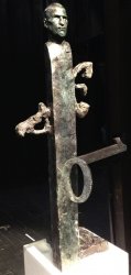
Does anyone know what the growth is suppose to be near the top?
Yes, that's meant to be his head
----------
You're looking at it wrong.
Yes, it's far better if you look at it with your eyes closed.
The head is actually well done and a fitting tribute to him. but the body?
Why this desire to immortalise Steve jobs at every chance. He had a huge ego no doubt, but all this is getting stupid.
Someone who pushed for simplicity would not want that *********** hideous thing to be how he is remembered. Just a simple plaque with him name, d.o.b and d.o.d on would probably be enough. Name the new Campus after him but please do not take delivery of that thing.
It is not surprising that Cyrillic letters crop up in some works by Serbian artists. It is surprising that Cyrillic letters appear in this sculture -- representing an American without meaningful connection to the Cyrillic alphabet. For an American audience, the one and the zero are perhaps the only meaningful reference to Jobs' work. At best the reference is minimal, at worst it is trite. Of course, Jobs was not a programmer or engineer and not one to dabble with ones and zeros directly. The devices which represent the culmination of his life's work place a great distance between the end user and their binary underpinnings. Perhaps it is apt that Steve's head rests well above the "01" in this sculpture. None the less, perching a head on a tall stake is an odd attempt at reverence.
Well , it certainly doesn't look like a cyrillic Ш .. It looks a lot more like E , but the letters look a lot like an old cyrillic alphabet. Steve Jobs was a lot into Kanji, that doesn't mean it has to be Eng. alphabet just because he was American. On that note , letters are "alphabetically universal" and old traditional font.
I would (and I think Steve,too) much more appreciate infamous HELVETICA. But it's boring and not subject to discussion.
While I myself am proud it comes from my country, Serbia, I would much more prefer if we could get the Appstore Serbia already.
That all being said, I think this sculputure is somewhat ugly, I would prefer much more sleek and symetrical design.
I do , by the way, already see people in Cupertino standing in front of it ,and thinking not AШ , but more like WTF.
That is to certain degree - a meaning of art.
Cyrillic letters + 1 and 0.
Say what? I know that Steve was into both typography and binary-data-related-stuff, but come on.
Does anyone here know what Dragan Radenovic is most known for?
Cyrillic letters? That thing on the right side is the € (EURO) symbol; it's located above everything else and probably is supposed to tell people that Steve cared more for money than for technology (the 0 and the 1).
That being said, this thing is extremely ugly.
Guess I'm not 'versed' in art enough, to appreciate the potential beauty of this 'draft' sculpture, but that's one fugly totem pole to my untrained eye.
Also that head looks more like a younger Richard Dreyfuss to me than SJ.
Also that head looks more like a younger Richard Dreyfuss to me than SJ.

dreadful dreadful dreadful dreadful.
oh dear, apple please don't do it. Such taste as a company, i'm hoping the comments were just being polite or feigning interest.
oh dear, apple please don't do it. Such taste as a company, i'm hoping the comments were just being polite or feigning interest.

Register on MacRumors! This sidebar will go away, and you'll see fewer ads.