Got a tip for us?
Let us know
Become a MacRumors Supporter for $50/year with no ads, ability to filter front page stories, and private forums.
Tablet Hype and Rumors: Jobs and Cook, Carriers, and iPhone Apps
- Thread starter MacRumors
- Start date
- Sort by reaction score
You are using an out of date browser. It may not display this or other websites correctly.
You should upgrade or use an alternative browser.
You should upgrade or use an alternative browser.
Casiotone
macrumors 6502a
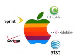
Ok, that's just freaky how all the colors match up EXACTLY.
They're primary colors (RGB & CMY). Corporate logos using primary colors? What a crazy idea!
puppyflightclub
macrumors 6502
Friend works in local Apple Store and was able to get some us some new product brochures out of the back room.
So yea, I saw the scoop on the iPad and am disappointed. It is more like a big iPhone than a laptop and the worst part is, it won't run Logic and has no FW ports.
Reality distortion field?....getting a reading of zero here.
Bummer.....
😉
pics or

strangeday
macrumors member
Why didn't I think of this??! The color theory makes perfect sense! 😱 Wow!
Could this just be a coincidence?? I mean, look at the colors. They could have easily used colors that compliment each other much better. But instead they chose the SAME pink T-Mobile uses, the SAME orange for AT&T, the SAMME etc...(I'll have another look to compare the colors again, but so far they seem to have the same values!)
Me, being a graphics designer, I quickly notice composition, colors and layout, and when I first saw this banner, it just looked odd. It wasn't as minimalistic as other apple banners or any apple ads. It looks sort of ugly and non apple-like. Doesn't make sense why apple would do this for any other reason than creating a "unifying" theme of all mobile carriers. Seemed as though they sacrificed some aesthetics to create the idea.
The other colors (blue, gray and purple), they could have just thrown in to make it less obvious.
What do you guys think?? I mean, does this banner look "appley" to you? Or is there a reason for the weird color combination?
puppyflightclub
macrumors 6502
shrimpdesign
macrumors 6502a
This thing absolutely better not require a monthly data plan.
If it has required 3G, then it probably will require a monthly plan. 🙄
Friend works in local Apple Store and was able to get some us some new product brochures out of the back room.
So yea, I saw the scoop on the iPad and am disappointed. It is more like a big iPhone than a laptop and the worst part is, it won't run Logic and has no FW ports.
Reality distortion field?....getting a reading of zero here.
Bummer.....
😉
Photos or it didn't happen 😉
I am getting disappointed. I'm sure it'll sell very well but I was hoping for something that could replace my Macbook Unibody Alu. I would love to have a note writing / OCR / word processing application to jot down notes in a meeting. Typing is faster but the screen just seems to separate people. 13" would be great but it looks like the rumors are converging on a 10" media device. Ah well, perhaps someone will write a beaut of an app. Unless they offer tethering, I won't be using its 3G abilities. I'm already paying for a cell voice / data plan, internet, cable, and home phone. I'm not adding another monthly expense!
FallibleClover
macrumors newbie
The colours could represent the carriers that'll have the Tablet, with the iPhone to follow in the Summer. 3's logo in the UK is purple, so is Metro PCS in the States, probably a bit of a long shot though - there has been no mention of 3 getting the iPhone in the UK.
kockgunner
macrumors 68000
He tablet is coming too fast. I missed the days where it was still a myth and every rumor added exponentially to the hype. Now that it's coming pretty much in a day, there will be no more hopes and dreams 😛
orangeillini14
macrumors regular
theneweyes
macrumors member
Guys, there'll be two models: one is a wifi model and the other is 3g model, just like the iPhone/iPod Touch.
As for free data plan....never going to happen. The tablet will use more data than the iPhone itself, AT&T can't handle iPhone data and you think they'll let you have free access for tablet as well? At most, the data plan for the tablet is going to be an extra 30-60$ a month easy.
As for free data plan....never going to happen. The tablet will use more data than the iPhone itself, AT&T can't handle iPhone data and you think they'll let you have free access for tablet as well? At most, the data plan for the tablet is going to be an extra 30-60$ a month easy.
LloydBraun89
macrumors member
Haha, remember the south park episode where cartman freezes himself so he can wake up when the nintendo Wii is finally released?
Congrats! You got my reference! kudos to you, sir
shrimpdesign
macrumors 6502a
strangeday
macrumors member
😀They're primary colors (RGB & CMY). Corporate logos using primary colors? What a crazy idea!
No! Wrong, sir (with all due respect). RGB and CMYK are not colors, silly 😛 They are not even color palletes. They are modes in which colors are displayed. RGB are lights, and CMYK = ink (cyan, magenta, yellow, black). The only primary color in a printing press is yellow.
The ATT orange is something like c = 0, y = 100, M = 35, K = 0. This combination is not "primary" It was made from 4 different values or "channels" and they happen to match up almost perfectly! Same with the others!! Awesome! lol
Ok, not trying to be a wise-@ss. Just saying this theory could be true. If not, man what a coincidence! 🙂
Rocketman
macrumors 603
conference call said:Regarding iPhone inventory during the quarter, Apple could have sold "a lot more" but chose to manage inventory tightly instead.
It appears the 4G iPhone will be released sooner not later. Why else would they self restrain iPhones. This is what they do with Macs right before a rev.
The orange portion of the logo is front and center.

Rocketman
random fragment:
"What is the difference between 3GPP and 3GPP2?
3GPP, defined by a group of telecommunications standards bodies called the 3rd Generation Partnership Project (3GPP), was created for use on Global System for Mobile Communication (GSM) networks, the most popular type of 3G network across the globe. 3GPP2 was defined by a different group of telecommunications bodies called 3rd Generation Partnership Project 2 (3GPP2) for use on the second most predominate type of 3G network, Code Division Multiple Access (CDMA) 2000. The 3GPP and 3GPP2 formats are very similar, as both are based on the QuickTime file format and contain MPEG-4 and H.263 video, AAC and AMR audio, and 3G Text. 3GPP2 adds the option to use QCELP audio and Movie Fragments, a technology that allows multimedia content to be delivered incrementally over standard TCP wireless networks, providing a more immediate viewing experience for the end user."
http://www.apple.com/quicktime/technologies/3gpp/faq.html
Peace
Cancelled
RazHyena
macrumors 6502a
This thing absolutely better not require a monthly data plan.
Probably.
Can't wait for this tablet stuff to blow over. No use for it.
Still waiting on that midrange headless mac. 😉
iPhone apps? No chance
...so how are apps made for a 3" screen supposed to run on a 10" screen? Super-low-quality graphics? That would fail. Not to mention that playing an accelerometer-based game wouldn't quite work when you're essentially holding a large book and waving it around (concussion city). Besides, who would want to use something that large when they're walking around? You don't see people walking around carrying netbooks in NYC...

...so how are apps made for a 3" screen supposed to run on a 10" screen? Super-low-quality graphics? That would fail. Not to mention that playing an accelerometer-based game wouldn't quite work when you're essentially holding a large book and waving it around (concussion city). Besides, who would want to use something that large when they're walking around? You don't see people walking around carrying netbooks in NYC...
Register on MacRumors! This sidebar will go away, and you'll see fewer ads.