Become a MacRumors Supporter for $50/year with no ads, ability to filter front page stories, and private forums.
i agree. it's marketing (5.8" > 5.5"). In truth a taller screen after a certain point adds very little utility.

the truth is, its easier for you to scroll down using your finger to read, than it is for your eyes to go all the way down to the bottom of the phone. your eyes stay on a relatively constant vertical zone when reading on a phone. it's not practical nor is it realistic for you to ever use the bottom most part of your screen to read a line on an article.

it's dead space - you will rarely focus your eyes on it, and it is actually very difficult for your fingers to interact with it (instead it is a zone you have to avoid in order to not trigger unintended actions)

the tall screen on the other hand takes away:
1. battery life
2. usability (one hand use, no bezels to rest your finger on)
3. space (no headphone jack!)

not sure the tradeoffs are worth it.

Width matters more than height after a certain point (you fit more words in the same line, or vertical zone). Which is why the 5.5" 8 plus screen I think is a more practical aspect ratio for a larger screen size.
I fully agree with your assertion concerning the reading of content on the display, and I went over this in my own comment, but I disagree with the other things you suggested.

Anyway, you’re right, you’ll simply scroll down as you read, as you do not want to move your eyes greatly. It goes against a basic biological rule that organisms try to conserve energy, and do things in the most efficient way. Human eye musculature does not want to move the eye greatly, constantly, of course. So my assertion is that intelligent design would mean that virtually no app simply shows more content in the vertical plane that otherwise would’ve been scrolled to. Intelligent design would be to keep the content virtually the same, but use the additional space for additional elements/controls that otherwise would’ve required a separate page or just not existed for example.
 
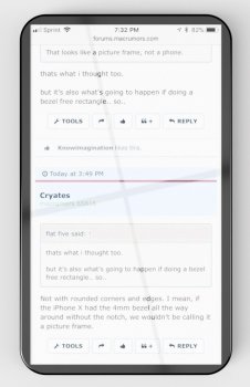
Not with rounded corners and edges. I mean, if the iPhone X had the 4mm bezel all the way around without the notch, we wouldn't be calling it a picture frame.
here you go..

16:9 aspect ratio screen.. 4mm bezel all around.. no notch.. corners are rounded up near max prior to cutting into the rectangle display (~3/8"R)


shown here at 3" wide (about as wide as iPhone 8 Plus body)..
5-1/8" tall (about 3/8" shorter than regular sized 8 body)..

7.5mm thick (8+ thickness)


19x9phoneII_2017-Oct-18_12-13-29AM-000_CustomizedView43695130473.jpg


19x9phoneII_2017-Oct-18_12-14-25AM-000_CustomizedView41036091971_jpg.jpg


-----------------
meh
 
Last edited:
  • Like
Reactions: ForumChick
Anything text based is generally better on a portrait display. The iPhone X will display more text in a news article or a forum post than the iPhone 8 Plus will.

Pretty sure forums and news account for more than 0.00001% of content.
From what I've seen, you get one extra line of text with the X than with the 8+
 
Last edited:
here you go..

16:9 aspect ratio screen.. 4mm bezel all around.. no notch.. corners are rounded up near max prior to cutting into the rectangle display (~3/8"R)


shown here at 3" wide (about as wide as iPhone 8 Plus body)..
5-1/8" tall (about 3/8" shorter than regular sized 8 body)..

7.5mm thick (8+ thickness)


View attachment 725946


View attachment 725951


-----------------
meh
Why are you quoting me with this hours later? All I literally said is a) the picture that was posted looks like a picture frame and not a phone and b) the iPhone x without a notch wouldn’t look like a picture frame because of its rounded edges and corners. I could care less about aspect ratios and rectangular screens or whatever you are trying to prove to me that I didn’t even ask for

However I will take this opportunity to say that whatever that device is you just posted looks absolutely terrible.
 
Why are you quoting me with this hours later?
ignore it then

However I will take this opportunity to say that whatever that device is you just posted looks absolutely terrible.
that's the point..
these are images of what "Apple shoulda done" as per the armchair designers..*

no, they shouldn't make a 16:9 bezel free phone like this thread is saying..
and no they shouldn't make true rectangles without also using large bezels as on previous iPhones.. it doesn't work..


(*albiet with a slight caricature twist on there for lulz.. ie- the pointy corners on the first one)


------
here's one for you though @Cryates..
iPhone X with no notch in the display.. but still keeping the front facing cameras, speaker, mic, etc)


EffYes.jpg
 
  • Like
Reactions: Diorama
I visit a lot of wepages that are primarily text, be it forums, news, etc. So I see value in it. At the same time, I see your point. Elongating the screen in one direction is a bit silly. It was silly with the 5 series too.

If I do get the X, I am looking forward to trying a thinner phone though. I have a feeling my typing might improve. I used my wifes 8 a few times (mostly while setting it up) and I seemed to be more proficient lol.
 
But we’re not talking about movies,
It’s about the best ratio for a phone..
i think on a phone, the ‘experience’ will be more like—
you generally use it in a similar fashion as you would an iphone 8.. the finger reaching and whatnot will be similar in most cases.

with the bezels being screen area now, it will give a more immersive feeling.. or, it’s like adding some peripheral vision and less of a tunnel vision effect.

i don’t think the idea is that we’ll be using all the screen all the time..

(though there will definitely be some things/apps which will actually make use of the entire thing)
 
  • Like
Reactions: roeiz
ignore it then


that's the point..
these are images of what "Apple shoulda done" as per the armchair designers..*

no, they shouldn't make a 16:9 bezel free phone like this thread is saying..
and no they shouldn't make true rectangles without also using large bezels as on previous iPhones.. it doesn't work..


(*albiet with a slight caricature twist on there for lulz.. ie- the pointy corners on the first one)


------
here's one for you though @Cryates..
iPhone X with no notch in the display.. but still keeping the front facing cameras, speaker, mic, etc)


View attachment 725955

Actually i don’t think this is so bad.
I bet most applers would have praised this if that was the real X.
 
i agree. it's marketing (5.8" > 5.5"). In truth a taller screen after a certain point adds very little utility.

the truth is, its easier for you to scroll down using your finger to read, than it is for your eyes to go all the way down to the bottom of the phone. your eyes stay on a relatively constant vertical zone when reading on a phone. it's not practical nor is it realistic for you to ever use the bottom most part of your screen to read a line on an article.

it's dead space - you will rarely focus your eyes on it, and it is actually very difficult for your fingers to interact with it (instead it is a zone you have to avoid in order to not trigger unintended actions)

the tall screen on the other hand takes away:
1. battery life
2. usability (one hand use, no bezels to rest your finger on)
3. space (no headphone jack!)

not sure the tradeoffs are worth it.

Width matters more than height after a certain point (you fit more words in the same line, or vertical zone). Which is why the 5.5" 8 plus screen I think is a more practical aspect ratio for a larger screen size.

Just to be sure, do you think the human eye takes less energy to move left and right than up and down?
 
Just to be sure, do you think the human eye takes less energy to move left and right than up and down?

I think the human eye would be more strained moving left to right and then down... then all the way up again... than simply left to right, whilst staying in roughly the same vertical space.

I read once that someone studied human eye movements and it’s actually not a very precise muscle. It takes a lot of energy to move and direct your eyes precisely. It’s easier for other parts of your body to bring an object to the focus of your eye (ie, your finger in this case). Speed reading techniques emphasize this.
 
Three things about a phone's screen shape that one should care about:
1. Can you interact with a website or an app with one hand?
2. Can you fit it into a super convenient place (like a pocket) ?
3. Can the screen show the stuff that you are interested in?

I would add point number 4. Is it easy to type on the keyboard. This is where width of the display comes into play. With narrower but taller displays landscape mode doesn't become any more useful and in portrait at best keyboard size is the same as 16:9 displays.

Unfortunately you can't just make the display wider because that makes it harder to hold.

I feel tall displays are not good because they shift the top and bottom portions up and down, making it harder to reach common locations for controls. I have resorted to using onscreen buttons on my Oneplus 3 because they are shifted about a centimeter higher compared to the capacitive buttons and are thus easier to reach without thumb gymnastics in one handed use - which happens often when you need to quickly check something on the go.
 
  • Like
Reactions: roeiz
Specific content is coming for Snap. New shows. I love how Snap uses the entire screen for pics, ads, features, shows. Looks great and can't wait to see it on the iPhone X.
 
Tall screens that are not 16:9 are straight gimmicks. It’s Samsung that thought - how do we innovate screen size without making the phone wider? Then everyone else followed . There is really nothing great about tall screens. About 0.00001% of web content is designed for portrait.

Tall screens exist strictly as a marketing gimmick to advertise bigger screen size in a thinner phone.

This fad/phase of tall screens is supposed to get people reinvigorated about buying smartphones which have been largely unchanged for years now. Once this feature is normalized throughout the industry, marketing will come up with a new gimmick.

The real innovation would have been to make a bezelless 16:9 phone. Unfortunately, this is all preplanned based on marketing. The consumer will have to suffer at least several years of these useless designs before they “fix” it and start selling bezelless 16:9 phones.
How is it a gimmick? And guess what the iPhone X isn't 16:9 as well. Yeah for video the 18.5:9 isn't great on the note but for text on a web page it's fantastic actually.
 
Why limit yourself to an aspect ratio that suits *some* video?

Phones are used for a million other things. Look at the iPad, Apple made it 4:3 because video is just one thing you can do with it. Same thing with a phone.

Most websites have adaptive layouts that look great in portrait.

And it’s not a marketing choice, it’s a design choice.
I prefer the 4:3 on the iPad because it just feels more natural in the hands and viewing everything but video it makes more sense imho
 
Again, the point I made still stands. When viewing web content in portrait mode, more text will be displayed on the X than the Plus.

but wouldn't the +'s extra width eventually have the same amount of text (instead of the extra upper line in the x)?
 
So first this forum says "the knotch doesn't matter, I always use in portrait mode".

Now the forum says "tall screens are a gimmick because web content isn't made for portrait mode."

What will the all mighty forum say tomorrow?
 
  • Like
Reactions: Gathomblipoob
Register on MacRumors! This sidebar will go away, and you'll see fewer ads.