Got a tip for us?
Let us know
Become a MacRumors Supporter for $50/year with no ads, ability to filter front page stories, and private forums.
iPhone 17 Pro Max The Cosmic Orange thread. What’s your opinion?
- Thread starter ozziegn
- Start date
- Sort by reaction score
You are using an out of date browser. It may not display this or other websites correctly.
You should upgrade or use an alternative browser.
You should upgrade or use an alternative browser.


Apple_Robert
Contributor
You are welcome to your opinion as we all are. I just wanted to point out that there is no such thing as a childish color. Just like there is no such thing as a boy color or girl color. Colors are colors and the things you attached to the orange phone are all due to your personal bias.Personal opinion is that it is garish, childish, and even worse, made in cheap aluminum. It will appeal to teenagers and young people, and maybe Seniors with poor eyesight who lose their phone. Wish Apple would keep the Pro line looking Professional in both color and materials. Will not be participating in Upgrade program this year for the first time because I would be embarrassed to use it while working with other professionals. I don't use a case. Aluminum looks cheap in silver and blue as well. For the first time since the Upgrade program started, I'm keeping my 16Pro which looks and works great (desert titanium). ProPhones are work devices for most people and should reflect that level of seriousness.
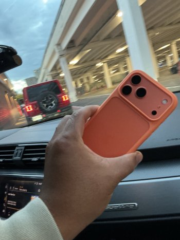
17 pm orange. One tb. Don’t use a case. Looks more copper. It’s not a great looking phone from back of it but it’s comfortable to hold and great to use. I’m good with it. More comfortable in hand than 15 pm for sure. Not really concerned with scratches. I’ll trade it in regardless later. I guess part of that is because it’s simply a phone. Not something I sit and admire. Screen is awesome. That’s the part that matters.
The speed is noticeable. Cameras. Reception. Battery. Screen. Definitely a keeper.
The speed is noticeable. Cameras. Reception. Battery. Screen. Definitely a keeper.
AF_APPLETALK
Suspended
Non-response response. It’s a soft orange, and it’s a little too close to coral or salmon.Feminine? Hmmm. A hundred or so years ago, blue used to be associated with girls and pink with boys.
Make it your own and forget what things society puts in our heads about colour.
Ac1d 8urn
macrumors 6502
I checked out the orange pro in best buy and I loved it, it's straight up pumpkin orange and actually looks really nice in person. I almost bought one, but I went with a green 17 instead cause I couldn't justify paying $300 more for basically just a slightly better camera. It's still nice to finally see a pro in a fun color.
Jackbequickly
Suspended
I have always done black or space grey. Was shocked that option was no available.Same here. Would have preferred a black or space grey option though.
ThePinkChameleon
macrumors regular
Not for me Jeff.
Sorry, not into bright orange tbh, not seen it in person but watched many reviews and it wouldn’t be my choice personally. Reminds me of the Walkman Sony Ericsson I had in about 2011, black front and bright orange back. Didn’t keep that one very long.
The first thing that popped into my head when I saw the orange iPhone was this blast from the past. I didn’t have this color but one of my sons did.

TimeOrMoney
macrumors member
I bought a vlear case. Under certain light, it looks salmon.I don’t think I like the orange although that is the one I went with. It looked good in store, so I cancelled my deep blue. However, when I got it home, I really started noticing some peach/pink undertones in certain lighting and the Ceramic Shield on the back is just so contrasting (and yes, I do use my phone case less from time to time). The leaks that said apricot was the color were right on the Ceramic Shield. I’m still torn though on whether I just keep it or not. But the orange around the front bezels is really jarring to me.
jz0309
macrumors P6
I love how the orange shows with the blue tech woven case. The screen looks dull in this photo to light/sun conditions

Rivanov
macrumors 6502a
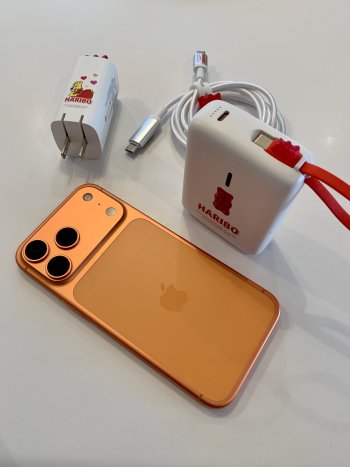
I absolutely adore my Cosmic Orange. Especially in daylight it’s more copper than orange.
So ... two full days in now ...
I liked the idea when it was announced. Loved what I saw when I picked it up. And I like it even more now.
I'd probably still have gone with a black version, if there had been one ... but I do love the orange on this.
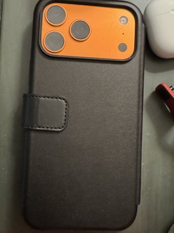
Bought an orange Apple case in the interests of attaching a "Basecamp Orange" RIDGE wallet to the thing (since just using the MagSafe wallet directly on the phone is entirely too weakly attached) ... will see how that goes using the strengthening tray and some specialist adhesive (the tray will NOT stick to a silicone case worth a damn ...).
I liked the idea when it was announced. Loved what I saw when I picked it up. And I like it even more now.
I'd probably still have gone with a black version, if there had been one ... but I do love the orange on this.
Bought an orange Apple case in the interests of attaching a "Basecamp Orange" RIDGE wallet to the thing (since just using the MagSafe wallet directly on the phone is entirely too weakly attached) ... will see how that goes using the strengthening tray and some specialist adhesive (the tray will NOT stick to a silicone case worth a damn ...).
Very happy with the color. Hopefully it is not a one off and there will be a bright color every year. Very good iPhone and a great color too. Was apprehensive of the dual toned back but like it very much now.


joshwithachance
macrumors 68030
ValerieDurden
macrumors 6502a
NotApplicable
macrumors 68000
Personally not a fan of the orange but my partner likes theirs and I couldn’t care less what color other people choose for their phones!
As to weather or not the orange is “professional,” this is a dumb debate. Which profession?
As to weather or not the orange is “professional,” this is a dumb debate. Which profession?
Last edited:
ThePinkChameleon
macrumors regular

For all you crazed 17 orange lovin’ peeps

Here the threads link to the original:


Selcher
macrumors regular
nelle douville
macrumors regular
It doesn't remotely look salmon and it's not soft. it's bold and beautiful. It is my all-time favourite iPhone colour.Non-response response. It’s a soft orange, and it’s a little too close to coral or salmon.
