Become a MacRumors Supporter for $50/year with no ads, ability to filter front page stories, and private forums.
My favorite part of this is the awful english in the SMS:

Do you where I could get a bunch of telephone wire?

The lack of the word "know" makes this whole mockup not official at all, to those who are saying that this is HTC's concept.

Edit: Wouldn't the name "1" contradict with the Nexus One?
 
I absolutely loved everything about that. It really should have showed the amazing experience possible for web browsing with that design. The Alarm clock feature is exactly what I've been looking for!


The UV concept is just plain stupid though.
 
You might be onto something LOL.

rightguard_jpg1.jpg
4790030239_59721cf33a_m.jpg

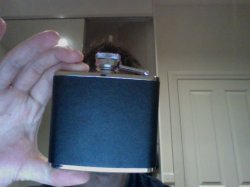
Actually, it looks more like my best friend.
 

Attachments

  • Photo on 2010-07-15 at 21.30.jpg
    Photo on 2010-07-15 at 21.30.jpg
    313.1 KB · Views: 52
Actually, it looks more like my best friend.

Well, he does say in the 4th image the inspiration was from the classic old leather with steel top/bottom cameras. Similar to that flask.

Anyway, I think it misses the stated objective in the 3rd image, as so many devices do - harmony between the UI and the hardware designs. The minimalist hardware is fine, but the UI still doesn't have the same feel. And HTC would want their UI standard across all devices, so reality interferes with idealism.

And also, the red dot. It's always interesting to see even those who strive for ultra minimalism still can't resist that little splash of colour as if they are not secure enough in their own minimalist design to let it stand alone. Something which Ives doesn't do (when he uses colour, he uses it as a main element - G3 iMac). So make that red home button aluminium, like on the iPhone 4.

I like the flip stand idea. He should patent it before showing the world.
 
Register on MacRumors! This sidebar will go away, and you'll see fewer ads.