Got a tip for us?
Let us know
Become a MacRumors Supporter for $50/year with no ads, ability to filter front page stories, and private forums.
iPhone 13 The new Sierra Blue is the best color by far
- Thread starter Appl3FTW
- Start date
- Sort by reaction score
You are using an out of date browser. It may not display this or other websites correctly.
You should upgrade or use an alternative browser.
You should upgrade or use an alternative browser.
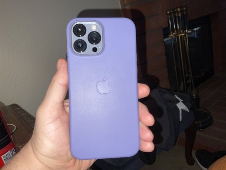
Is the Midnight wallet a dark navy blue or is it more black? Thanks!New iPhone Pro is Sierra Blue has just arrived, with clear case and Midnight wallet. Love the colour.
View attachment 1844002
With Wallet attached.
View attachment 1844004
Comparison to my silver X
View attachment 1844009
Noticeably thicker than the X as well, especially the camera bump.
View attachment 1844010
Man I'm digging this Sierra Blue as well. Very nice color. Not too in your face as others have mentioned. Caseless user so will be able to really enjoy this color.
I saw the Sierra Blue today in a non-Apple retail store today (one that had no natural light inside), and have to say I didn’t like it as much as I thought it would. Would still be my first pick and I think at this stage would prefer it over another 2 years of Space Grey (aka Graphite) but anyways:
It was vastly more silver. I struggled to see where/how blue it was. Maybe in daylight it’ll look better but yeah, I saw a lot more icy / murky grey tones there and found myself wishing it looked more like the baby blue promotional picture above it
It was vastly more silver. I struggled to see where/how blue it was. Maybe in daylight it’ll look better but yeah, I saw a lot more icy / murky grey tones there and found myself wishing it looked more like the baby blue promotional picture above it
it looks more black to me with a hint toward navy blue. Totally depends on lighting. I saw black in some light but could see the dark blue when turned so the light hit it differently…..Is the Midnight wallet a dark navy blue or is it more black? Thanks!
sorry… I know that’s not helpful….
very dark navyIs the Midnight wallet a dark navy blue or is it more black? Thanks!
Wasn't a fan from the marketing photos, but just saw the Sierra Blue in person at the Apple store and it's definitely what I'm buying now. A nice blue/grey metal looking color, not as baby blue as the renders make it seem.
Also wanted something different than Graphite. Silver was my original pick, but wasn't a fan of how obvious/distracting the bright steel frame is when looking at the screen - makes it feel smaller.
Also wanted something different than Graphite. Silver was my original pick, but wasn't a fan of how obvious/distracting the bright steel frame is when looking at the screen - makes it feel smaller.
My 13 Pro Max arrived today and the Sierra Blue is absolutely gorgeous. It looked "baby blue" in a lot of photos but it is not baby blue. It is not Tiffany Blue (not even close). It is a silvery/gray blue. Truly a sophisticated and beautiful color. There is not one photo that I've seen online that is correct for this color. My monitor is calibrated for color, but I know that it can still be off. But most all photos are too blue and not enough gray. I think someone mentioned that it was a "frosted" blue and I can see that that could be accurate, as well.
I dunno guys, I haven't gotten mine yet and trying to reserve judgment, because you never know until you see it in person, and your comments have me feeling pos, but the images don't... maybe it doesn't photography well. I don't see any of the blue from the promo photo?
Received my Sierra Blue 13 Pro today and it looks more grey than blue to me. Still very nice but it's gone straight into a Clover silicone case anyway!
This picture is not accurate all. However, the Sierra blue is almost impossible to get correct. I've worked with color a lot in proofing consumer catalogs and sometimes, there is a product color that just cannot be reproduced or adjusted in Photoshop, etc. So far, Sierra Blue is turning out to be one of those colors.
That's what I got too and love it. I went to the AT&T store and once I saw it had to have it. Not what I would have ordered and so glad I went down there.
That is not at all what the blue looks like.I like how it looks in this video - perfect shade of blue here (I hope this isn’t edited!)
View attachment 1844787
Don’t worry… when you see it in person, there is nothing dull about it.Uhh I ordered the Sierra Blue and was very much looking forward to it. But now the more photos I see the more disappointed I feel. That light blue in the promo images would have been really nice but based on the photos it just looks...dull grey, it ain't even blue. Will need to see it in person tomorrow when I go and pick it up. I hope I will like it in person. If not, I will need to return...
Same here. I went to a Best Buy this morning. The pictures and videos don’t do any of the colors justice.Wasn't a fan from the marketing photos, but just saw the Sierra Blue in person at the Apple store and it's definitely what I'm buying now. A nice blue/grey metal looking color, not as baby blue as the renders make it seem.
Also wanted something different than Graphite. Silver was my original pick, but wasn't a fan of how obvious/distracting the bright steel frame is when looking at the screen - makes it feel smaller.
I’ve never been a fan of gold iPhones but I was a fan this morning after looking at it in person and hands on.
I'm not even going to color adjust these photos so don't pay attention the tone of the blue. Many of you have already posted better pictures of the color but I don't see many paying attention to the shiny frame. So here's few photos in warm living room light. Coming from Pacific Blue the frame is really light and shiny, noticeable too when looking at the phone dead on. Going to take some time to get used to it.


So nice but choosen gold over it. Gave this one to the lady. Gold for 12 or 13 pros are too hard to pass by.
It definitely has some grey-ish tones in it, though I quite like it. But also it is undeniably blue in some lights, which i also likeI saw the Sierra Blue today in a non-Apple retail store today (one that had no natural light inside), and have to say I didn’t like it as much as I thought it would. Would still be my first pick and I think at this stage would prefer it over another 2 years of Space Grey (aka Graphite) but anyways:
It was vastly more silver. I struggled to see where/how blue it was. Maybe in daylight it’ll look better but yeah, I saw a lot more icy / murky grey tones there and found myself wishing it looked more like the baby blue promotional picture above it
")
I have had black, silver, gold and white all in the past and am bored of them so I'm happy with this choice! If they had the dark blue this year I might have struggled to decide but tbh I kind of think I prefer the lighter blue.
Received my Sierra Blue 13 Pro today and it looks more grey than blue to me. Still very nice but it's gone straight into a Clover silicone case anyway!
How does it look with the clover case?
I think blue jay is the perfect match.
But best without a case.
I just checked out the colors at the store today. IMO, the sierra blue is overrated. It wouldn't be my first choice. I preferred the look of the silver. I went in expecting to like gold, but somehow it didn't quite look as nice in person. And graphite is an absolute fingerprint magnet.
Incidentally, white also happens to be my favorite with the non-pro phones.
Incidentally, white also happens to be my favorite with the non-pro phones.
Last edited:
All ya all are cray cray. Dis case is da best for siiiiierrra bloooo
Really???
The best is blue Jay.
Also I just realized that before Apple, so called Sierra Blue color was used by other phones from Samsung, Oppo, etc. Many years ago.
It may be a new Apple color but that color has been used by other companies. I feel last year’s color (Pacific Blue) and (Midnight Green) was a new color in the market. Sierra Blue isn’t
Apple has hyped it way too much through their reviews.
It is a nice color but surely not the best color from Apple.
I just checked out the colors at the store today. IMO, the sierra blue is overrated. It wouldn't be my first choice. I preferred the look of the silver. I went in expecting to like gold, but somehow it didn't quite look as nice in person. And black is an absolute fingerprint magnet.
Incidentally, white also happens to be my favorite with the non-pro phones.
To me Gold is the best and then Sierra Blue.
Both phones will shine best without a case.
With a case, the graphite and silver will be best.
You have to make your choice based on how you will rock your phones.
Last edited:
I just checked out the colors at the store today. IMO, the sierra blue is overrated. It wouldn't be my first choice. I preferred the look of the silver. I went in expecting to like gold, but somehow it didn't quite look as nice in person. And black is an absolute fingerprint magnet.
Incidentally, white also happens to be my favorite with the non-pro phones.
All phones are fingerprint magnets it is just that in darker colors they are more noticeable.
This can be avoided by using dBrand skins.
This is where Graphite phones are the best. The color matches so many skin options and of course cases.
So with Graphite iPhones you can use a case or used it without a case with dBrand Skins.

iPhone 13 Pro Max Skins, Wraps & Covers » dbrand
When people want iPhone 13 Pro Max skins, they come to dbrand. Why? We've got the best customizable iPhone 13 Pro Max skin and free shipping. Buy yours today.
Last year till the day I got the iPhone 13 Pro Max Graphite, I used skins from dBrand and switched skin colors every month. Apart for a new look every month, the phone was scratch free which helped me fetch a better resale value for my 12 Pro Max. Doing the same this year. Currently using the dark cherry leather from Apple, until my new skins arrive.
Register on MacRumors! This sidebar will go away, and you'll see fewer ads.