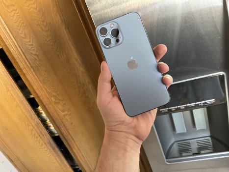
The Sierra Blue is so vibrant in Tim’s review!


Got a tip for us?
Let us know
Become a MacRumors Supporter for $50/year with no ads, ability to filter front page stories, and private forums.
iPhone 13 The new Sierra Blue is the best color by far
- Thread starter Appl3FTW
- Start date
- Sort by reaction score
You are using an out of date browser. It may not display this or other websites correctly.
You should upgrade or use an alternative browser.
You should upgrade or use an alternative browser.

No. In person Sierra Blue is more grey than blue imo. I haven't placed an order yet. Now I'm really torn between Sierra Blue and Silver.
Last year I was dead sure I was going for Pacific Blue. Canceled PB order twice online before choosing Gold in the end. I don't know what I'll do this year.
But I see the beauty in SB, it's but a bit too grey for my taste.
Last year I was dead sure I was going for Pacific Blue. Canceled PB order twice online before choosing Gold in the end. I don't know what I'll do this year.
But I see the beauty in SB, it's but a bit too grey for my taste.

I think silver is so beautiful because the stainless steel adds a nice contrast. I wish they wouldn't color the stainless steel on the Sierra Blue, think that would look even nicer.
I wish they wouldn't make the shiny mirror sides at all. I think it looks like cheap bling. In addition, it makes a reflective ring around the phone when it's inside a case that lacks a lip around the front edge, like the Apple leather case. I compared them all in the Apple Store, and the Silver and Gold are the worst, while the Graphite and Sierra Blue are better. I actually convinced myself the Sierra Blue is best, but then again, it's what I preordered, and I ain't returning it. lol. In any event, it's not going to be a huge distraction, though I wish it wasn't there at all.I think silver is so beautiful because the stainless steel adds a nice contrast. I wish they wouldn't color the stainless steel on the Sierra Blue, think that would look even nicer.
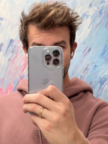
Nope! Does nothing for me…Sierra Blue in Ringke fusion clear. Artificial warm light. Awesome. Best color so far on pros. Nothing like baby blue.
I have to like it instantly … if I need to contort and change lighting etc… then nope!
😂😂
please Apple, give me burnt orange!!!
My mention on artificial light was only to give an impression how it looks in light like this 😅 it looks amazing in every lighting conditions 😆 I thaught i will go Gold, but when i saw this during The keynote, i was sold 😅
Hi- how do you like this case? Been thinking of getting it as I want a clear case. looking at the one with MagSafe.Sierra Blue in Ringke fusion clear. Artificial warm light. Awesome. Best color so far on pros. Nothing like baby blue.
Hmmmmm…….🤔My mention on artificial light was only to give an impression how it looks in light like this 😅 it looks amazing in every lighting conditions 😆 I thaught i will go Gold, but when i saw this during The keynote, i was sold 😅
It’s very nice - better than spigen ultra hybrid which i had on i12. Buttons are more responsive, it’s also more „compact”. I can’t say anything about yellowing yet, but spigen was bad. I have also one with magsafe (Ringke), but it has a matte back. Didn’t try it yet.Hi- how do you like this case? Been thinking of getting it as I want a clear case. looking at the one with MagSafe.
Sierra Blue in Ringke fusion clear. Artificial warm light. Awesome. Best color so far on pros. Nothing like baby blue.
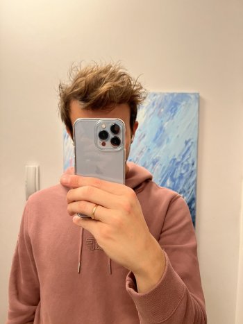
Clear or matte back?
Ah! Apple explains the difference:
Fresh from apple press release, typos and all
“The all-new Pro lineup features a premium flat-edge design, crafted with exceptional materials, including the surgical-grade stainless steel band, with an elegant finish that is resistant to abrasion and corrosion, and a textured matte glass back. Both models are available in four striking coolers including the all-new sierra blue, created using multiple layers of nanometer-scale metallic ceramics applied across the surface for a stunning and durable finish.”
😂😂 “coolers”?
80% of the time it's a overcast gray color.
Thinking about returning it for the silver.
Thinking about returning it for the silver.
Dew eeeet!!!!80% of the time it's a overcast gray color.
Thinking about returning it for the silver.
don’t fall victim to group think! Be an individual!!
😂😂😂🤔
80% of the time it's a overcast gray color.
Thinking about returning it for the silver.
Silver’s the worst colour in my opinion, it’s so bland and too white. Sierra blue is a gorgeous icy colour!
Exactly why would you get silver when you have Sierra blue that’s glacier with some silver overtones in it. And you know the added benefit of getting Sierra blue over the plain old silver is you get durability. They use a specialized nano coating like in the gold so you don’t get those stupid micro scratches on the edges. Therefore you don’t have to get a specialized cleaner to buff it out. Whoever gets the silver this year is uninformed and shortsighted in my opinion.Silver’s the worst colour in my opinion, it’s so bland and too white. Sierra blue is a gorgeous icy colour!
Exactly why would you get silver when you have Sierra blue that’s glacier with some silver overtones in it. And you know the added benefit of getting Sierra blue over the plain old silver is you get durability. They use a specialized nano coating like in the gold so you don’t get those stupid micro scratches on the edges. Therefore you don’t have to get a specialized cleaner to buff it out. Whoever gets the silver this year is uninformed and shortsighted in my opinion.
One of the smartest person I know on here. Real talk.
I prefer the sierra blue to last year’s blue. Pacific blue looks dull in comparison
Dull? I mean…Pacific Blue is darker but I don’t consider it dull. It’s a rich, saturated and pigmented blue that is deep and beautiful. Sierra Blue is almost a steel grey in certain lighting. It’s like all the color has been sucked out of it that I almost wouldn’t classify it as a shade of blue.
If you plan on keeping it forever… maybe, if you upgrade yearly, so what?Exactly why would you get silver when you have Sierra blue that’s glacier with some silver overtones in it. And you know the added benefit of getting Sierra blue over the plain old silver is you get durability. They use a specialized nano coating like in the gold so you don’t get those stupid micro scratches on the edges. Therefore you don’t have to get a specialized cleaner to buff it out. Whoever gets the silver this year is uninformed and shortsighted in my opinion.
Sierra Blue is so good looking I got a clear case for the first time ever just to show it off.
Love the sierra blue colour this year
I liked pacific blue last year and midnight Green the year before as well. Great colours
may issue with pacific blue was not the colour but how gross the steel made finger prints look if you went caseless (as I tend and prefer to)
i noticed sierra blue does a much better job at hiding the finger prints. They’re still there but you just don’t see them the way you did with pacific blue
I wonder if this colour choice was in relation to that back lash from last year
anyways they’re all sharp and great colours. Apple does a stellar job every year.
Dull? I mean…Pacific Blue is darker but I don’t consider it dull. It’s a rich, saturated and pigmented blue that is deep and beautiful. Sierra Blue is almost a steel grey in certain lighting. It’s like all the color has been sucked out of it that I almost wouldn’t classify it as a shade of blue.
To me it’s dull. I didn’t have a 12 Pro, I only upgrade every 2 years, but if I did I wouldn’t have got the pacific blue, too dull and masculine for my tastes.
I went SB this year, I initially went with the Graphite but I had that last year, and the year before, and even the year before that - as beautiful and stellar as it is, it’s the same and felt a bit boring. I did initially also go PB last year but wasn’t a fan of the green hues and camera back colour.
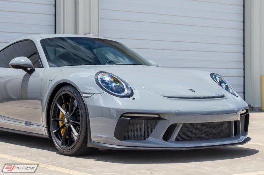
The way the SB reflects in different lighting conditions is simply stunning. It reminds me of the Porsche Nardo Grey.
The way the SB reflects in different lighting conditions is simply stunning. It reminds me of the Porsche Nardo Grey.
Attachments
Register on MacRumors! This sidebar will go away, and you'll see fewer ads.