Become a MacRumors Supporter for $50/year with no ads, ability to filter front page stories, and private forums.
And any sane person would pic the calendar app on the left and its more clean and easier to view.

Ugh, god. Such an oppressive design. It's so heavy.

8 isn't perfect, but who says "hey, this stings a little. I know, I'll hit myself with a hammer to make it better" to themselves?

I liked your modified-7 design, but the fact that you're pining for 6 makes me seriously question every other point you've made.

Oppressive design? How is it heavy? Everything looks clean and is actually EASY to use. Not to mention how easy it is on the eyes. I still can't figure out the mess the calendar is in iOS 7. The music app is absolutely awful too.

The modified 7 design is where Apple should have gone with iOS 7. It's just too flat. Good thing this settings menu didn't make it past beta 2.

2i7mubl.jpg
 
Won't switch to another platform for one very simple reason: the iOS experience is still slightly better than android's ;)
My concern is: 1. the distance is getting shorter as iOS took unnecessary steps back, 2. I learned to develop for iOS because I loved the platform, so I want to protect my investment.

Now let me ask you, if you don't like the content of these threads, why don't you go somewhere else?

How many threads on macrumors does one need on essentially the same topic? Everybody is expressing an opinion on either side of the fence just like you.

I happen to think iOS 7 and beyond is leaps and bounds better than iOS 6 in every way. But i don't intend on starting threads for that opinion.
 
There is this fenomenon in tech design that when a new iteration of something comes up, it makes the previous one look old. So the natural thing would be , specially now that 2 years have passed, that everyone had all but forgotten past iOS versions. However, there are more and more people like me that think iOS 7 was a step back design wise. Usually, when you look at an old OS screenshot it looks ugly due to the ageing effect.
Even so, honestly, which one do you prefer?

I like generally like change and I was so thrilled everytime a new OS came up. Until iOS 7...i watched jony ive's presentation over and over to convince myself that iOS 7 was good, but it did not work. I still wish Apple finds a way to improve the iOS 6 looks without ruining it...my hope is all but lost for iOS 9, but who knows...if many people complains maybe Apple will listen. Maybe iOS 10 will be back on track.
 

Attachments

  • image.jpg
    image.jpg
    467.5 KB · Views: 281
There is this fenomenon in tech design that when a new iteration of something comes up, it makes the previous one look old. So the natural thing would be , specially now that 2 years have passed, that everyone had all but forgotten past iOS versions. However, there are more and more people like me that think iOS 7 was a step back design wise. Usually, when you look at an old OS screenshot it looks ugly due to the ageing effect.
Even so, honestly, which one do you prefer?

I like generally like change and I was so thrilled everytime a new OS came up. Until iOS 7...i watched jony ive's presentation over and over to convince myself that iOS 7 was good, but it did not work. I still wish Apple finds a way to improve the iOS 6 looks without ruining it...my hope is all but lost for iOS 9, but who knows...if many people complains maybe Apple will listen. Maybe iOS 10 will be back on track.

IOS 6 looks really dated compared to IOS 7 in those screen shots.
 
Goes to show...neither time nor the hole marketing associated with the release of a new OS (which usually are enough to make the previous OS look bad and outdated) could hide lack of care, thought and design quality of iOS 7/8.

I'm usually such a sucker for those apple keynotes and jony ive's videos, but this time not even that could convince me.

The team that took over scot forstall, lead by Jony Ive, instead of taking advantage of the wonderful work that was done so far, felt they had to show some work by tearing the hole thing down. So they re-skined the OS, stripping it of all it's magic and making it just another OS, comparable to Android. If you remember back then, iOS was considered to be far superior to Android, now it's discussable. They're seen as being almost neck to neck.

Some basic design rules were broken with iOS 7. It should be enough to say that it's not a good idea to have a screen with lot's of text, of different sizes and with different functions (body text, labels and borderless "buttons") without any graphic elements to provide alignment. Even more in a mobile OS that is meant to be operated by touch, not mouse. It's just plain wrong. As if that's not enough, now the content and default toolbars and are usually of the same color (white) which only make things worse.

If they were to be consistent, they would even remove remove the keys (yes they are skeuomorphic buttons;)) form the keyboard on the screen shot above, leaving only the actual characters. Arghhh...gladly they didn't do that

A few comparisons below...am I hallucinating or was iOS 6 much better, despite of it's age?
 

Attachments

  • Notes-App-Comparisons.jpg
    Notes-App-Comparisons.jpg
    383.7 KB · Views: 381
  • IMG_0564.PNG
    IMG_0564.PNG
    171.8 KB · Views: 297
  • elements-sample-app-in-ios-6-and-7.jpg
    elements-sample-app-in-ios-6-and-7.jpg
    48.1 KB · Views: 290
All they did was remove drop shadows, glares and some gradients/textures, otherwise is quite similar in design/ux.
 
iOS 6 is horribly outdated at this point. Not in a iOS 6 is 2 years old way but in a fashion trend has been replaced way. The iOS 6 screenshots next the the 7 look outdated in that way.

A lot of design has moved onto a flat simplistic look and feel. The base layout hasn't changed just the make up of the elements inside it. This is isn't an Apple or iOS only thing anymore, it's everywhere. We've lost the gradients and graphical candy of iOS versions before 6 and its not a bad thing.

I'm not saying you have to like it, but you have no choice. The exploration of color, animation, space and placement of UI elements as natural indicators of functionality are here to stay.
 
I agree. I think that magic of iOS/OSX was lost with iOS7 and Yosemite. We're now stuck with operating systems that are buggy, unreliable, that have unintuitive interfaces, and some cases, sections of the UI that look outright horrible.

There is much of iOS 7/8, design wise, that I don't like. There's also a lot I do like. I think the Messages app, for example looks much better. Generally speaking though, there is way too much white space, and not enough depth. They flattened everything out and hoped that the translucency they brought in would replace the depth that was previously present in the UI elements. If failed. Like most, I am used to the iOS 7/8 look, but when I see someone running an earlier iOS, instead of thinking "wow that looks dated", I think "wow, I forgot how good iOS used to look". I could never live without modern iOS features like "swipe to go back", etc...But I would LOVE a lot of the design elements from earlier versions.

From a reliability perspective, iOS has gone from screaming fast to a stuttery mess, even on the latest devices like the iPhone 6. Apps crash, freeze up, lose information, and generally run slow. It's subtle, but it really affects how you use your device. For example, subconsciously, I've stopped using my iPad Mini to write posts on forums, because there's about an 80% chance that Safari will crash and I'll lose everything. I see someone on the train with an iPhone 4 running iOS 5 or 6, and just watch it run SO smoothly and I get jealous. I would never have thought that would be possible - in reality, the iPhone 4 guy should be jealous of my iPhone 6 running iOS 8.

As for Yosemite, well, it's like all the bad points of iOS7 and 8 multiplied by 1000. Again, there's a lot of design changes that I disliked, and a few I did like. But again performance wise, it's a joke. It made my Late 2013 rMBP run like an absolute dog. I would spend at least 10-15 minutes a day trying to connect to WiFi. Sure, I got used to the new interface, even if I didn't like it, but I just couldn't use my computer properly. I didn't even realise how great OSX looked until I reinstalled the older version. I conditioned myself to using something I didn't like, just to stay up to date. Now, back on Mavericks, it feels like I'm using a Mac again. Everything runs awesome, and it looks FANTASTIC on a Retina screen - everything working, and looking great is that Apple magic we all fell in love with, and my MBP feels like that again since downgrading.

I don't think there is an answer to the problem - they will NOT go backwards and bring back design elements from iOS6/OSX 10.9. I'm grateful I can download the OSX version on my Mac, so I don't have to subscribe to their new design philosophy, but I think the damage is done. The magic is lost - using Apple devices used to be a pleasure, everything ran flawlessly and looked great. These days, you have a few portion of Apple users dissatisfied with both the appearance and performance of their devices - and the community is divided.

It's all a real shame.
 
Oppressive design? How is it heavy? Everything looks clean and is actually EASY to use. Not to mention how easy it is on the eyes. I still can't figure out the mess the calendar is in iOS 7. The music app is absolutely awful too.

The modified 7 design is where Apple should have gone with iOS 7. It's just too flat. Good thing this settings menu didn't make it past beta 2.

Image

I thought you were referring to iOS 7 until you mentioned iOS 7. Ios 7 except for multitasking has the edge by a significant margin over iOS 6.
 
Disagree with OP, iOS 6 was looking dated and twee. Skeumorphism is for old fashioned people, I'm glad it has changed. It's gone and not coming back.

This has been covered ad infinitum, is there a forum posting rule about circular arguments?
 
I don't mind the look of iOS7/8, I just mind the bugs. The 'it just works' thing is dead. It really is. Pick up an iPhone and actually use it hard for a couple of hours. How many minor and how many major, frustrating & work-impeding bugs can you find? The question is, why haven't Apple picked them up?

You are absolutely 100% correct! On every point you've made.

My wonderful solution is to assign my iPhone the secondary role, promoting my fun, fast, stable and highly useful Nexus 5 to use as my primary smartphone. I've carried two phones for years because I enjoy one for work, one for personal. Plus nothings as much fun is using both platforms. I don't have to rely on second hand opinions. I like staying current with both.

I do think that Apple may get serious next year and hopefully make iOS 9 a reliable useful OS. I really don't care what it looks like, just that it works. Apple can do it, I know they can. But as long as they continue to sell mediocre product as fast as they can make it, their greed prevails.
 
Disagree with OP, iOS 6 was looking dated and twee. Skeumorphism is for old fashioned people, I'm glad it has changed. It's gone and not coming back.

This has been covered ad infinitum, is there a forum posting rule about circular arguments?

Assigning subjective things to some sort of stereotypes seems old fashioned.
 
You are absolutely 100% correct! On every point you've made.

My wonderful solution is to assign my iPhone the secondary role, promoting my fun, fast, stable and highly useful Nexus 5 to use as my primary smartphone. I've carried two phones for years because I enjoy one for work, one for personal. Plus nothings as much fun is using both platforms. I don't have to rely on second hand opinions. I like staying current with both.

I do think that Apple may get serious next year and hopefully make iOS 9 a reliable useful OS. I really don't care what it looks like, just that it works. Apple can do it, I know they can. But as long as they continue to sell mediocre product as fast as they can make it, their greed prevails.

Points maybe spot in for you two, but it seems by apples recent sales of iPhones there are those who don't share your point of view.

To each their own, and ymmv and that sort of thing, thankfully my iPhone 5s along with my iPad 2 are trusty workhorses. Yes, it's fun with multiple devices even if they are both iOS.

I agree with you, just read the last part of my post.

Apple's logo alone will sell anything. It doesn't have to perform well like prior Apple products.

They can sell millions of anything that has the Apple logo. Most of their target market only use a small fraction of the various features.
 
I was very reluctant to use iOS past 6.
And now that I have been on it for a good amount of time, I must say that the best thing apple did in its update was reduce the amount of dark grey colours from places like its keyboard. And on reflection parts of IOS 6 seem similar in appearance to win 3.1

IOS 8 is not perfect, and apps like find friends, notes etc are testament to this.
 
Almost three years later and another thread on this?

Well, the fact threads like this still appear (almost two years later, not three) might be a hint that possibly, just possibly, something really wrong happened when iOS 7 was released.
 
This recent buzz on the Internet, exponentially reinforced by Marco Arment's recent article “Apple has lost the functional high ground”, is that Apple has lately reduced their famous attention to detail which may have put their “it just works” moto at risk. In particular, the latest iOS and OS X releases are seen as somewhat buggy. I believe that that is not the main issue, at least with iOS. The real issue is that iOS 7 is poorly designed (and iOS 8 hasn’t changed that).

Let me start by saying that the first time i saw an iPhone I fell in love with it immediately. The same has obviously happened to many people around the world, which explains the huge success of the iPhone (and iPhone like smartphones).
The reason for this is iOS (or the original iPhone OS) was magic. Every time I pressed a button, scrolled a list or even just looked at a beautiful iOS screen, it felt like magic. That magic illusion comes from both great engineering and great design (and also good taste). My passion for iOS was such that it led me to learn software development and create an app myself, currently available on the App Store :).

Well, I believe that magic was lost in iOS 7 and 8. Not only because of the bugs but mostly due to the inferior experience caused by weak, uninspired designed. You may say that design quality is subjective, and good taste even more. Is it really? Than go back in time and compare Windows 3.1 with Mac OS! If someone thinks Windows is better designed, I rest my case.

Anyway for the sake go argument, let me just pick one of the several severe design problems in iOS 7/8:

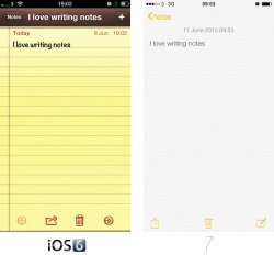
The text, borderless button. In fact buttons were not redesigned. They were simply removed and replaced by text or a chevron. These are not buttons anymore, just text links to an action. Apart from looking ugly (like 90’s html links) these “borderless buttons” have a few other design problems.
First, they do not invite touch. If you read Apple’s development guidelines (at least up to iOS 6), they rightfully say that a button has to have a minimum area of 40x40 points, because thats the size of a fingertip. If you see anything smaller than that your instinct will tell you that’s to narrow for you to touch it, and you loose at least some of the will to do it. Honestly, text does not invite touch (even click with a more precise mouse is debatable). So that’s plain bad design.
Second. Graphically, text poses some problems to a well designed screen or app. Lets say that you have to put some longer than usual text in a button (you may not even be aware of that, but it may happen an app is available in non-English language countries). Than iOS will truncate it or reduce it’s size. If you have a left button with a regular size text, and a right button with reduced size text, you know what will happen. Since there are no borders or anything to give a a similar size to the buttons other than text, this buttons will seem misaligned and tour screen will look like garbage.
Third, buttons will be confused with other text in your apps, even if you tell the user that text of one color is a button and of another color is not, that’s too much thinking required. And again, text of different sizes on the same screen, without any visual contours, just looks confusing and really bad.
Fourth, a mobile OS has to be intuitive. If you have lots of text in a screen (some that you can tap, some not), that will be confusing, specially since apple now usually gives the same background color (usually white) to toolbars and content.

This is just one of what I consider to be a large number of design problems that plague iOS8/9, and I’m not a professional UI designer, would love to hear from them on this.

Unfortunately I could go on and on…I still hope that Apple takes iOS to the drawing board again and redesigns it completely. With the loads of cash that Apple has, it would not be difficult to hire the best designers out there and make iOS jaw dropping again!! Just look as apps lake Paper from 53, Clear, even Yahoo news Digest. and an endless list of outstanding design Apps…

With the original iPhone OS you were being trained for the next step of UI. No longer do you need buttons as you have been trained to swipe back and forth (the words remain as an intermediary step) When you want to know something more about a word on screen you touch it and choose dictionary definition. Now when you want to know more info about something instead of a button you touch the word and it takes you to another screen. It all makes sense if you let go of your previous idea :)
 
Found it:-

Repetition. If you repeat the same claims without adding new information, we might remove your posts. Again, if you started the thread, then we may remove or close the thread.

Duplicate discussions. If a new thread repeats a topic that has been previously discussed or debated, without basis for a separate discussion, the thread may be closed, removed, or merged into an earlier thread on the same topic. A news report on a previously discussed issue doesn't automatically deserve a new thread.


Source:- https://macrumors.zendesk.com/hc/en-us/articles/201327723
 
Register on MacRumors! This sidebar will go away, and you'll see fewer ads.