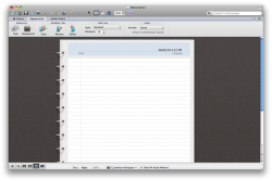
Open Word in the menubar look under View and select Notebook Layout thats pretty much OneNote
No, it isn't. Have you even use OneNote?
Open Word in the menubar look under View and select Notebook Layout thats pretty much OneNote
Read my mind. Even going back to 2001 and Office v.X the icons looked decent. Until now.Those icons won't be sittin on my dock

 Who ever needs splash screens?
Isn't that the point? I click my Pages document and I get my Pages document. I click a Word document and I get to wait so it can show me an image saying I'll someday get my Word document while it takes the time to do who-knows-what in the background. It's just a word processor. We have multiple cores at multiple GHz with multiple GB of RAM and Microsoft needs a splash screen to show me a page of text? Give me a break.
Having watched the videos on the Windows Demo, here is a rundown on the communicator....
It is an Instant messaging client taken a bit further. This new communicator will integrate with all office products allowing you to IM and collaborate on documents right in office and supposingly offer real time editing of documents in a chat sessions. Also, with it being integrated - you can now IM, email, and use your computer to call a contact that is listed within a document itself (or also in your contacts in outlook), just by clicking on the information in the document (phone number, email address, instant message screen name).
I have not played with communicator myself, but for a while I had the 2010 windows beta downloaded, and it seemed pretty nice and rock solid in performance. Since I work for a company where all employees are based out of their homes, I am really looking forward to this. From the videos I watched, this version is supposed to do a lot for people on the go or in remote offices (away from corporate).
Still dreaming they would bring OneNote to the mac. It was a push, but after several conference calls; management discovered many employees were using their own purchased OneNote. So now it may look like it will be a standard tool (thank God - took them long enough).
Also another dream of mine - Office for the ipad. iwork is ok, but just to be able to work on a document in it's native application is so much better, no compatibility issues. My biggest things I need to come to the ipad are:
Word
Excel
OneNote - Although MobileNoter seemed to cover that.
Outlook - Apple Mail is ok except when using exchange. I need access to my companies public folders, not just my own folders.
KeyNote on the ipad is so much better than PPT anyday.
Looking forward to upgrading to office 2011 when it is available.
If iWork came out with built in bibliographical support for Chicago style citation/biography I would drop Microsoft Office almost immediately. It annoys me that this is a well known feature lacking from iWork and with each release Apple adds pointless crap no one gives a toss about and leaves out a feature that a large number of students need.
Some of those changes included in the latest beta version are new icons and splash screens for the Office applications,
I was kind of wondering about 64-bits. This is supposed to be Cocoa, right?I didn't say it was just a rename. I said renaming it doesn't mean it's not crippled. As you point out, I'm quite right-- they called it Outlook but built it around a gimped alternative to MAPI.[...]Without implementing the entirety of MAPI, of course the damn thing's not going to be exactly the same, but there are many reasons, all of them well known, why Outlook is not just the rename you, for some reason, think it is.
You could make a strong case that Apple does the same thing every year with iTunes updates. It went from being a simple music player to now being a jack-of-all-trades music player, music store, data management application, etc.I will buy it but over the years, I notice that nothing from Microsoft ever quite works as intended. They are obsessed with applying layers upon layers of features on top of features. If someone at MS says keep it simple theyre fired.
What does this even mean?1st, The ICONs are ugly for sure!!
Maybe they think those are art, but I think art should be brought to everyone like Apple style!
When you have large applications like Adobe CS5 or Microsoft Office that can take a while to load, users typically want to see something, anything, that lets them know the application is loading and not stalling or crashing. Hence, a "1990s" concept of a splash screen. It's called good interface design.2nd, the splash screens? What the hell are those splash screens doing there?
It's soooooo PC! It's sooooo 1990's!!!
Wake up M$ Mac Unit people, well come to 2010, and well come to Macintosh world!
If they do this they would have an inferior product. iWork pales in comparison to Office.I think M$ Mac Unit should just copy iWork design and creativity.
...
...
...
There's this new concept called an opinion, sometimes referred to as "different perspectives." This new concept raises a very inflammatory conjecture: that some people like one thing while others don't like it. Thus, I know it's hard to believe, but some people might like the Beta 3 icons just because.Since we all know the majority of people have bad (or no...) taste I think we can conclude the new Office 2011 icons look quite good.
What exactly is OneNote, why is it so important, and, in which IT environments would I likely find everyone using it? I've heard of it, but, don't have any personal experience with it.OneNote - Although MobileNoter seemed to cover that.
Plus a lot of people on these MacRumors forums worship the ground Steve Jobs walks on, so naturally any icon design out of Microsoft is immediately crucified as terrible, amateur, uninspired, etc. Yet you know that if the exact same icons were packaged with iWork '10, everyone would be talking about how great they are and worshiping Steve Jobs even more.The icon is the face of the application, it is important. If they made poor or lazy design decisions wih the icon it has to make you wonder if they made other poor or lazy design decisions in the rest of the app. Plus a lot of people on these MacRumors forums are designers, so it's only natural they would take notice.
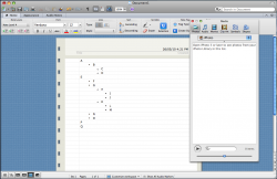
OneNote is note-taking software, essentially. It has auto-save and there is no real concept of a page... You can write anywhere, draw anything and drop in media, pictures, etc. I don't know how useful it is in a business setting, but it's probably my most-used software as a college student. It's far more useful than taking notes in Word just because of the way the program works. Like a wiki, you can have various notebook "tabs" that are hyperlinked together, and then you export various snippets of your notes into other Office programs. You can also take screenshots and import them into OneNote, you can import snippets of text and have the program cite them for you, etc.What exactly is OneNote, why is it so important, and, in which IT environments would I likely find everyone using it? I've heard of it, but, don't have any personal experience with it.
Now they've gone from one broken web services interface to another and changed it's name-- maybe this will mean different headaches, but it will certainly mean headaches.
engineered to be worse than useless because the interface was straight out of Fisher Price.
Why is Microsoft insisting on using different exchange interfaces for their PC and Mac products? They own MAPI, it's not like they need to break in and steal the interface documents...
How exactly do they hurt your eyes?Those icons hurt my eyes... and of course the Messenger icon stands out like a sore thumb.
Just so you know, he'll never get back to you because he never had an argument in the first place. He was just looking to get in a cheap Microsoft jab, because that's the trendy thing to do nowadays.Please explain how EWS is broken, particularly as iPhone and Windows Mobile devices use the same interface.
With all these letter icons I'll bet we could start playing scrabble with our docks. Just think of the words you could spell?
Communicator - Outlook - Word ---> COW
PowerPoint - Outlook - Excel --> POX
PowerPoint - Outlook - Word --> POW
Now if only I could think of a way to work in the QuickTime "Q" on a triple-word score dock position........
Just so you know, he'll never get back to you because he never had an argument in the first place. He was just looking to get in a cheap Microsoft jab, because that's the trendy thing to do nowadays.
Open Word in the menubar look under View and select Notebook Layout thats pretty much OneNote

What does this even mean?
When you have large applications like Adobe CS5 or Microsoft Office that can take a while to load, users typically want to see something, anything, that lets them know the application is loading and not stalling or crashing. Hence, a "1990s" concept of a splash screen. It's called good interface design.
If they do this they would have an inferior product. iWork pales in comparison to Office.


M$? Really?Good to know that's called good interface design.
Maybe Adobe Photoshop CS5 is a large application which needs load a lot of plugins when it starts, the splash screen is indeed needed.
But M$ word needs splash screen just because word is a large application???
Or because word is not well coded application?
Have fun