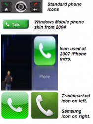
What people forget, is that the WHOLE POINT OF AN ICON IS TO BE UNIVERSALLY UNDERSTOOD. That means that if every company had its own set of icons, a large part of the purpose is lost.
Heck, that's why Apple chose a retro phone image in the first place... so that people who were familiar with cell phones would understand the meaning.
And yes, a white on green left leaning phone icon was used by Skype and in Windows Mobile dialer skins, before the iPhone came along and did one as well. Apple had to add stripes in order to get a trademark on their version. The one they used at the iPhone debut in 2007 was too common.
View attachment 353932
MacDav: "During jury selection, you can be sure the lawyers for both sides weeded out jurors who owned any Apple or Samsung products. Goes without saying."
"That would likely be hard to do. I believe there's actually one Apple and one Google employee on the jury."
Good one , I'm assuming your kidding of course.
MacDav: "Yes. it is pretty cool. Looks nothing like the iPhone. Only problems are:
1. Almost an inch thick
2. Very small screen with very poor ppi, probably need a stylus to use it.
3. Not made by Apple
Technology progresses. For example, to many people, the current iPhone is seen as being too chunky and with too small a screen.


