Become a MacRumors Supporter for $50/year with no ads, ability to filter front page stories, and private forums.
I wish widgets could be placed on the desktop similar to how amnesty widget browser allows you to.

You can with a terminal command. I don't remember what it is, but you could google it. Then all you have to do is open the dashboard click and hold a widget and close dashboard. Unfortunately, if I recall correctly, the widgets on the desktop will float over all windows.
 
It's easier to list what I don't like.

"Searching"

Sherlock under OS 9 was 10000 X better than spotlight or the finder search.

If you wanted to search for a filetype, you'd just go to the advanced search (or whatever it was called), drag the type of file you wanted to search for then go ahead and search for it.

it also supported proper boolean searches without any messing around to just get it half right like OS X does.

"File selectors"

I hate most of them and their inconsistent behaviour. Again, in OS 9, it was much better.
 
It's easier to list what I don't like.

"Searching"

Sherlock under OS 9 was 10000 X better than spotlight or the finder search.

If you wanted to search for a filetype, you'd just go to the advanced search (or whatever it was called), drag the type of file you wanted to search for then go ahead and search for it.

it also supported proper boolean searches without any messing around to just get it half right like OS X does.

You might like Find in Finder. File > Find or Cmd+f. It's not the same, but it's nice.

For the record I like spotlight, I just wish it's implementation was a little better. I'd like to know where the files came from, so I end up almost always clicking on "show all" in the Spotlight menu.

What did you mean by "file selectors?"
 
The best things:
  • Coherent keyboard shortcuts in easily reachable places. Whoever thought that Alt+F4 was an easy shortcut for closing programs in Windows should be shot.
  • Good program installation paradigm. Just mount the .dmg and drag the app into Applications. Unfortunately some programs (like Adobe's ****) want to use an installer which IMO should be only used for things like drivers.
  • Consistent application looks, apart from Adobe.. :p
  • Automatic application updates
  • Stacks. They offer nice and quick access to files but Apple left the feature a bit half-baked because you can't really do anything with the files except open, move or delete 'em.
The worst stuff:
  • Mouse support. Basically it's Apple or Microsoft mice. Logitech mice don't have proper drivers so their mouse acceleration is totally ****ed and you need to buy a 3rd party mouse driver just to fix it.
  • Font rendering. It's great when you've got large font sizes but blurry for very small ones.
  • No DPI scaling (working one at least). Hopefully fixed in Snow Leopard.
  • Extra click required to activate windows. Annoying when you just want to click a link in a browser etc.
  • Finder. Its got awkward file sorting and generally is just painful to use. Thank God there's Path Finder.
  • Preferences. I think they really need an Apply button because sometimes you can't be sure if your settings are actually saved if nothing changes on screen. Having to go back and forth and hit "Show all" in some is also annoying.
  • Window resizing is not very convenient with just the one corner. I like the Windows way better.
 
I've never had any problem with the support for third-party mice, except from Logitech. The others I've used have all plugged in and worked. So this is a problem created by Logitech. But I've noticed that the Logitech drivers for Windows aren't so great either.

The way OSX antialiases fonts at small sizes is user-configurable. Mac antialiasing is definitely different than Windows, but personally I think fonts in general look better in OSX than Windows, but it's probably more what you are used to.

I don't know why Apple has chosen to have windows resize only from the lower right corner. Longtime Mac users don't seem bothered, but this difference does seems to bug a lot of crossover users.
 
hahahahaha righto then, i LOVE the dock as it is, hiding it makes it really accessible and really compact. your clearly not accurate enough with your mouse haha (kidding)

If you use an application with menus/buttons at the bottom - e.g. LightWave - there's no point in hiding the dock and going full screen because it just pops up over them.
 
The way OSX antialiases fonts at small sizes is user-configurable. Mac antialiasing is definitely different than Windows, but personally I think fonts in general look better in OSX than Windows, but it's probably more what you are used to.

I don't know why Apple has chosen to have windows resize only from the lower right corner. Longtime Mac users don't seem bothered, but this difference does seems to bug a lot of crossover users.

I agree. I think fonts look tons better in OS X.

I switched six years ago and I've never been bothered by resizing, but I rarely resize my windows once I have them set up.

If you use an application with menus/buttons at the bottom - e.g. LightWave - there's no point in hiding the dock and going full screen because it just pops up over them.

All of those buttons both in layout and modeler have keyboard shortcuts and most, if I remember correctly, also exist in a menu. I've never had that problem in LW. My dock is hidden and my LW is always full screen. Though I will agree that those buttons could pose a problem if you're not careful, however that's Newtek's issue.

Newtek could do much more to develop a better, more native UI for the Mac. I don't mind the proprietary buttons, but why not put the bottom buttons where they have the extraneous menu buttons in the upper-left? Couldn't they just use the actual menu bar for its intended purpose? They could even put those buttons near the bottom on the left bar. There's not many panes that go all the way to the bottom. There's tons of unused space there. For things like symmetry settings and action center modes, those could be relegated to a right-click menu similar to Maya's implementation.
 
You might like Find in Finder. File > Find or Cmd+f. It's not the same, but it's nice.

For the record I like spotlight, I just wish it's implementation was a little better. I'd like to know where the files came from, so I end up almost always clicking on "show all" in the Spotlight menu.

What did you mean by "file selectors?"

File > Find in the finder is exactly what I'm talking about

If you want to search by type, you need to wait for the finder to analyse your installed applications for filetypes while it constantly updates the list on the fly when you go to [Kind] [Others...] it's pathetic.

Spotlight's annoying window bugs me too, it should just open a normal finder search window with the view set to "by name" or tell you more info about the files you've found than simply putting them into categories.

When you go to File > Open, you get a file selector, the behaviour and feature set is totally inconsistent.

I'm also annoyed that I just wrote over a tune I was working on for the past week just because I was so stupid I called it "untitled 1" :(
 
Not really an OSX thing but the mirrors apple puts in front of their screens and the resolutions suck on the 15 inch MacBook Pro. I do not want a 17 inch just to get a matte screen or 1920*1200 resolution.

I'm also annoyed that I just wrote over a tune I was working on for the past week just because I was so stupid I called it "untitled 1" :(

It's called Time Machine!
 
Have you ever tried navigating lots of folders in icon view?

The most annoying thing is when not all the icons fit the view, so the finder has a scrollbar. You go to drop something in a specific folder, but it's not in the view, so you have to play this game with the Finder to get it to bring your folder in to view.

This annoys me to no end. I often fail and fix it using the terminal.
 
Pros:
-no viruses/spyware hassle.

-no excessive right click, this tab, advanced, then another tab, then advanced again to get to the option that you want. Go back to Windows and you'll notice that you have a lot of menus and tabs to go through to get to options.

-integration of hw/sw means less hassle and more of the it just works feeling.

-Time Machine

-Spotlight. I use it alot to launch apps.

-System Prefs. Easily accessible and love the one click to change things.

-software update. No nonsense updates.

-various nice usage related touches like emailing photos in iPhoto or right click to open web address in another tab or double-clicking a word to highlight it etc.

-looks great.

-very smooth and seemingly stable. Love the way it handles errors.


Cons:

-No open Finder shortcut key.

-no QuickLook on Grid or Fan GUI layout.

-what's the point of minimizing Windows?

-apps sometimes put folders in my applications folder instead of icons (personal nitpick.)

-lack of distinction between Docs and Downloads on the right side of Dock? I still get confused which is which. I should memorize it, but that side of things including minimized windows is messy.

- hw/sw integration downside is you get what Apple gives you.

-Mobile Me service fee. I wish they'd also support a (1st or 3rd party) free ad-supported option.

-expensive. Macs do hold their value fairly well and are easier to sell than a no-name pc, but I think there's room for Apple's integration of hw/sw in a not so flashy less costly yet eye pleasing package. For example, the new 24" ACD. I'm guessing at least 90% of their laptop users are not going to buy the monitor. But I bet a massive amount have an external monitor. It seems like Apple is leaving a ton of possible sales on the table here. ......But make a 20" black plastic non-LED TN-panel monitor with the same capabilities (speaker,webcam, mic, usb, charging,) and sell it for $300 (roughly speaking) and you have a hot-selling product. I think they need to develop a secondary brand to their "Lexus" brand.

-lack of gaming/app/web support. Some of the reason for the Pros is low market share. But this is also a con sometimes.
 
Not really an OSX thing but the mirrors apple puts in front of their screens and the resolutions suck on the 15 inch MacBook Pro. I do not want a 17 inch just to get a matte screen or 1920*1200 resolution.


It's called Time Machine!

I'm still slumming it with Tiger and a G4 unfortunately.
 
- Easy to boot on external drive.
- Firewire boot on Macs.
- Portable OS and user account (external boot).
- OSX does not disable itself if you change your components.
- No viruses, no idiot ballons.
- Easy to make keyboard short cuts for any menu items.
- Easy to automate things with AUTOMATOR

-Worst of all, the onslaught of foreign symbols Apple uses to indicate shortcuts. I've had my Mac for two years, still don't know what half of them mean.

Is it hard to google:
mac keyboard symbol

By the way, there isn't an "onslaught" of symbols. There are only FEW.


some gripes i have discovered:

1. no copy/cut and paste in finder. drag and drop works most of the time, but sometimes if you need to copy or move something from one folder to another, its easier to cut and paste vs navigating to source folder, open new finder window, navigating to destination folder, arrange folders side by side, drag and drop.

2. no universal uninstaller. yes, apps are mostly self contained and you can just trash the .app folder, but many also create files in the system and library folders. AppCleaner does a good job, but we shouldnt have to rely on a third party app for something like this.

3. no easy way to specify regular Sleep vs Safe Sleep (ie Hibernate). i want to hibernate when i know it might be several hours before i need to use my MBP. i want to sleep when i will need it again soon (eg. going to my next class), or when its plugged in since battery isnt an issue. i have it set to hibernate when on battery and sleep when on AC, but its still not optimal.

4. plugging (more specifically unplugging) USB devices wake up the computer from sleep. i put the computer to sleep at night, but the next day i might need to take it with me. unplugging everything then wakes it up and i have to wait for it to sleep again.

5. switching GPU on unibody pros. hopefully this gets fixed in snow leopard, its pretty ridiculous. on top of on the fly switching without having to log out, it should switch automatically when on AC vs battery.

6. folders in finder. i was used to it in windows, but it definitely made a lot more sense IMO. folders always on top of the list is just easier. i think i saw a post on here before that said it best: you're either looking for a folder, or you're not. so mixing the folders in with everything else in alphabet view and even arranging by kind just makes it feel more cluttered.

thats all i can think of right now. overall, i'm more than happy with the switch from windows. :)

1. COPY: hold option and drag
CUT: drag, once you started dragging, hold COMMAND

2. AppCleaner (search macupdate.com)

3. Widget at
http://www.apple.com/downloads/dashboard/

4. Unplug the things before you sleep it.

5. No experience. Write to apple.com/feedback
You probably have more battery saving by disabling a core.

6. It's not very useful for the people that look for things by NAME. Personally I don't care whether it's a folder or file, I want it sort alphabetically.
 
File > Find in the finder is exactly what I'm talking about

Oh, OK. I wasn't sure if you were taking about going through the Spotlight menu bar item. Granted if you hit show all it's the same thing. It would definitely be nice to have some boolean options in it. At least a not.

......But make a 20" black plastic non-LED TN-panel monitor with the same capabilities (speaker,webcam, mic, usb, charging,) and sell it for $300 (roughly speaking) and you have a hot-selling product. I think they need to develop a secondary brand to their "Lexus" brand.

I think one reason Apple doesn't do something like that is because it wouldn't be "green." They'll never make anything else out of plastic if they don't have to. Their whole product line is green.

1. COPY: hold option and drag
CUT: drag, once you started dragging, hold COMMAND

2. AppCleaner (search macupdate.com)

6. It's not very useful for the people that look for things by NAME. Personally I don't care whether it's a folder or file, I want it sort alphabetically

1. By the way, you can actually change those modifiers on demand

2. App Zapper also works, but it's not free

6. I agree. I hated the way windows sorted. Besides, if you really want that functionality, I think you can sort by type to get some of the way there.
 
If you use an application with menus/buttons at the bottom - e.g. LightWave - there's no point in hiding the dock and going full screen because it just pops up over them.

why would you ever want to use full screen? there is simply no need for it with todays resolutions. even on my poor old MBP's res its decent for me. not to mention that i have an external monitor aswell :)

oh and i have my dock hidden on the left hand side.. no annoying dock at the bottom for me :)
 
holding command while i drag does not invoke cut on my machine.

i wish i could just hit command X.

also the only thing i ran into was setting up bluetooth for the firstime - i turned bluetooth on and set everything up but my device wouldn't connect. usually things are pish posh easy - but i had to go and check bluetooth file sharing in the sharing pref pane.

not a big deal but usually everything is right there, and if that is off - most of the time it tells you
 
why would you ever want to use full screen? there is simply no need for it with todays resolutions. even on my poor old MBP's res its decent for me. not to mention that i have an external monitor aswell :)

oh and i have my dock hidden on the left hand side.. no annoying dock at the bottom for me :)

You want to for 3D work, or video work.

When I used After Effects at all of my old jobs, I used both monitors full screen. I like to see as much of the timeline that I possibly can. Now that I'm freelancing, I need to buy a second monitor at some point.

In 3D I only use one screen full screen. The other Monitor is used for reference material or finder windows. Anyway, you definitely need that one window full screen. Usually you work with 4 views (or at least I do) unless I'm selecting polygons that are hard to get to, then I use one view full screen. Even on my 1920x1200 4 views is less than 960x600 per view.

holding command while i drag does not invoke cut on my machine.

i wish i could just hit command X.

Me too. But that's as close as you can get. Either way it's useful to know when dragging between devices or network folders. Holding command forces a move instead of copy.
 
I've never had any problem with the support for third-party mice, except from Logitech. The others I've used have all plugged in and worked. So this is a problem created by Logitech. But I've noticed that the Logitech drivers for Windows aren't so great either.

The way OSX antialiases fonts at small sizes is user-configurable. Mac antialiasing is definitely different than Windows, but personally I think fonts in general look better in OSX than Windows, but it's probably more what you are used to.

I think you may be just used to the crappy mouse acceleration. It's a known problem in the OS actually. Try some third party drivers like SteerMouse or USB Overdrive and you'll be amazed how more fluid the mouse movement becomes. The best implementation seems to be on MS mice, ironically. They have their own drivers with their own mouse acceleration.

Yeah you can turn the font antialiasing off to a degree, but even the different options don't IMO have the clarity of Windows fonts with Cleartype. This is just a difference between what they aim for: MS went for readability over accurate font representation (fonts crushed into pixel grid) while Apple decided to have accurately drawn fonts at the expense of readability on screen. It's not a huge issue to me because I'm used to it.
 
You want to for 3D work, or video work.

When I used After Effects at all of my old jobs, I used both monitors full screen. I like to see as much of the timeline that I possibly can. Now that I'm freelancing, I need to buy a second monitor at some point.

In 3D I only use one screen full screen. The other Monitor is used for reference material or finder windows. Anyway, you definitely need that one window full screen. Usually you work with 4 views (or at least I do) unless I'm selecting polygons that are hard to get to, then I use one view full screen. Even on my 1920x1200 4 views is less than 960x600 per view.

true, i forgot about 3D applications. i was talking more for general use people (i.e. limewire, safari, itunes etc) i dont see it as a necessity.
 
true, i forgot about 3D applications. i was talking more for general use people (i.e. limewire, safari, itunes etc) i dont see it as a necessity.

Yeah, for other programs it's not a big deal. After I wrote that I had a feeling you were just unfamiliar with LightWave.
 
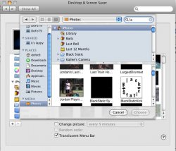
I have a lot of pictures. Most of them are tagged. What I'd like to do is search by name and narrow down the results. Similar to what iTunes does with music. Scrolling through and squinting at 160 thumbnails aint fun.
 

Attachments

  • Picture 1.png
    Picture 1.png
    254.3 KB · Views: 112
Yeah, for other programs it's not a big deal. After I wrote that I had a feeling you were just unfamiliar with LightWave.

lol thought you said limewire (very experienced with that). never used the LightWave application..

I have a lot of pictures. Most of them are tagged. What I'd like is to be able to do is search by name and narrow down the results. Similar to what iTunes does with music. Scrolling through and squinting at 160 thumbnails aint fun.

if you hit the "+" down the bottom it allows you to search to some extent...
 

Attachments

  • Picture 1.jpg
    Picture 1.jpg
    82.3 KB · Views: 108
Register on MacRumors! This sidebar will go away, and you'll see fewer ads.