Become a MacRumors Supporter for $50/year with no ads, ability to filter front page stories, and private forums.
You can scale wallpaper if you turn the parallax setting off.

One other niggle I have with the parallax: if you have the phone locked in portrait orientation but open a game which is in landscape mode, then any system popups have the parallax "back to front" - ie if you tilt the phone top and bottom (holding it in landscape mode) then it shifts the parallax as if you were tilting it left and right (ie top and bottom in portrait mode), and vice versa.

Hard to explain clearly but it just looks wrong. I just noticed this while opening the new Angry Birds game and getting the Allow Notifications popup.
 
I still don't like Safari, the new buttons are confusing and the whole bright white and simple thin icon layout is yuck!
The animations are so so, a bit too slow really and not necessary. Oh and why the hell have they made Notes have a bright white screen? If Apple truly felt bright white was better than they would change the Notes app in Mac OSX to be bright white too, instead of the better yellow colour.

I also don't like how iOS has now totally lost it's individuality and uniqueness in it's interface and looks. It's not a total mash up of iOS and WebOS and Android, I can even seen buttons copied from Google Chrome browser!
 
How do you scale your wallpaper on the new IPhone ios7? It won't let me. (I have Iphone 4s)

It made my wallpaper bigger than what is was

All i did was got the original picture form the pc, opened up in paint (windows machine) and put a thick black border around it.

The sync'ed it back to the phone. Now i can select the same picture and have it how it used to be.

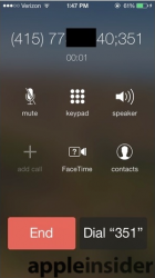
My biggest grip (now im getting used to it) is the bright white screen when you use the dialer.

would have preferred black with white buttons
 
1)

I want a phone that's a phone, not a video game. I don't need to fly into my apps, and then fly back out when I'm done, like I'm playing Call of Duty. There should be an option to disable this annoying gimmick.

These are just my personal observations after using it for 1 day... Other than that, I love iOS 7! ;)

My god, you freaking troll. Someone ban this guy.
 
Is all very pretty but I think that some basic usability has gone out of the window. For example getting the control centre up is a bit awkward in some apps, I need to exit then swipe up to get it. It's made worse if using a case that goes along the bottom edge of the screen.

Also the calendar isn't too great. The last one didn't look as good but fundamentally it work better.

Overall apple has focused too much on the aesthetics.
 
There are lots of things I like about IOS7 but hate all the white particularly on the Apple apps. Contact list, Calendar, Calculator, Notes etc are just horrible. How, they think this is better I cannot imagine.

One basic function that is annoying me is answering a phone call. Previously just hit the button to answer now have to swipe. Hopefully, there is an option to change this but not had an opportunity to look for it yet.
 
I have been using iOS7 for about a day, but I have done a lot in that day, both with my iPhone and my iPad at work. The things I do not like are:

  • Button highlighting when entering passcode in lock screen - why keep the pressed buttons highlighted after they are pressed? To allow the NSA or anybody else in view to obtain your passcode?
  • The readability of text is somewhat low - I have poor vision, and even with bolder, larger settings for fonts, it is harder for me to read labels in iOS7 than it was in iOS6. For some reason this seems worse on the iPhone than the iPad. There is an separate thread about this.
  • No 'close all apps' button in command center - or have I missed something?
  • Maps still sucks where I am - I expected Apple to unveil more accurate information. There is a separate thread about this, and a poll.
  • Siri is incomplete at best where I am - for instance, it does not include movies playing at the only cinema we have in town.
  • Swiping up to gain access to control center is unreliable - I am not sure why, but I suspect it's an effect caused by artifacts at the edge of the touchscreen when it is trying to locate the center of my finger.
  • Currently weather is not showing up in notification center in spite of being toggled on in location services.

    However, overall iOS7 is growing on me. I really like and use command center when I can get it to open.
 
Last edited:
#1 entire music app is one big annoyance of regression

#2 the copy paste bug in text and iMessage

#3 random reboots still
 
1.Music App
-I hate the big artwork for artist(instead of list of names) and that you have to scroll through all of the songs just to find the album you want.

This. I have one particular artist with 39 albums, and 459 songs. To get to the last album I don't just have to scroll down through 39 album titles like before. I now have to scroll through ALL 459 SONGS!

What idiot thought this up? Do they not even test these things for usability?
 
Well I have a few things and I have even reported to apple but no response ..

1. deleting individual messages is a waste. We can't clear all without going through 3 steps. Irritating.

2.we cannot set up a wallpaper that is not the screen size of the phone .. For eg. U crop a picture to any aspect smaller than the phone , set it up as a wallpaper , they will zoom the pic,hiding some of the part of the pic ...
We even need to go through 3 steps in setting up a wallpaper on a 4S or 4 .. Unlike on iPhone 5

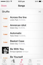
3. there is no index scroll in all music .. I need to keep scrolling to the letter instead of just sliding through the ABCD on the side like on the contacts app.. Apple pointed out in my bug report that it's there but it's not

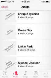
4. When In artists, I don't find pictures next to them , just album name and their name , in beta 6 we got default pics for them automatically which was cool..

5. After clicking on an artist we don't find albums by them but we get albums + their songs.. To scroll through them is very irritating if u have many albums of 1 artist.. And the effect if the album pushing another album up like they do in alphabets in music and contacts, is very bad.

6. The icons in safari and other sharing icons like stetting up a wallpaper or save to the home screen is very bad .. It's thin and inconvenient and doesn't go with the OS ..

7. From the lock screen if we slide the camera, it opens the camera like any other app unlike in ios 6.. What I mean is that In ios 6 it wasn't there in multitasking when we double click the home button, that means it closed after we didn't use, but in ios 7 we need to manually close it by double clicking..
 

Attachments

  • image.jpg
    image.jpg
    96.2 KB · Views: 99
Last edited:
I don't like the fact that my battery charger case no longer works since I updated to iOS 7. It tells me that item not a supported accessory charges for 2 secs then stops. Only had since June and love it back up for when am out all day and using Facebook and hipstamatic heavily!

Although I've ordered an Apple leather case with my 5s I would have liked to keep the case on my bag for back up grrr!! Can't even bundle it as a little extra with my 5 when I come flog it eBay :-(
 
Is all very pretty but I think that some basic usability has gone out of the window. For example getting the control centre up is a bit awkward in some apps, I need to exit then swipe up to get it. It's made worse if using a case that goes along the bottom edge of the screen.

Also the calendar isn't too great. The last one didn't look as good but fundamentally it work better.

Overall apple has focused too much on the aesthetics.

I am yet to find a way to simply select the month in the new calendar? You HAVE to scroll endlessly through every day of every month to get to the one you want! What the hell usability is that??

And yes, your last comment, that's exactly what you get for letting a designer head up the work on the interface, form over function every time. That's EXACTLY why Jobs never had the teams working on iOS and the hardware speak to each other..
 
The colors/ the text-"buttons".
Musicplayer on iPad is a scrollhungry wasteland of useless white.
 
It made my wallpaper bigger than what is was

All i did was got the original picture form the pc, opened up in paint (windows machine) and put a thick black border around it.

The sync'ed it back to the phone. Now i can select the same picture and have it how it used to be.

My biggest grip (now im getting used to it) is the bright white screen when you use the dialer.

would have preferred black with white buttons

Yo can do it by turning off the parallax effect .
 
I don't like the Calendar on the iPad. On the phone it's not as bad but I just hate it on the iPad.:(
 
I'll definitely agree with not being able to delete texts by swiping, have to hit edit first now, takes longer.

I also dislike all the white on the text messages,
Not to mention the colors are terrible, looks like a child's color scheme now, not very professional to me, not to mention very blinding with the bright white.

Learn how to swipe better.
 
No big deal but why on earth does the video camera on the facetime logo have a question mark on it?!
 

Attachments

  • Screen Shot 2013-09-21 at 18.19.42.png
    Screen Shot 2013-09-21 at 18.19.42.png
    123.9 KB · Views: 113
Pretty much everything I don't like. Except the lock screen and the SBS settings, the rest sucks.
 
Not when you have to manually scroll through every single hour of every single day of every single month of every single year on a 4" screen it isn't!

Yeah, I'll agree with you there. What were they thinking, anyway?
 
Well I have a few things and I have even reported to apple but no response ..

1. deleting individual messages is a waste. We can't clear all without going through 3 steps. Irritating.

2.we cannot set up a wallpaper that is not the screen size of the phone .. For eg. U crop a picture to any aspect smaller than the phone , set it up as a wallpaper , they will zoom the pic,hiding some of the part of the pic ...
We even need to go through 3 steps in setting up a wallpaper on a 4S or 4 .. Unlike on iPhone 5

3. there is no index scroll in all music .. I need to keep scrolling to the letter instead of just sliding through the ABCD on the side like on the contacts app.. Apple pointed out in my bug report that it's there but it's not

4. When In artists, I don't find pictures next to them , just album name and their name , in beta 6 we got default pics for them automatically which was cool..

5. After clicking on an artist we don't find albums by them but we get albums + their songs.. To scroll through them is very irritating if u have many albums of 1 artist.. And the effect if the album pushing another album up like they do in alphabets in music and contacts, is very bad.

6. The icons in safari and other sharing icons like stetting up a wallpaper or save to the home screen is very bad .. It's thin and inconvenient and doesn't go with the OS ..

7. From the lock screen if we slide the camera, it opens the camera like any other app unlike in ios 6.. What I mean is that In ios 6 it wasn't there in multitasking when we double click the home button, that means it closed after we didn't use, but in ios 7 we need to manually close it by double clicking..

1. use EDIT (top left in blue)
2. the said from the beginning that is was an 'edge to edge' design
3. works for me
4. re-sync your music maybe??? I didn't loose any albumn pics
5. got nothin' for ya on this one
6. I tend to agree it took me a few seconds to figure it out
7. I don't understand................
 
The transition from iOS 6 to iOS 7 has some qualities similar to that of Snow Leopard to Lion/Mountain Lion. The newer OSs have gained connectivity and security but at the price of a great deal of ugliness.

Some of iOS7's icons are embarrassingly ugly, particularly Calendar, Photos and Weather. A real disappointment is the keyboard. It looks boring and is harder to use because it looks less like a keyboard. Bag the anti-skeuomorphism rant Apple. A keyboard is a three-dimensional object, not a graphic.

While I am satisfied with my new iPhone 5c the OS graphics really look like another one of Jony Ive's goofy change for the sake of change moves. iOS 7 is harder to use because of the deterioration of its visuals.

Finally, zooming animations really, really suck. Even Windows lets you turn that garbage off. Come on Apple, get back to basics.
 
Register on MacRumors! This sidebar will go away, and you'll see fewer ads.