Become a MacRumors Supporter for $50/year with no ads, ability to filter front page stories, and private forums.

apfhex

macrumors 68030
Aug 8, 2006
2,670
5
Northern California
Why on earth do people think that they need iTunes in 64-bit?
Agreed. Unless someone can list a really good reason why iTunes would benefit from being 64-bit?

It's Cocoa now
Actually, it's not.

I like bits of the new interface. The scroll bars look really good. I've modded my system to have the iTunes 8 style scroll bars and list headers everywhere, now I want to update that to the new look (why oh why didn't Apple do this for Snow Leopard? Would have been perfect). The shaded search box looks good and the play/next/prev buttons are nice too, kind of metallic. The window gradient is a little too strong, I'd rather it look like every other Leopard/Snow Leopard window. Mostly, though, I like it.
 

Shake 'n' Bake

macrumors 68020
Mar 2, 2009
2,186
2
Albany
Why on earth do people think that they need iTunes in 64-bit?

It's Cocoa now, and that's what we needed.

For me, it just has to be 64-bit. It feels really awkward, almost wrong, at least for me, to have all major system apps except one to be 64-bit.

Prove it. I want to find the Xcode file that it comes from to see if it's Carbon and to change the backgrounds and other stuff I don't like.

EDIT: Interface Builder can't open compiled stuff, so I'm going to see if I can do a decompile. Also, it looks as if the minimum version of OS X required is 10.4.9.

EDIT 2: Can't find a way to decompile. It is possible with iPhone apps, though...
 

mrmayor92

macrumors 6502
Jul 12, 2008
303
0
PA
LOL, iTunes 9......should be called iMedia 9.

How much RAM does this bloated piece of software eat up anyway? Once Vox gets library support, I'm never going to use iTunes ever again. The choice of mp3 player software us mac users have is ridiculous.

Anyway:

http://www.voxapp.net

Vox.jpeg


Apple really needs to release a simple application for playing back mp3s ONLY. The fact that we have to load up and run, or even have installed, all the other unnecessary crap that some of us dont use (ipods, iphones, itv, apps, itunes music store, etc) is ridiculous.

Snow Leopard was supposed to give us tweaks. It did, sort of...but it could be better.

looks like an awesome app ill try it out
 

Jolly Jimmy

macrumors 65816
Dec 13, 2007
1,357
3
Am I the only one who thinks it looks exactly as a app that's not in the foreground looks? It looks terrible.
 

Cboss

macrumors 6502
Dec 11, 2008
388
0
Colorado
Am I the only one who thinks it looks exactly as a app that's not in the foreground looks? It looks terrible.

I agree. The gradient is FAR too strong and the white background looks down right bad. It's like they put all of their effort into the new features (which I love) and forgot about everything else...
 

macrem

macrumors 65816
Mar 11, 2008
1,433
100
For me, the links at the bottom are dead, for example "Podcast Directory" at the bottom of the Podcasts section, "Get more Applications" at the bottom of the Applications section.

Is anyone else experiencing this?
 

AAPLaday

Guest
Aug 6, 2008
2,411
2
Manchester UK
For me, the links at the bottom are dead, for example "Podcast Directory" at the bottom of the Podcasts section, "Get more Applications" at the bottom of the Applications section.

Is anyone else experiencing this?

Mines working fine and this version has fixed the 'check for updates' part of the app store which was always flaky on iTunes8 for me
 

macrem

macrumors 65816
Mar 11, 2008
1,433
100
Mines working fine and this version has fixed the 'check for updates' part of the app store which was always flaky on iTunes8 for me
I probably have to delete some stale cache or pref file(s)... will investigate further. Thanks for confirming.
 

aidricksdad

macrumors regular
Dec 29, 2008
229
0
Round Rock
i HATE the white background it really does hurt my eyes
and i do get a few beachballs on simple stuff like changing tracks and get info
 

LizKat

macrumors 604
Aug 5, 2004
6,765
36,272
Catskill Mountains
The white is nasty.

They need to bring back the black backgrounds and fix the green button!!

Yep and also it's weird to have the volume slider light on the left and dark on the right, especially when the trackplay / progress indicator uses dark on left, light on right.

I sent them a feedback basically said hey u r frazzle my brain, which likes to drive entertainment on autopilot whenever possible. There is something startling and WRONG about the way those two sliders look now; they should flip the positive/negative on one of them.

On the plus side, I like being able to put the column view back the way it was (split the browser window horizontally) and appreciate the options to choose what categories show up in the browser.

The Store... I dunno... still finding my way around the changes. At first I could not find genres when I went to Music. By time I clicked into someplace that gave me that, I didn't know how I got there and it was that dull list view, the one that makes me think I've left the Store and landed in one of the big playlists I maintain to autofill shuffles.

It's true that even good change is unsettling at first, unless one regularly does different types of startle-exercises to get the brain to buy into changes. You know, like occasionally putting the other earring on first, or the other sock and shoe.

So I will discount various WTF reactions I've had so far, such as the disappearing cart. I dislike that now everything is one-click or else wish-list... I liked dumping all manner of stuff into cart, previewing some along the way. Later on I would sort it out, make discards, listen to what remained one more time, maybe drag a few items to a previews playlist for later, then BUY THE DAMN CART when I was sure. I could put tracks from several artists in there, say eleven tracks, play the previews three or four times, right after each other, or alternately, and finally pick out seven to buy. You can't do that so easily with the wishlist because it's artist-album oriented.

Oh well. I can still drag the tracks to a playlist and mess with the previews until I have what I want in that list and then buy my way down whatever's still in the list. Still, I have reset my warnings and left on the one for "are you sure you want to buy this??" to prevent inadvertent buys, but when I'm buying about half an album then it also ticks me off having to click once to buy and once to confirm.

{pouts.. wants her shopping cart....}

{shrugs... still managed to spend $29.05 in there yesterday, doing it their way. Well I had to make sure it worked, right? I got everything I wanted more than I want what's on my grocery list.}

Actually I do like the wishlist, it works a lot better than taking screen captures of stuff I would like to get later, or dragging previews into playlists I sometimes forget to rename so they sort high and I see them later.

The Help documentation says you can find My Wish List under quick links at the top right of the store homepage, but actually it's currently way at the bottom right, down by links to your account stuff. They NEED to put a Quick Link up top for the wishlist.

Aisde from UI and store issues: I finally tried Genius on a pretty big library on my blackjack, figuring it was a way to test the integrity of the iTunes 9 update of my stuff. I was pleasantly surprised by a few of the mix constructions, they must have been working on ways to improve Genius. It shows. I have a lot of alt rock and singer-songwriter stuff and they made some nice choices for three different playlists. But they threw in a couple of "huh?" picks into one of two latin mixes. Inexplicably they chose a Kings of Leon offering and a Strokes track, and not for any shortage of latin rock and pop in my library, that's for sure. Anyway, the Tennessee boys' track was called "King of the Rodeo" so maybe that one Spanish word tipped that one in, but the Strokes pick was bizarre, the track was "What Ever Happened?" One might well ask! :)

On to the next bar, connecting the toys to iTunes 9: I'm going to start with the ipod touch having the least amount of data I care about, in case the fun part of this update is officially over now.
 

tibi08

macrumors 6502a
Sep 17, 2007
703
75
Brighton, UK
Now that I've had the new interface for a few days, I can say with certainty that the white background on grid view is ****ing nasty.
 

liketom

macrumors 601
Apr 8, 2004
4,190
66
Lincoln,UK
new itunes is saving me cash - i have not bought a single thing since it was released as i find the navigation horrid

bring back the old store
 

Shake 'n' Bake

macrumors 68020
Mar 2, 2009
2,186
2
Albany
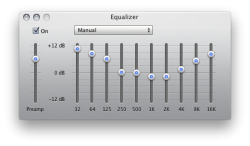
If anyone hasn't noticed, the "iTunes Music" folder has been changed to "iTunes Media." New EQ UI as well.
 

Attachments

  • Screen shot 2009-09-19 at 4.38.21 PM.png
    Screen shot 2009-09-19 at 4.38.21 PM.png
    153.1 KB · Views: 46
  • Screen shot 2009-09-19 at 4.38.34 PM.png
    Screen shot 2009-09-19 at 4.38.34 PM.png
    159.7 KB · Views: 44

mrmayor92

macrumors 6502
Jul 12, 2008
303
0
PA
Thanks for the link. I'm back on iTunes 8.2.1 at the moment, but I'll give iTunes 9 another go now that there's a mod. Are there any issues when using a theme for iTunes like this though?

Cheers

no issues at all ive been using it for a while now and have noticed no difference
 
Register on MacRumors! This sidebar will go away, and you'll see fewer ads.