Become a MacRumors Supporter for $50/year with no ads, ability to filter front page stories, and private forums.
puckhead193 said:
I think they should add rims to it, maybe like 20's :rolleyes:
i like the way they are now the only thing i would like to be changed is a high def. screen and more USB/firewire ports and to put them in the back like the old Ti ones, looks much cleaner that way. Maybe a built in isight...

edit - this is my 1,000 post if anyone cares :cool:

Thankfully I don't have any pictures of vehicles sporting 20's, so I won't be doing that mockup :p

Congrats on the 1000th post, well well done me thinks :)
 
Leave them the design the same.

In my eyes, they are pretty much a perfect design...
 
Les Kern said:
Sorry, but to me it looks like something Paris Hilton would have... and not know how to use of course. I can imaging that if I walked into a meeting with the board and had that, they'd think twice about my big raise, thinking instead that this guy is immature.
I need a professional look, not an MTV version of a workhorse.
Well, different strokes for different folks. I always liked the original color iBooks, just not crazy about the clamshell shape which made it look too feminine. But a metal-covered laptop painted like a car finish would be so cool. I'd walk into any boardroom with that any day!

Besides, Paris Hilton would probably have a pink one, not a red one. Not sure why people are so reistant to color in computers. It's what made Apple's equipment so popular a few years ago. Black, gray, white and beige are really boring. But I guess a lot of people work in a boring company with boring people and want equipment that matches.

Not I!
 
MontyZ said:
Well, different strokes for different folks. I always liked the original color iBooks, just not crazy about the clamshell shape which made it look too feminine. But a metal-covered laptop painted like a car finish would be so cool. I'd walk into any boardroom with that any day!

Besides, Paris Hilton would probably have a pink one, not a red one. Not sure why people are so reistant to color in computers. It's what made Apple's equipment so popular a few years ago. Black, gray, white and beige are really boring. But I guess a lot of people work in a boring company with boring people and want equipment that matches.

Not I!


I'm with you on this. There's color and then there's COLOR. Ferrari Red is NOT the same as red. Metal as opposed to plastic would b every cool.

Then again, I don't believe that stuff like laptops hinders 'promotion'. I made my way up the corp ladder by being good at my job and keeping my personality intact. The position I am in now I can do what I like and get away with it. A red laptop just adds to my quirkiness and quirkiness .. in corp america .. is what gets you name recognition in the company. Provided you are good at what you do of course.

I would even take in a fly yellow - lamborghini yellow laptop. :)
 
eVolcre said:
I'm with you on this. There's color and then there's COLOR. Ferrari Red is NOT the same as red. Metal as opposed to plastic would b every cool.

Then again, I don't believe that stuff like laptops hinders 'promotion'. I made my way up the corp ladder by being good at my job and keeping my personality intact. The position I am in now I can do what I like and get away with it. A red laptop just adds to my quirkiness and quirkiness .. in corp america .. is what gets you name recognition in the company. Provided you are good at what you do of course.

I would even take in a fly yellow - lamborghini yellow laptop. :)

And, BTW, i didn't work for an eclectic Dot Com or an ad agency. I was an executive at IBM, arguably one of the most conservative companies in the Fortune 500.
 
MontyZ said:
Well, different strokes for different folks. I always liked the original color iBooks, just not crazy about the clamshell shape which made it look too feminine. But a metal-covered laptop painted like a car finish would be so cool. I'd walk into any boardroom with that any day!

Besides, Paris Hilton would probably have a pink one, not a red one. Not sure why people are so reistant to color in computers. It's what made Apple's equipment so popular a few years ago. Black, gray, white and beige are really boring. But I guess a lot of people work in a boring company with boring people and want equipment that matches.

Not I!

I dunno...I think the shiny white iBooks are very 'clean' and classy looking. They definitely promote the fun, new, and fresh attitude of Apple.

Bright colors on computers would look cheap. It would not look like a professional product.

White is nice, as long as it is shiny. And the grey accents are an excellent touch.

I'd never buy a brightly colored computer. That's what alienwares are for :D
 
eVolcre said:
I'm with you on this. There's color and then there's COLOR. Ferrari Red is NOT the same as red. Metal as opposed to plastic would b every cool.

Then again, I don't believe that stuff like laptops hinders 'promotion'. I made my way up the corp ladder by being good at my job and keeping my personality intact. The position I am in now I can do what I like and get away with it. A red laptop just adds to my quirkiness and quirkiness .. in corp america .. is what gets you name recognition in the company. Provided you are good at what you do of course.

I would even take in a fly yellow - lamborghini yellow laptop. :)
I'm with you on that. What guy would look at a red sportscar and say "does this come in beige?" Black and White are good, safe, but still cool non-colors. But color adds personality and even more style. A Lamborghini-yellow laptop would look pretty damn cool, IMO!

Male Humans have lost touch of their showy side. In other species that inhabit the Earth it's usually the male who has the most colorful feathers, scales or skin. Time to get in touch with your masculine side guys! More color! The females dig it! :)
 
MontyZ said:
I'm with you on that. What guy would look at a red sportscar and say "does this come in beige?" Black and White are good, safe, but still cool non-colors. But color adds personality and even more style. A Lamborghini-yellow laptop would look pretty damn cool, IMO!

Male Humans have lost touch of their showy side. In other species that inhabit the Earth it's usually the male who has the most colorful feathers, scales or skin. Time to get in touch with your masculine side guys! More color! The females dig it! :)

I've often been called 'metrosexual' maybe that's part of it. I dunno, I like dressing well and making a statement. I KNOW I could carry off a red or yellow laptop. Heck, I would pay extra for that. Not plastic, I can see how that might look cheap but polished or matte finished metal. The U2 ipod - not a bad red. Imagine a U2 laptop in red with black accents. Sexxxxy.

To the other poster, I really don't think bright colors would look cheap if the material, finish and choice of color was classy.

Then again, I can carry off a pink shirt sooo ... different strokes for different folks I guess.

Monty,

I'm with you on this
I'm with you on that.

We have a verbal tag team going back and forth. :)
 
eVolcre said:
I've often been called 'metrosexual' maybe that's part of it. I dunno, I like dressing well and making a statement. I KNOW I could carry off a red or yellow laptop. Heck, I would pay extra for that. Not plastic, I can see how that might look cheap but polished or matte finished metal. The U2 ipod - not a bad red. Imagine a U2 laptop in red with black accents. Sexxxxy.

To the other poster, I really don't think bright colors would look cheap if the material, finish and choice of color was classy.
It takes confidence and taste to do color well, whether it be clothing, cars or computers. And I think that's why some guys have no problems wearing pink, while others think blue is adventurous. And let's face it, guys with good style and color sense do very well with the ladies (and the gay guys).

And you know, pink is the new black! :)

Yes, it's possible for colorful products to look garish and ugly. In fact, this is a lot more common than not. But, as you said, if done tastefully with the right materials, it can look sleek and beautiful.
 
In fact, I'm going to go one step further and propose a tie in

*drumroll*

Ferrari has been done. I say APPLE team up with DUCATI. Similar image, more expensive, stylish, different "feel" and you *could* get a suzuki (like a DELL) that does the same thing cheaper but a Duke is a Duke. Pattern it after the Monster line. Tons of charisma. A MonsterBook. Or an M-Book. Which could even mean the pentium 'M' book. Works all around. And the range of colors suits everyone's needs. Ducati Red, Ducati Yellow, Matte Black, Gloss Black and Metallic Grey. Something for everyone. What say?

img2,701_7,742.jpg


img2,701_7,741.jpg


img2,701_7,744.jpg


The last one isn't a MONSTER but it's the same DUcati Yello

img2,575_7,296.jpg


Apple needs to hire me :cool:
 
Or, Apple could team up with Jaguar and put out a limited-edition laptop that is painted with the same paint used on Jaguars. When you open it up, the palmrest and keyboard area could be burlwood like the interior of a Jaguar.

It would be damn heavy, though!

But, the real point here is that it's possible to have a good looking laptop in colors like red and yellow that look masculine and stylish.
 
MontyZ said:
It takes confidence and taste to do color well, whether it be clothing, cars or computers. And I think that's why some guys have no problems wearing pink, while others think blue is adventurous. And let's face it, guys with good style and color sense do very well with the ladies (and the gay guys).

And you know, pink is the new black! :) [bold mine]

Yes, it's possible for colorful products to look garish and ugly. In fact, this is a lot more common than not. But, as you said, if done tastefully with the right materials, it can look sleek and beautiful.

I wish people would stop sayings this....at least in clothing it is not true. The statement "pink is the new _____" was given at a fashion conference and in many popular magazines after that conference, saying that pink was the new white. They were suggesting that men purchase lightly colored pastel pink shirts and they would function in the place of white under most any suit color and look stunning. Pink DOES NOT replace black, how can it? Pink and white however, similar colors arguably seeing they are both light in depth.

Anyway, I see what you guys are saying about venturing out and having a unique look to your laptops, and that work great for you but for the masses it would not look professional. People look at the PowerBook currently and some think it is already too showy....so in red?, I think not.
 
Does anyone have any decent quality "stock" images of iBooks and PowerBooks they could imageshack or host somewhere so I could get at them?

I want to play around with a few things, but the only images I really have are off of Apples site, and the quality is lacking to say the least. Any help would be appreciated, thanks.
 
kjr39 said:
Leave them the design the same.

In my eyes, they are pretty much a perfect design...
I agree, just about the only thing that I would change with the 15" and 17" PowerBooks is the speaker grills, they seem to pick up a lot of dirt and dust that is very difficult to clean. I'm not quite sure how else it could be done though.
 
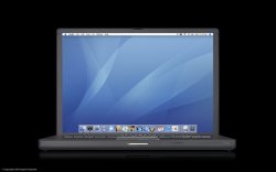
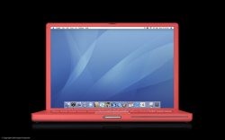
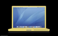
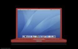
Quick mocks again, colors taken off the Ducati bike images in Photoshop. I tried to take the most 'natural' portion of the bike for a color sample, but lighting and things influenced a little....they should be close. The number in the image name shows the % opacity I used when filling OVER the current silver color. I did not blank them first as this was just quick and dirty....so comments away, what do you think?

Oh, I didn't grab off the silver bike because the only decent color sample looked very similar to the current PB with an ever so slightly different color. All these colors are screwy anyway online, look a lot different in PS so just take them as a quick sample of what could be.

All images are 800x500 small-cropped to not waste space on MR ;) The large ones give a little better feel, but also show how quick and dirty the operation was on my part....since I just wanded the fields and color-filled everything :rolleyes:
 

Attachments

  • pb15front_60black.jpg
    pb15front_60black.jpg
    52.2 KB · Views: 111
  • pb15front_60red.jpg
    pb15front_60red.jpg
    58.3 KB · Views: 94
  • pb15front_80yellow.jpg
    pb15front_80yellow.jpg
    57.9 KB · Views: 83
eVolcre said:
In fact, I'm going to go one step further and propose a tie in

*drumroll*

Ferrari has been done. I say APPLE team up with DUCATI. Similar image, more expensive, stylish, different "feel" and you *could* get a suzuki (like a DELL) that does the same thing cheaper but a Duke is a Duke. Pattern it after the Monster line. Tons of charisma. A MonsterBook. Or an M-Book. Which could even mean the pentium 'M' book. Works all around. And the range of colors suits everyone's needs. Ducati Red, Ducati Yellow, Matte Black, Gloss Black and Metallic Grey. Something for everyone. What say?

img2,701_7,742.jpg


img2,701_7,741.jpg


img2,701_7,744.jpg


The last one isn't a MONSTER but it's the same DUcati Yello

img2,575_7,296.jpg


Apple needs to hire me :cool:

OK I like Ducati..........but with apple :confused: :confused: :rolleyes:
 
Why not? We had U2 with IPOD? Acer with Ferrari, why not Ducati with Powerbooks? That was tongue in cheek but I can see a promotion like this working. Ok maybe not across the entire line but as a special one off like the U2 Ipod

efoto - the yellow and red look a little off. More pastel as opposed to the Ducati Colors. Know what i mean?

As an aside - check this guys mockup up. Looks interesting

https://forums.macrumors.com/threads/132514/
 
eVolcre said:
Why not? We had U2 with IPOD? Acer with Ferrari, why not Ducati with Powerbooks? That was tongue in cheek but I can see a promotion like this working. Ok maybe not across the entire line but as a special one off like the U2 Ipod

efoto - the yellow and red look a little off. More pastel as opposed to the Ducati Colors. Know what i mean?

As an aside - check this guys mockup up. Looks interesting

https://forums.macrumors.com/threads/132514/

The colors are more pastel based on the reason I gave, they were filled at the listed percentages in the filename because when applied at full opacity the things looked like retarded pc-plastic-laptops for toddlers, worse than the real pc laptops! :eek:
I see your point, but I am no where near the quality of PS to change the color, add custom lighting effects and a nice metallic-like gloss. Somebody else will have to tackle this one.
 
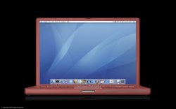
I'm in the minority here with my color choices but one last one. I LOVE this color. Not copper, not red, not orange. Rust?

06eclipsegame_landing.jpg
 
Done with the same poor quality so it is an easy comparison:
At 60 and 80 % opacity, you can tell the difference. 100% just looked horrid, no image detail because it is just a block fill.

Edit: I grabbed the color from the closest point as oriented (back right bumper) and a somewhat darker portion of it. The 60% looks much more pastel because 40% of the silver/grey current is showing through. As you like, but the darker one isn't that bad IMO, you might be on to something with this color.
 

Attachments

  • 15inch_60rust.jpg
    15inch_60rust.jpg
    56.4 KB · Views: 92
  • 15inch_80rust.jpg
    15inch_80rust.jpg
    56.6 KB · Views: 108
efoto said:
Done with the same poor quality so it is an easy comparison:
At 60 and 80 % opacity, you can tell the difference. 100% just looked horrid, no image detail because it is just a block fill.

Edit: I grabbed the color from the closest point as oriented (back right bumper) and a somewhat darker portion of it. The 60% looks much more pastel because 40% of the silver/grey current is showing through. As you like, but the darker one isn't that bad IMO, you might be on to something with this color.

It's hot man. I'm looking at my U2 Ipod right now and that color combination on a powerbook could really work. As I said, maybe as a special edition so that the more daring of us could go for the 'make a statement' colors. Lets see what they come up with :)
 
efoto said:
I wish people would stop sayings this....at least in clothing it is not true. The statement "pink is the new _____" was given at a fashion conference and in many popular magazines after that conference, saying that pink was the new white.
Ligthen up, honey. It was meant to be sarcastic.
 
eVolcre said:
It's hot man. I'm looking at my U2 Ipod right now and that color combination on a powerbook could really work. As I said, maybe as a special edition so that the more daring of us could go for the 'make a statement' colors. Lets see what they come up with :)
I like black. I like red. Just not together. To me, it looks too Dracula-like. The U2 iPod looks good, but, I wasn't sure why they chose those two colors to use together.
 
efoto said:
They were suggesting that men purchase lightly colored pastel pink shirts and they would function in the place of white under most any suit color and look stunning. .

I gotta try that! Could look pretty damn good.
 
Register on MacRumors! This sidebar will go away, and you'll see fewer ads.