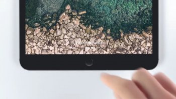
I mean look at this. Are they blind or what? With cluttered wallpaper like that the text is almost unreadable. One would think that they'll learn a lesson since iOS 7... but no. I wouldn't normally make this thread, but the fact they proudly showing it in the new iPad Pro ad is just mind boggling to me. I guess they are blind.. Or ignorant, tasteless, ego too big to acknowledge a mistake? I want to apologize to all of you, but it makes me seriously mad. I want Apple to make beautiful, yet functional software. The detail like this is an evidence it's not. What do you think?
Got a tip for us?
Let us know
Become a MacRumors Supporter for $50/year with no ads, ability to filter front page stories, and private forums.
Why Apple still sucks at software design??
- Thread starter Feyl
- Start date
-
- Tags
- design ios user interface
- Sort by reaction score
You are using an out of date browser. It may not display this or other websites correctly.
You should upgrade or use an alternative browser.
You should upgrade or use an alternative browser.

Strider64
macrumors 68000
Just my opinion from a design point of view it's probably on the lower end, but from a practical point-of-view it's better that it doesn't standout. I mean most people know what the home button does and for those who don't then it tells them what it does.
AppleB
macrumors 65816
You are seriously complaining about the wallpaper in a iPad ad?
chino-rican
macrumors regular
Still better than this:
https://gizmodo.com/delightful-google-bug-seemingly-gives-pixel-3-xls-an-ex-1830080828
https://gizmodo.com/delightful-google-bug-seemingly-gives-pixel-3-xls-an-ex-1830080828
Wallpaper isn’t the issue here.You are seriously complaining about the wallpaper in a iPad ad?
[doublepost=1540997530][/doublepost]
That’s a bug, not a design.
[doublepost=1540997592][/doublepost]
I don’t know about that, but it doesn’t make the design better, right?There is no text like this on the new iPads.
chino-rican
macrumors regular
It's still there on the non-pros, since they do have a home button.There is no text like this on the new iPads.
I think you're being AWFULLY hyperbolic when you say Apple "still sucks at software design." Yeah, they're not perfect but I'd argue they're still on top when it comes to software... and they certainly don't "suck" at it. Let's chill a bit.
BugeyeSTI
macrumors 604
Change the wallpaper, who uses the native wallpapers anyway? A lot of wallpapers compromise the text on he screen. If the text was black, the same would happon dark wallpapers. No way to make the text perfectly legible under every color and brightness combinationI mean look at this. Are they blind or what? With cluttered wallpaper like that the text is almost unreadable. One would think that they'll learn a lesson since iOS 7... but no. I wouldn't normally make this thread, but the fact they proudly showing it in the new iPad Pro ad is just mind boggling to me. I guess they are blind.. Or ignorant, tasteless, ego too big to acknowledge a mistake? I want to apologize to all of you, but it makes me seriously mad. I want Apple to make beautiful, yet functional software. The detail like this is an evidence it's not. What do you think?
Well, then why it’s still there?Just my opinion from a design point of view it's probably on the lower end, but from a practical point-of-view it's better that it doesn't standout. I mean most people know what the home button does and for those who don't then it tells them what it does.
You're absolutely right. But as I said it makes me emotional, so sorry about that. They're still on top that's for sure, but they should do much better.I think you're being AWFULLY hyperbolic when you say Apple "still sucks at software design." Yeah, they're not perfect but I'd argue they're still on top when it comes to software... and they certainly don't "suck" at it. Let's chill a bit.
[doublepost=1541019120][/doublepost]
It wasn't a problem untill iOS 7 came out.Change the wallpaper, who uses the native wallpapers anyway? A lot of wallpapers compromise the text on he screen. If the text was black, the same would happon dark wallpapers. No way to make the text perfectly legible under every color and brightness combination
Marshall73
macrumors 68030
The text looks difficult to read in that pic but in reality it is much clearer, more so due to parallax as well.
Prince Akeem
macrumors regular
The text looks difficult to read in that pic but in reality it is much clearer, more so due to parallax as well.
No it doesn't really look much better in reality.
In fact, the Topic Starter is right in the sense that for details like this, they undermine their own design philosophy to keep things clear, by desperately holding to their other "flat design" philosophy introduced in iOS 7.
Every UI designer knows that in order to make white text readable on a white/light background, you have to add a (very subtile) drop shadow below the text (if you don't want to mess with text borders). In case of the lock screen, they don't add this anymore (unlike in the past) because they want to keep everything flat. In an attempt to solve this, they added some tricks:
- When you select the lockscreen wallpaper it detects if it's light or dark, and automatically change the lockscreen text color to white or black. In the examlpe of the iPad wallpaper with sea and rocks (that came with iOS 11), you can see this light/dark detection fails and it renders the text white causing it to be unreadable. A very subtile dropshadow would have fixed this.
- Depending upon the the wallpaper overall lightness, iOS also decides to choose between dark or white font of the text below the launch icons on the home screen. This mechanism also fails in a lot of cases. In case of an in-between wallpaper/photo (containing very light parts but also darker), it simply darkens the whole photo when chosen as wallpaper, and keeps the textlabels white. In past iOS the readability of the launch icon text labels was clearly better, due to a subtile dropshadow on the text.
- [EDIT:] The time/date on the lockscreen however, actually DO have a (very subtile) dropshadow in iOS 12. This is visible when you add a background with a light/white top but dark bottom so the font-color is still white. But still strange that they don't seem to apply this on the text at the bottom, which is the subject of the design flaw in this topic...
Luckily Apple nowadays re-introduces subtile drop shadows on some places, to create some depth/UI clarity in iOS. But as long as the flat design continues to be the trending fashion for some more years, it won't go back to iOS 6 style design that had UI drop shadows all over the place.
Personally, I hope that in some years, they will evolve more and go in-between with the UI design. Some aspects of iOS 6 were nice, but a lot of aspects from modern iOS are great too. It actually improved greatly since the first flat (and buggy) UI attempt with iOS 7. Modern UI things like the realtime blur effects are great, while some old things like the glass/gloss effect on icons look hugely outdated now. Also adding a dark-mode to iOS will hugely improve eye strain for a lot of people, caused by the light UI design.
Last edited:
revmacian
macrumors 68000
I think that is a very good point. The first thing I focus on when unlocking an iOS device is the home button. Then I press it and unlock the device. I seriously had to focus on that text to see if it was really there on my iOS devices, usually I unlock the device without ever reading the instructional text.Just my opinion from a design point of view it's probably on the lower end, but from a practical point-of-view it's better that it doesn't standout. I mean most people know what the home button does and for those who don't then it tells them what it does.
So, don’t use it on the lockscreen! It’s not the default wallpaper on the lockscreen btw!I mean look at this. Are they blind or what? With cluttered wallpaper like that the text is almost unreadable. One would think that they'll learn a lesson since iOS 7... but no. I wouldn't normally make this thread, but the fact they proudly showing it in the new iPad Pro ad is just mind boggling to me. I guess they are blind.. Or ignorant, tasteless, ego too big to acknowledge a mistake? I want to apologize to all of you, but it makes me seriously mad. I want Apple to make beautiful, yet functional software. The detail like this is an evidence it's not. What do you think?
Prince Akeem
macrumors regular
I think that is a very good point. The first thing I focus on when unlocking an iOS device is the home button. Then I press it and unlock the device. I seriously had to focus on that text to see if it was really there on my iOS devices, usually I unlock the device without ever reading the instructional text.
So, don’t use it on the lockscreen! It’s not the default wallpaper on the lockscreen btw!
Telling you personally don't really need the instruction on the lockscreen, or to use a different wallpaper (than the one provided by Apple), is irrelevant. That is irrelevant to the design flaw as mentioned by topic starter and detailed in my post above.
If that's your solution to every problem, then you still have a problem.So, don’t use it on the lockscreen! It’s not the default wallpaper on the lockscreen btw!
Marshall73
macrumors 68030
StellarVixen
macrumors 68040
Your criticism is invalid, wallpaper is customizable, if you find that font and icons do not contrast well against the background, you can change it.
It would be horrible if you couldn't change the wallpaper.
It would be horrible if you couldn't change the wallpaper.
AppleFan91
macrumors 68000
Well, then why it’s still there?
You're absolutely right. But as I said it makes me emotional, so sorry about that. They're still on top that's for sure, but they should do much better.
Dude...
vrflyer
macrumors 6502
You're absolutely right. But as I said it makes me emotional, so sorry about that..
Wow! Hope you are not married or have a significant other. You could have a bigger problem right there.
gwhizkids
macrumors G5
Why do I even open threads like this?