Become a MacRumors Supporter for $50/year with no ads, ability to filter front page stories, and private forums.
It's really not that hard ... navigate to the files in finder, copy the originals to your desktop, drop the new ones in, relaunch finder and you should see them ...
 
I think OS X looks the best as it ever has right now with Leopard. Snow Leopard, if they change any parts of the GUI at all, will likely look even better.

10.0 wowed me back in the day, but it's comparatively ugly to me now. Same goes for the original iMac compared to todays model.
 
Bah, the current look of OSX sure is depressing, looks like a Linux machine now. Dull and grey looking, who wants to stare at that all day? Aqua was a great idea, I too wish we could go back.
 
Hey at least be thankful we don't have a blue bar with a green button and yellow folders! :D

To those who say the new UI fits more into the enterprise world, well, the enterprise world uses exactly that, a blue bar with a green button and yellow folders! :eek:

Face it, enterprise look = fisher price look! :)
 
i really like the way osx is headed looks wise.

however they DO need to spend some time merging all their different themes and styles into one more consistant look.
 
I personally like the matte grey of leopard, but I'm another graphite user.

The pinstripes and brush metal of the past, whilst nice at the time, dated really quickly. I'm sure the sweetie buttons and bars are due to go soon.
 
It was the Aqua look that originally (a few years ago) made me interested in Macs to begin with...I wasn't too keen on the light blue pinstripes in the menu, but I would have liked the option to keep the blue Apple up top.

I don't understand why Apple couldn't just make like 3 or 4 themes (they already have 2) for people who want a more pro look, while giving others the choice of having their full-on Aqua look too. If Windows can offer theme support, surely Apple could do the same :)
 
Bah, the current look of OSX sure is depressing, looks like a Linux machine now. Dull and grey looking, who wants to stare at that all day? Aqua was a great idea, I too wish we could go back.
You aren't suppose to be staring at the GUI all day. You're suppose to be looking at the apps that are open or what's in them.

After using the iTunes scrollbars for at least 6 months now I can honestly say that I don't even see them anymore. They blend in and don't get in my way. I believe this is the way Apple is going with the GUI. Even the iPhone's scrollbars don't even show up until you start scrolling. Now that's what I'm talking about. I'm mean, why do we even have scrollbars anymore when everyone has a mouse wheel, scrollball or uses two finger scrolling?
 
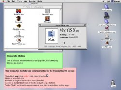
one day we'll get back to this

one day ..
macosx102.jpg

Hey, Vista ripped-off the transparency from a very old version of OS X! :eek: (Sorry for image quoting, but its needed coz the image is on the last page and this post makes no sense without it.)

Anyway, I like the Leopard looks better than old OS X, wayyy more modern.
 
I did like Aqua back in the day but now I like the Leopard/iTunes 7 look. :)
I hope the Leopard/iTunes 7 look stays.
 
Hang on, now... I thought you said it would be system-wide. It's only for the Finder!

I want it in Safari, iChat, and everything else that uses scroll bars!

Edit: Never mind. I just needed to restart them. Man, I'm a dooftard...
 
Hang on, now... I thought you said it would be system-wide. It's only for the Finder!

I want it in Safari, iChat, and everything else that uses scroll bars!

Edit: Never mind. I just needed to restart them. Man, I'm a dooftard...

Didnt work here...
 
I think this metallic, matte, grey style will endure. Sorry! I'm quite fond of it, and I think it looks perfect on the Air's screen, and good elsewhere. I think Apple like it too, and there are substantial rumours saying the new MacBook will join the aluminium crew!

That said, it will inevitably change someday, as everything does so if it bothers you that much don't worry! It's unlikely you'll have to wait more than 5 years before something else is default haha.
Alternatively get a GUI mod.
 
You're all crazy. Leopard looks AMAZING! Everything else looks like crap.
 
i much prefer the streamlined look of Leopard to the pinstripes of Jaguar. those were distracting and an eyesore imo.
 
If you go into the Time Machine preferences that is what I feel Apple should do to the GUI. (Although probably not the giant slider, small ones would be okay though.) Those buttons would fit perfectly with the new title bar style and the iTunes Scroll bars. Hopefully it'll happen in Snow Leopard. It's not that big of a change but would make a world of difference.
 
Register on MacRumors! This sidebar will go away, and you'll see fewer ads.