Graph improvements feature request (duration)
Observations
Today the graphs appear to present their metric from the beginning of the activity until current.It's useful to get an overview from the beginning, but the utility is limited in multiple ways, mainly:
- the horizontal axis scale is a constantly changing duration
- when activities gets longer, recent changes becomes impossible to view
- low or high values, from peaks of intensity or intervals makes automatic vertical axis scaling ineffective

Use cases for graphs
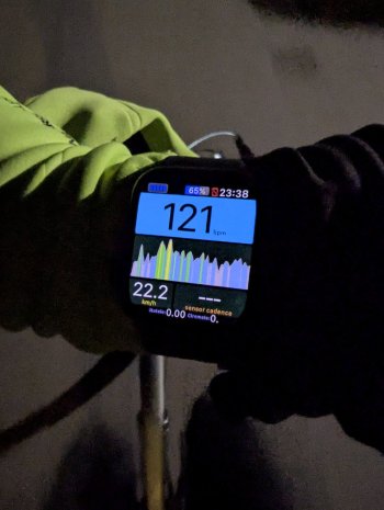
The heart rate zones graph (called HR Intensity Graph in WOD) is my favorite tool for pacing and regulating intensity, especially when combined with power value or power graph.The heart rate zone graph is my main tool on easy Zone 1 or Zone 2 runs to stay at the target intensity. It's an effective way to calibrate perceived exertion to the metabolic rate, and remain at a desired intensity without relying on annoying alerts.
I also use the heart rate zone graph extensively when cycling as means of transportation in order to not get carried away or sweaty while remaining efficient (for me: in the 120-130 bpm range)
Looking at the heart rate value is okay as a snapshot, but the heart rate can go back down quickly when coasting as well as up fast on a short climb. Glancing at a graph gives a much better overview of what's going on.
And this is just for heart rate, I'm sure there's just as much use for other metrics.
Feature suggestion
Configurable time scale
X-axis is time, and WOD would allow to select which amount of time is displayed with these options:- Current interval (variable x-axis scale: shows only the current interval values)
- 30 seconds
- 1 minute
- 2 minutes
- 3 minutes
- 4 minutes
- 5 minutes
- 10 minutes
- 15 minutes
- 20 minutes
- 30 minutes
- 1 hour
- 2 hours
- 3 hours
- 4 hours
- Full duration (variable x-axis scale: shows all values from beginning to current)
Configuration options
- Graph duration per activity type
- Graph duration can be configured on the watch itself while recording an activity
- Toggle to enable "Current Interval" during workouts
Colored zone graphs for Power, Pace and Speed
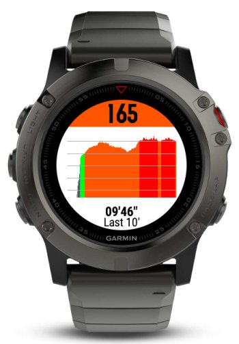
A graph without scale or zones is not very useful, but a graph with zones is the most effective to get the info desired at a glance.Like the HR Intensity Graph colored according to the zones definition, Power, Pace and Speed graphs will get a lot more useful with colors.
Min / Max / AVG values on the graph
Dynamically updated values overlayed on top of the graph to give a sense of what the min, max and average values for the current graph visualization are.It's a more informative alternative to showing a legend on the x-axis: the user who wants a graph typically uses it to target remaining within a range, and would like to know what the average is for the duration displayed.
Optional display of the current value
A display of the current value in the bottom/left/top/right/center position, on the same slot.This enables having a very large graph that's the easiest to glance at as well as the value itself - in an optimized layout for both.
Inspiration and acknowledgements
- Heart Rate Zone Chart by Jorgillu on Connect IQ
- effective layout
- horizontal grid lines
- configurable duration
- Heart Rate Zone Graph [hHRZone] by hSoftware on Connect IQ
- configurable min/max/current functionality

Last edited:

