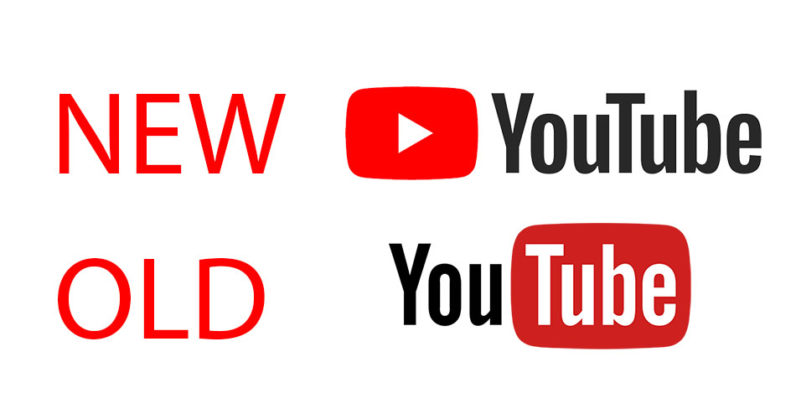
Where is the dark mode option in the app? I can't find it. Is it a Red-only feature?
It’s only on the desktop site.
Where is the dark mode option in the app? I can't find it. Is it a Red-only feature?
Notice the same thingIn the App Store, the new icon is not shown as in the home screen. Wtf?
Their smart TV app absolutely sucks too. It never pushes the right resolution for your internet connection, nor allows you to choose quality settings. Buffering for days on a solid wireless network.I just hope they update the appletv YouTube app, it’s absolutely garbage.
I'm on gigabit internet and it still does that.Their smart TV app absolutely sucks too. It never pushes the right resolution for your internet connection, nor allows you to choose quality settings. Buffering for days on a solid wireless network.
Their smart TV app absolutely sucks too. It never pushes the right resolution for your internet connection, nor allows you to choose quality settings. Buffering for days on a solid wireless network.
We used to be able to play videos all the time, and it worked without an issue. Some number of months ago they must’ve released an update, and it just crippled everything.That too! All their TV apps are all garbage, I have more than capable of an internet connection to handle 4K and it always plays 480p or 1080p and then by the end of a video it’ll play in 4K
Most likely, many will ask: why is it called a tube?In five years the company will be rebranded with a new name, with the "tube" removed.
Same goes for Google's main logo when it was updated a couple years back quite honestly. Google's designers know how to take an iconic logo and replace it with something no longer iconic and not even as nice to look at.Old logo is nicer.


I can hold a physical Apple logo in my hands today if I take one bite...So, how many you tubers have been banned today because they WrongThinked?
[doublepost=1504024264][/doublepost]
That's what they want.
Take over the ISO/IEC 18035 symbol for the play function.
Sooner or later, you'll see kids saying "this old BluRay player has the YouTube button"
I mean... I literally said I understand why they wanted to change it. My critique was of the new logo.Then you should understand why the change.
The old logo, and the name YouTube relate to a CRT TV or Monitor, which are both outdated.
The new logo, representing a Play button, focus on the fact that you can play videos. The logo completely disconnects from the "tube" concept, which may be old school for the new generations.
Regardless, I don't use their app at all.
You are right; in a world with 32-bit color (and higher) displays, we all would have expected a more impressive logo...I mean... I literally said I understand why they wanted to change it. My critique was of the new logo.

