Become a MacRumors Supporter for $50/year with no ads, ability to filter front page stories, and private forums.
And now that they've changed it, now YOU'RE the one who's whining about it. How ironic. People who were complaining about it before had at least as legitimate a right to complain as you do now. Please take this as a lesson that just because someone complains doesn't mean they're a whiner. If the complaint is legitimate then it's not whining.

Well there is a major difference between having a legitimate complaint and whining. There were hardly any legitimate complaints about the translucent menus.
Most people just say the same thing they do about the dock, "It's too pretty, I don't need reflections, the dock is a mess, I don't care for all these translucent menus. Hardly any REAL reasons to back up their complaints other than mentioning that text is too hard to see and it's not hard.
An option should have been made like the menu bar.
 
I think what people need to get out of this thread is that you can't satisfy everyone, and you shouldn't try to. Before, people complained the menus were too transparent, now they are complaining they are too opaque. Apple can't and shouldn't try to cater everyone with options that only add bloat to the OS. Yes, it'd be nice if they were there, but they just won't be. Wait for ShapeShifter or something similar to be built for Leopard.
 
I think what people need to get out of this thread is that you can't satisfy everyone, and you shouldn't try to. Before, people complained the menus were too transparent, now they are complaining they are too opaque. Apple can't and shouldn't try to cater everyone with options that only add bloat to the OS. Yes, it'd be nice if they were there, but they just won't be. Wait for ShapeShifter or something similar to be built for Leopard.

I'd always agreed with this sentiment before, but the fact that Apple gave into the people who were complaining about the translucent menu bar by adding an option to turn it on and off kind of goes against everything they've done before, and--if nothing else--means they should, at the very least, be consistent with the translucency of the menus themselves. That should be self-evident. Menus that outright clash with the menu bar is downright bad design, and should be rectified as soon as possible. Even if they made the menu bar itself opaque for everyone, that would at least be consistent. I wouldn't like it, but it'd be consistent.
 
Are you using a desktop Mac or a different screen? I'm on a MacBook. The only thing I can imagine is that perhaps the translucency shows up differently on different screens, but I can't see any of your background behind the menu in that in that picture. (...)

it's a matter of screen calibration. by default all screens need to be calibrated. most people won't do that 'cause they don't know how to do it, or think they don't need or even imagine such thing. also, they can simply don't need or even can't tell the difference.

the pictures you've posted here are useless, 'cause each one of us will see it in a different way. so, by reducing the transparency apple made a safe move and you guys must understand that. 'cause by default sometimes the menus were unreadable in some screens. of course it's inconsistent with the rest, no doubt. but apple wants to have some control on the interface properties. i don't think we'll ever see a slider to control the opacity, 'cause this would make the user change the opacity perhaps every background change, at least for the menu bar. and this isn't very logical. maybe an on/off global "transparency", for an overall unified look, but watch out that transparency, apple! :p

but i agree, this UI is still bit messy, but hey, it's more unified than tiger! ;) thank god we are not talking about leopard interface small glitches so we would be here all month, or perhaps even more :p
 
There were hardly any legitimate complaints about the translucent menus.


Are you kidding? As someone who deals directly with issues of readability and legibility every day, the transparent menus are a complete backward step for usability on a general level.

There's no two ways about it and including them in the first place was a complete sop to the 'shiny' crowd who like the way things look, rather than the way things work.

When was the last time you enjoyed a book or magazine that had semi-transparent pages?

I knew someday we'd agree on something. :D
 
Are you using a desktop Mac or a different screen? I'm on a MacBook. The only thing I can imagine is that perhaps the translucency shows up differently on different screens, but I can't see any of your background behind the menu in that in that picture.
You're saying that in the picture posted here that you can't see the orange-ish building and windows through the drop-down menu? They are subdued and blurred, of course, but plainly visible to me.

I'm using a 15" MBP.

In your example, it's not as clear as the browser window isn't as high-contrast. But I see the color variations of the window beneath, the muddled text of the address bar, and such. It's that underlying variation of contrast and small details that makes it harder to read. It's like trying to a double-side document held up to a light. The back side printing bleeds through and confuses the text of interest.
 
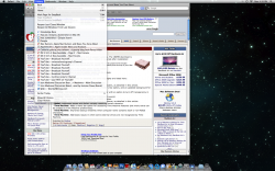
Drop down menu's BEFORE the update (on co-workers MacBook)
 

Attachments

  • BeforeUpdate.png
    BeforeUpdate.png
    1,011.9 KB · Views: 217
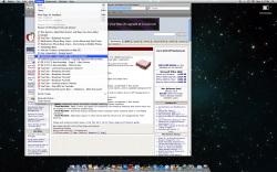
And now menu's after the update - I liked the user experience better before as many of you do. When Steve first showed Leopard weren't they even more transparent?
 

Attachments

  • AfterUpdate.png
    AfterUpdate.png
    1.1 MB · Views: 204
Yes, yes, I know, but i have evidence. I am on 10.5.2. In .1, there was transparency, but in 10.5.2, Apple did not completely diminish transparency, there is still VERY little transparency, almost unoticeable, But I have seen the address bar through the history menu, not much, but more importantly, I can see my wallpaper through the Apple menu, and its surprisingly easy, here is a screenshot:

Picture1-19.png


See it? I included some of the wallpaper in it.

Also, stand up and look down at the screen, your displays viewing angle will mess up the colors, making it easier to see through!!!

We know there is some transparency but, the fact is... now it's so little that the menus look very very white and stick out like a sore thumb.
 
My drop down menu's BEFORE the update (on co-workers MacBook)

And now menu's after the update - I liked the user experience better before as many of you do. When Steve first showed Leopard weren't they even more transparent?

Yes, quite a good example :)

The first is very pleasing to the eye, provides a more seamless experience, and is completely readable.

The second one doesn't work as well for me. :(
 
Are you kidding? As someone who deals directly with issues of readability and legibility every day, the transparent menus are a complete backward step for usability on a general level.

I second that ! I am really glad that the transperancy is gone for good. Both on the menu bar and everywhere else. Leopard is now much more fun to use. When I first installed it it really felt like a step down from Tiger.
 
Are you kidding? As someone who deals directly with issues of readability and legibility every day, the transparent menus are a complete backward step for usability on a general level.

There's no two ways about it and including them in the first place was a complete sop to the 'shiny' crowd who like the way things look, rather than the way things work.


When was the last time you enjoyed a book or magazine that had semi-transparent pages?

Well what about Windows Vista, the start menu is very translucent and MS didn't compensate properly for the text to be easily readable but you don't see the Windows fanboys complaining.
 
I second that ! I am really glad that the transperancy is gone for good. Both on the menu bar and everywhere else. Leopard is know much more fun to use. When I first installed it it really felt like a step down from Tiger.

I don't really understand this mentality of being glad it's gone for everyone (in the drop-down menus, at least, thank god I still have my translucent menu bar!). How come those concerned with the alleged better "usability" of the nearly opaque versions don't even want those of us who liked it to be able to use it, even though we had no issues with the legibility? Without them I feel like it's a step down from Tiger, not the other way around, and I find it much less "fun" now...

I wish someone could at least find a Terminal command :(

Well - of course I can understand that it would be better instead of changing features giving the user more flexablility. I am glad for me because I like it better the way it is now but I understand that not everyone feels the same about it.
 
I don't really understand this mentality of being glad it's gone for everyone (in the drop-down menus, at least, thank god I still have my translucent menu bar!). How come those concerned with the alleged better "usability" of the nearly opaque versions don't even want those of us who liked it to be able to use it, even though we had no issues with the legibility? Without them I feel like it's a step down from Tiger, not the other way around, and I find it much less "fun" now...

I wish someone could at least find a Terminal command :(

Well technically you can "fix" it for yourself. It's just more difficult than a terminal command. ;)
 
Here's a great example. This is a really horrible GUI design choice. I really thought there was a bug in my video when I first looked at the screen.

If you think this is "less distracting" I just don't know what to say. I think it's a usability nightmare.
 

Attachments

  • Picture-2.jpg
    Picture-2.jpg
    61 KB · Views: 127
Here's a great example. This is a really horrible GUI design choice. I really thought there was a bug in my video when I first looked at the screen.

If you think this is "less distracting" I just don't know what to say. I think it's a usability nightmare.

I thought it looked quite strange, too, at first, because the buttons seemed far too muted against the dialog screen, but then I realized they were like that because you were actively exporting the movie, so they were grayed out. I opened my iMovie and tried to export something, and the buttons were bright and obvious, and everything looked fine. But yet, the dulling of the buttons when exporting makes it look kind of odd. Otherwise, though, everything looks fine to me.
 
I thought it looked quite strange, too, at first, because the buttons seemed far too muted against the dialog screen, but then I realized they were like that because you were actively exporting the movie, so they were grayed out. I opened my iMovie and tried to export something, and the buttons were bright and obvious, and everything looked fine. But yet, the dulling of the buttons when exporting makes it look kind of odd. Otherwise, though, everything looks fine to me.

Being able to see the images in the background provides zero enhancement. Maybe you just want a darker shade of gray for your dropdowns so your less distracted. Though I have no idea how a menu could be distracting, you're only dropping it down when you want to view it and it should be the focus of the screen, not sharing focus with the crap behind it. Bleed-through for purely aesthetic effect is counter productive and a horrible design.
 
Being able to see the images in the background provides zero enhancement. Maybe you just want a darker shade of gray for your dropdowns so your less distracted. Though I have no idea how a menu could be distracting, you're only dropping it down when you want to view it and it should be the focus of the screen, not sharing focus with the crap behind it. Bleed-through for purely aesthetic effect is counter productive and a horrible design.

I was browsing another mac forum when someone else brought up his hatred of the opaque menus and his reasoning made me realize another reason I find the translucent menus so much better. It's because--the way I see it--is that menus shouldn't be the focus of the screen. Rather, they should take as little focus from the application you're using as possible, because they're a tool of that application, part of it, and shouldn't distract one from it. The poster complained how he gained productivity from being able to "look through" the menu to the application to remind him of what he was doing. Maybe I'm just absent-minded, but sometimes when I click on the menu, its presence jolts me from remembering what I originally wanted to do, and so I either have to click back to the application to see what I was doing, or look around the menus to find the command that fits what I wanted. The translucency of the menus made it a much more "seamless" part of the application that didn't call attention to itself. Rather than being the focus of the screen, it was merely a tool that didn't take my attention away from what I was working on. I know that kind of thing may not apply to everyone, but it's how the translucency isn't always just for "aesthetic effect" and how it can actually increase productivity.

But I guess it's just my fault for being absent-minded, huh? Or maybe you think me and the other guy are lying?

Fair enough. I'm not sure how a half visible view of the small section of the screen that is a menu is helping you, but I'll take your word for it. Perhaps you should learn shortcuts or something so you can't forget so easily. Guess that won't work either since you have a bad memory you won't be able to remember shortcuts either. Well, I still think the vast majority of users find a dropdown menu to be the focus of what they are doing. My condolences that this is not true for you.

Posted in the other thread:

Has it occurred to everyone that everyone has DIFFERENT tastes?

Just because YOU have a problem with it... doesn't mean we ALL do. I never ever, ever suffered from translucent menus and my ability to read them was always fine. It always looked nice to be able to see some color show through the menus and with the blur effect, it softened the harshness and made it even more usable in my opinion. By blurring the background behind the menu, along with the translucency, it was very easy to tell that the menu was in the foreground and there was focus brought to it. Now they just look white to me... just plain jane white as if I'm using OS 7.5. It just looks bad in my opinion. It no longer looks modern... it just looks plain. I'm the kind of guy who likes subtlety (I use scale instead of genie and I turned off Window animations) but, for some reason, I really liked the previous menus from 10.5.0-10.5.1 ... they just worked.

Now, because a few people were bitching that they couldn't read their stupid drop down menus because they're half blind, now we all have to suffer with the new change... and as far as this thread is concerned... there's still a lot of people who liked the better LOOKING menus and never had a problem with usability.

It's not a matter of being half blind, but nice job seeming like a bit of a lunatic. Readability always trumps "better looking". Though if you think my example above is better looking, personally I discount your opinion completely. That looks more like a bug than a feature.
 
Fair enough. I'm not sure how a half visible view of the small section of the screen that is a menu is helping you, but I'll take your word for it. Perhaps you should learn shortcuts or something so you can't forget so easily. Guess that won't work either since you have a bad memory you won't be able to remember shortcuts either. Well, I still think the vast majority of users find a dropdown menu to be the focus of what they are doing. My condolences that this is not true for you.

Actually, I love keyboard shortcuts. I don't have to think about it to remember them, my fingers do that once I use them enough, so that's not an issue. I use keyboard shortcuts for just about everything I can, so I only have to use the menu bar when I really, really need to. I like keyboard shortcuts because they're very quick and don't distract or slow me down from what I'm doing. My fingers know where they're going and there's nothing extra on the screen, so I don't have to think about it. Thanks for taking my word for it, by the way.
 
Register on MacRumors! This sidebar will go away, and you'll see fewer ads.