Become a MacRumors Supporter for $50/year with no ads, ability to filter front page stories, and private forums.
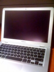
Thanks for posting! What a great looking computer the matte screen version is! If they made that in a 15", I'd buy one in a heartbeat!

Damo

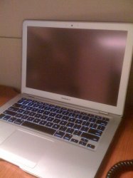
Ditto!. The glossy MBP will be on ebay so fast, it would probably be not packed properly back in the box. Just hate the stupid Black bazel. Silver bezel is way natural and matte rules.

It is why I still hang on to the PB 1.67 as it has 1440X960 glorious matte machine that none of the new MBP15 can match. Thats 86,400 pixels more than standard 1440X900 people!.:eek:
 
Matte looks terrible IMO. The bezel is a distraction and takes my attention away from the screen.
 
Matte looks terrible IMO. The bezel is a distraction and takes my attention away from the screen.

its teeeerrible. its sooo distracting. i can only stare at the distracting gray bezel. i cant work because my attention keeps getting drawn away from the screen to the distracting gray bezel. why would they do this?

the black is so much less distracting and im 300% less distracted.
 
to be honest, I think the black bezel looks better hardware wise. I love the illusion that the screen goes all the way to the edge. I'm not sure if it is a worthy sacrifice for anti glare though. Tough decisions! well not really since I'm not in the market for a 17"
 
exactly! i thought it was a bit of left over rubber around the edge :p its not attractive and it would look better with the glossy 17" border around the matte screen, that said i doubt anyone lucky enough to own one of these machines is going to be complaining about the rubber bezel :p

It's clearly Apple being lazy and not really thinking this design through. The issue of the black rubber seal could have been easily resolved by switching it to a light grey seal like on the MacBook Air.

I will be buying the 15" if it ever comes out in matte.

And to all you guys saying that the silver bezel looks dated, I fire back that the silver bezel is classic while the glossy black is trendy. In 10 or 20 years when I show folks pictures of me using the unibody MBP, at least I won't be mortified that a I was using a MacBook Pro that hideous looking and was considered cool at the time. :D (I kid... kinda)
 
its teeeerrible. its sooo distracting. i can only stare at the distracting gray bezel. i cant work because my attention keeps getting drawn away from the screen to the distracting gray bezel. why would they do this?

the black is so much less distracting and im 300% less distracted.

Aww, did I hurt your feelings?
 
enjoy your looooong tempting wait :p

I wasn't planning on buying a new laptop until around November or December of this year at the earliest, so Apple's got plenty of time to shape up and get matte screens, mobile Nehalems, and Snow Leopard onto their 15" machines. Kind of a 4th anniversary of Core Duo Macs present for myself. :cool:
 
I wasn't planning on buying a new laptop until around November or December of this year at the earliest, so Apple's got plenty of time to shape up and get matte screens, mobile Nehalems, and Snow Leopard onto their 15" machines. Kind of a 4th anniversary of Core Duo Macs present for myself. :cool:

I would wait until May 2010 in that case.
 
Thanks for posting. I presume the screens weren't calibrated, though, which appears to greatly favor the anti-glare screen. I'd prefer, by the way, a black bezel with an anti-glare screen.

For my money, TechRestore's service is not at all worthwhile.

Yes, I don't think they were calibrated the same. The matte model looks a bit bluish in color but I didn't want to make too many changes since there were so many people in line to see the Macbook Pro. I do think the matte version looks better overall. I like the silver bezel and it doesn't take away the focus on the screen like the glossy bezel does. They were both very cool to the touch.
 
The black keyboard looks out of place on the matte mbp, they should have made it silver. I think the black bazel and black keyboard combo looks much better, or maybe I just got used to mine... In any case, thanks for the comparison pics, I'm satisfied with my glossy mbp.
 
The overall look of the glossy is nice, the black keyboard and screen blend well. The matte display with the black keyboard is a little "off" to me, but that is only going by the picture. Im torn though. Never used a glossy display so naturally I would prefer to stick to a matte, but appearance wise I am leaning towards the glossy. :confused:
 
I prefer the black bezel around the glossy screen - looks more stylish. The silver bezel looks dated in comparison.

If the old Pro had a black bezel then you'd be saying the opposite.

I think the new one could do with a silver keyboard, and removal of all of the black from the system. Then we'd be on to an awesome product design.
 
Originally I didn't like the black bezel at all on the 15" because it looked too wide but the 17" looks much slimmer.
I also personally don't mind the glossy but my laptop primarily stays in my office where I can control the light.

Is the Matte the same screen inside as the glossy?
 
I have to say, I really like the matte version with the grey bezel (and even the thin black gasket around the edge). It has a kind of no-nonsense, utilitarian look about it.

The glossy (glassy, really) version seems too shiny and reminds me of a flat-panel HDTV or some other piece of entertainment consumer electronics that one would see at Best Buy.
 
I'm not a fan of glossy but I like the black bezel around the screen compared to the matte alum - even though I will probably be getting the matte.
 
I prefer to use an anti-glare film instead because I can always revert back. I used Power Support Anti-Glare film for $30 on my Air and it looks perfect. It's a bit tricky to install because you don't want dust between the screen & film. See my post on the Air forum for details.

The images on the screen look a bit sharper too.

attachment.php

attachment.php

attachment.php
powerbook_antiglare.jpg
 

Attachments

  • MBA 1.jpg
    MBA 1.jpg
    141.9 KB · Views: 123
  • MBA 2.jpg
    MBA 2.jpg
    114.3 KB · Views: 134
  • MBA 3.jpg
    MBA 3.jpg
    117.3 KB · Views: 127
So.. Did it seem any lighter? I wonder how much weight the glass adds.

There was no difference. The matte was the same weight as the glossy. I asked the Apple guys how is it possible that the matte be the same weight? They said adding the grey enclosure bezel for the screen makes it the same weight as the glossy.
 
I prefer the black bezel - I hate having a silver border.

But thing is, I'm torn. The silver looks more sleek and professional - looks the business. But the black border blends with the dark imagery or whatever is on the screen, eliminating a border.
 
I prefer the black bezel - I hate having a silver border.

But thing is, I'm torn. The silver looks more sleek and professional - looks the business. But the black border blends with the dark imagery or whatever is on the screen, eliminating a border.

Agree! The silver bezel looks OLD.
 
It looks ok if you're not picky about details. It DOES look like something got removed with the dip (which is what it is). Clearly it was a half-a$$ed job. Should have been a completely new cover.

Why is apple charging 50 dollars more for one less component. Shouldn't the glossy but more expensive with the extra glass. You don't pay for a glass for the matte.
 
Register on MacRumors! This sidebar will go away, and you'll see fewer ads.