Become a MacRumors Supporter for $50/year with no ads, ability to filter front page stories, and private forums.
Status
Not open for further replies.
Liverpool have signed former Standard Liege striker Milan Jovanovic on a free transfer. Milan's quoted as saying:
I opted to sign for Liverpool because they're one of the biggest teams in Europe - definitely in the top 10

Surely a top 10 team would be playing Champions League football this coming season? ;)
 
Surely a top 10 team would be playing Champions League football this coming season? ;)

Yes, yes, thanks for the reminder. :eek:

It's certainly not setting the world alight....a 29 year-old striker who had a few good seasons in the Belgian League. He certainly won't average .5 goals per match in the Prem. He's more likely to be the next Ryan Babel.
 
I'd like to award West Brom the 'ugliest shirt sponsor logo' award:

west-brom-albion-10-11-umbro-away-kit-a.jpg


west-brom-albion-10-11-umbro-home-kit.jpg
 
The sponsor does indeed spoil what is otherwise a very fine shirt - as is Sunderland's polyester rag which was unveiled a day or two ago and follows a very similar design.

Personally, I think they both look great and it's a frustrating that we're no longer supplied by Umbro – that West Brom home shirt would look fantastic in black and amber. But an Adidas teamwear template it is for us.

In my humble opinion, of all the main manufacturers Umbro are putting the best stuff out at the moment. I'm a well jealous Jaffa. :(
 
That is a nice design - but MY GOODNESS that sponsor logo is hideous!! :eek:

Even if I were a West Brom supporter I would not buy that shirt due to the sponsor logos. Yuck, yuck, yuck.
 
Even if I were a West Brom supporter I would not buy that shirt due to the sponsor logos. Yuck, yuck, yuck.
Well, they've been spoilt for the past couple of seasons by not having any sponsor on their replica shirts at all – meaning that this monstrosity of a logo is going to come as even more of a shock to any unsuspecting Baggie.

The house logo looks a bit like an upwardly pointing arrow – given West Brom's reputation as a bit of a yo-yo club a downwardly pointing one might be a bit more appropriate for the upcoming Premier League season. ;)
 
The house logo looks a bit like an upwardly pointing arrow – given West Brom's reputation as a bit of a yo-yo club a downwardly pointing one might be a bit more appropriate for the upcoming Premier League season. ;)

I can't understand why they don't just get Tesco as their sponsor. ;)

_42063312_tesco203pa.jpg


It's an ongoing joke between our fans. This is what the Baggies fans left behind last time they visited the Molineux. :D

seatsalbion.jpg
 
I'd like to award West Brom the 'ugliest shirt sponsor logo' award:
west-brom-albion-10-11-umbro-away-kit-a.jpg
Yeah that is unattractive to say the least.

The sponsor does indeed spoil what is otherwise a very fine shirt - as is Sunderland's polyester rag which was unveiled a day or two ago and follows a very similar design.

Personally, I think they both look great and it's a frustrating that we're no longer supplied by Umbro – that West Brom home shirt would look fantastic in black and amber. But an Adidas teamwear template it is for us.

In my humble opinion, of all the main manufacturers Umbro are putting the best stuff out at the moment. I'm a well jealous Jaffa. :(
I like some of the umbro stuff but that collar has to go!

That pic doesn't do the away kit justice look here:
west-brom-albion-10-11-umbro-away-kit-e.jpg

i like what they've done with the badge.
 
Here’s ours for the new season. It’s the best shirt we have ever had IMO


rangers-10-11-umbro-home-kit-3.jpg
 
Thing is, while those West Brom offerings are both nice shirts — sponsor aside — Umbro haven't learnt their lesson from our shirts from the 2008-2009 season. Our black and amber stripes and our dark grey away kit both clashed with Newcastle, if you remember we had to borrow Geordie shorts and socks on our first trip to St James' Park, and press into service a hastily recommissioned all-white away kit from the previous season on our second trip to Tyneside. West Brom are going to have the same problem this season, one would expect.

Anyway, our new home kit was unveiled earlier. As suspected it's the basic Adidas template I anticipated, and it looks horrendous. Bloody horrendous, in fact.

I'll post some pics later.

EDIT: A classy effort Troon, the only black mark is I'm not convinced by the look of the sponsor.

Gah! You're just rubbing my nose in it with these nice Umbro shirts. :eek:


It’s not the best looking sponsor i know. But there isn’t much can be done about that.

I loved the England training kit for the WC. The blue top you saw the player wear is the dogs bollocks
 
I loved the England training kit for the WC. The blue top you saw the player wear is the dogs bollocks
I know the one you mean, and it's a nice bit of work. I was tempted to treat myself to one a couple of weeks back but decided to wait on for the inevitable sports shop sale on England gear after our inevitable elimination.

I just checked it out of the official website, you are right, hideous.
Gauging the opinion of City supporters in person and online, it looks like we're not alone in thinking this. :eek:

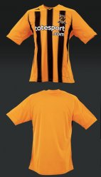
I promised some pictures and further thoughts earlier – so, here's the polyester rag we'll be donning at the KC next season...

Homeshirt_2010.jpg

I predicted a month back that we'd have the same template as Stoke City's new kit, and unfortunately that's the case. It's a basic teamwear template that you or I could buy unbadged straight out of the Adidas catalogue if we were equipping a five-a-side team or something.

Two complaints involve the stripes. The front panel features stripes that are edged with dashed lines, making them look fuzzy at distance. It's totally needless, looks daft, and spoils the effect of stripes which should really be nice and bold.

Secondly, the back is totally plain with not a stripe in sight. The manufacturers will tell you that this is to ensure that the number (and player's name, if appropriate) are clearly visible. Now, I concede that they have a bit of a point with teams like Newcastle United – there's a huge contrast between their black and white stripes, meaning that dark numbers clash with the black and light ones with the white. However, white numbers can be seen perfectly well on our black and amber stripes, so there's no reason why we can't take this route.

Another issue can be seen on the below picture – which also gives us a closer view of those bloody stripes.

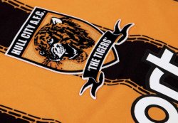
Homeshirt_2010_Crest.jpg

The Tiger's head on our crest isn't embroidered – it's screenprinted onto a bit of felt which is then stuck onto the shield. The same technique is used on the crest on the away kit which I saw first hand earlier today, and in my opinion it just looks nasty.

A plus point is that we've managed to persuade Totesport that a white version of the logo looks better on a striped background, but that aside the new shirt leaves me cold.

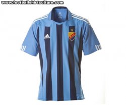
Now, as I mentioned this template is being used elsewhere – Stoke City have it, and Plymouth Argyle have unveiled their two-tone green version today as well. I have seen a couple of variants that – while not classic shirts – look a lot better than our effort. Swedish oven-lovers Djurgården are currently using this template with a modified collar, while Steve McClaren's new charges Wolfsburg will also be sporting the shirt next season...

Djurgardens.jpgwolfsburg.jpg

I think both look nicer than the new City shirt, and a huge reason for this is the use of proper, solid stripes – none of this dashed edge malarkey. I know obviously that we're not going to get bespoke designs or anything – such things are reserved for 'bigger clubs' than we – but there's no reason why there can't be the odd small modification to make the shirts a little different. Certainly, the stripes are printed rather than being woven into the fabric so there's no reason the pro-clubs can't have solid stripes in the manner of the examples above.

Anyway – poor show, Herr Dassler. We expect you to try harder next year. Much harder. This shirt just looks cheap and nasty, although at £42.99 for a short-sleeved adult shirt cheap it most certainly ain't.
 
I'd like to award West Brom the 'ugliest shirt sponsor logo' award:

west-brom-albion-10-11-umbro-away-kit-a.jpg

They've got to be joking. A phone number? WTF?

It's shirt spnosorship, not a frigging advertising hoarding. Use their proper logo for chrissakes. It's this one, isn't it?:

logo.gif


Should be a rule: logos only.
 
Secondly, the back is totally plain with not a stripe in sight. The manufacturers will tell you that this is to ensure that the number (and player's name, if appropriate) are clearly visible. Now, I concede that they have a bit of a point with teams like Newcastle United – there's a huge contrast between their black and white stripes, meaning that dark numbers clash with the black and light ones with the white. However, white numbers can be seen perfectly well on our black and amber stripes, so there's no reason why we can't take this route.

The plain back is bad.

Thirdly, the plane shoulders. Why can't the stripes go all the way to the top?

Although it's still better than Wigan's hideous offerings last year, waiting to see what they roll out for this season.

Jaffa, another one for your collection using the same template - Partizan Belgrade:
pfc2011adidas.jpg
 
EDIT: Don't forget - the World Cup may be over, but you can still watch MLS :D Columbus drew 0-0 with Houston this weekend, not a bad away result for us though Brian Ching missed a sitter that would have sunk us. I feel that the Crew aren't as good as we were in 2008, but we are still doing well in the league and I expect a decent post-season run.

New York is announcing the acquisition of a new, yet-to-be named designated player on Thursday, widely expected to be Thierry Henry. I assume his people have reminded him that "soccer" is in fact "football" and he can't use his hands here either.

Sounds like Jimmy Bullard's being a naughty (and expensive) boy.

A lot of discussion of Torres donning a Liverpool scarf while holding the WC trophy - but I see nothing in that. He could be off tomorrow.
 
Sounds like Jimmy Bullard's being a naughty (and expensive) boy.
Said Adam Pearson, "Hull City were prepared to subsidise a year in Glasgow for Bullard. Let's just say we would have made a significant contribution to the overall wage package. But unless he has a dramatic change of heart overnight, we expect him back here. He has had four weeks to make up his mind and has strung people along, frankly."

So, after a jolly weekend in Scotland at the golf he's heading back down here. Either he wants to play for us next season or he can go elsewhere. Either way, sort it out Bullard you great bloody waste of a squad number.

Anyway, let's move away from players who are trying to engineer lucrative moves away from their current clubs and instead discuss Cesc Fabregas. :p

The Spanish national team are having a big victory parade through Madrid tonight, and Fabregas' fun-loving team mates jumped him and forced a Barcelona shirt over his head. Fabregas took the offending polyester rag off quickly enough, but it looked like the experience gave him a warm fuzzy feeling in his tummy. :D
 
Well, I'm not sure how, but we've somehow managed to sign Clinton Morrison Now, he's never set the big stage alight, but could well do a decent job for us in jolly old League 1 this coming season, especially as we've signed Neil Mellor as well.
 
We'll have to wait a couple days to find out how bad Torres is hurt. It is obvious to me that we took too many risks last season by playing him half-fit. Hodgson should just rest him for however long it takes to guarantee he's as healthy as modern medicine can make him before he sets foot on the pitch again, even if it means waiting a few months.

Yossi Benayoun has some not-so-nice things to say about Rafa Benitez. I must say, I feel he was underutilized and Benitez never seemed to rate him as highly as he deserved.

Hmm. Do you want Bullard? Go on, have Bullard.

Bullard seems a decent player (when fit), but I think his tenure at Hull City proved beyond doubt that he's too injury prone. His asking price might make sense for a healthy player of his skills....but he isn't healthy. Hull City gambled on his fitness and lost, so for him to expect another club to do the same seems unwise.
 
Status
Not open for further replies.
Register on MacRumors! This sidebar will go away, and you'll see fewer ads.