Become a MacRumors Supporter for $50/year with no ads, ability to filter front page stories, and private forums.
I just got a MBP from the refurb. It has a 9C84 panel. Upon turning it on for the first time, I thought the grey startup screen seemed a bit magenta. Neither hot (yellow) nor cold (blue), but magenta.

The default profile is way too washed out (no wonder, it's gamma 1.8).

I tried to calibrate it with the colorsync assistant but every step of the advanced procedure had the rightmost "tint slider" off-screen, impossible to grab ! Never seen that before. Also, once I clicked into that rightmost box to move the slider, I could never get the tint to look right (it was working on my iMac), the values I can choose don't have enough range (which explains why the slider is out of the window by default).
The end profile is too blue, even though the gamma value I dialed in (2.2) is closer to reality and colors look less washed out. So I have to use only the basic calibration options, I set the gamma to 2.2 instead of 1.8 and things look less bad.

What I find very annoying on this screen (maybe it's just the 9C84) is the greys going magenta when my eyes are a bit higher than full frontal position.

Try this : put a Finder window in the center of the screen. Make it inactive (click on something else, like the desktop). Now the window elements are all grey. Tilt the screen towards you (or move your head higher) until the alternating blue/white lines blend together.
Now look at the -normally grey- window elements, the toolbar, the shortcut pane on the left : they are slightly magenta now.


How does it look on everyone's screen ? it would be good to know. This is a big issue for me, much more than overall yellow-ness or blue-ness of the screen, or even black level (which seems quite good on my machine, even though when I look at it from above, I get the same washed out image as in this other thread, leftmost computer, the same background image is set on my computer for accurate comparison purposes)
 
I have a question. I have had macbook pro since Nov and have not been not happy with display colors and contrast. Default color settings look brownish, when I tried RGB color settings - even worse, it looks so blueish, I tried to calibrate - could not do it properly. I downloaded color profiles from the web, some of them worked, but still not what I would expect. I checked my friends power book and I should say his colors look better. I have just put my macbook pro beside our 24" iMac and iMac looks SO much better, way better, contrast is great, colors too. I set them both to defaults and what a difference in color, macbook looks so brownish as I said before. When I set iMac to Adobe RGB for example it does not look bluish, but Macbook is way blue. When I look at the dock icons, they stand out on iMac, so crispy and sharp, on Macbook they are sort of washed out a bit, ok, but great. Shall I speak to Apple, or they are going to tell "that is the way it supposed to be"? How do your screens look like? I don't know what to think.

I checked, my display is 9C84, I checked default "color LCD" profile and said 9C84, but I checked other profiles I downloaded and one for example was 9C68.
 
Mine says 9C99...do they really update that quickly or am I look at something wrong.

I'm looking at #13, in Display/Color/Profile/13
 
Hello all,

Can I use MBP15-9c85 Native 22.icc if my MBP is a 9G55 ?

thank you

You can certainly use it but it's likely your colors will be inaccurate.

This is the first I've heard of a 9G55. Is this a new 17" or a 15"?
 
I have the 9C85 and it Rocks!!!

One thing I noticed and it just might be me, but I have looked at a lot of Unibody MBP before I bought mine on Feb, 2. It seems to me that the 9C85 has alittle bit bigger screen space than the 9C84. The black boarder around the actual screen seems smaller than the display MBP at the Apple Store. Has anyone else noticed this or am I just imagining things?
 
This is the first I've heard of a 9G55. Is this a new 17" or a 15"?

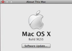
9G55 is the current build of Leopard 10.5.6 I'm pretty sure he's mistaken and looking at the wrong info.
 

Attachments

  • Picture 3.jpg
    Picture 3.jpg
    16.5 KB · Views: 910
Quick question. I noticed that iPhoto crashes when I try to import photos, then I realized NoteBook for example, when I go to pick a color - it crashes, when I tried the same thing with journaler - also crashes the same way. Photoshop works fine. Do you think it might have anything to do with changing color profiles? I installed Super Cal to adjust color profile. I tried to remove it and try again - the same thing. Tried to reverse (through Time Machine) color sync folder - did not help. Really frustrating.
 
Sure, here you go buddy.

Thanks for this. The original profile seems very good to me, but this adds a bit more color clarity. I tried the spyder profile posted shortly after yours, but I don't know that I like how "red" it is (I did let my eyes adjust, it's just not as sharp for me).
 
Thanks for this. The original profile seems very good to me, but this adds a bit more color clarity. I tried the spyder profile posted shortly after yours, but I don't know that I like how "red" it is (I did let my eyes adjust, it's just not as sharp for me).

Did you try the one I posted in the profile thread 2 days ago? It works really well for me, and it is pretty accurate from some online tests I have seen. At least it is on my 85. Then again, it was calibrated on my screen. YMMV.
 
I just got a MBP from the refurb. It has a 9C84 panel. Upon turning it on for the first time, I thought the grey startup screen seemed a bit magenta. Neither hot (yellow) nor cold (blue), but magenta.

The default profile is way too washed out (no wonder, it's gamma 1.8).

I tried to calibrate it with the colorsync assistant but every step of the advanced procedure had the rightmost "tint slider" off-screen, impossible to grab ! Never seen that before. Also, once I clicked into that rightmost box to move the slider, I could never get the tint to look right (it was working on my iMac), the values I can choose don't have enough range (which explains why the slider is out of the window by default).
The end profile is too blue, even though the gamma value I dialed in (2.2) is closer to reality and colors look less washed out. So I have to use only the basic calibration options, I set the gamma to 2.2 instead of 1.8 and things look less bad.

What I find very annoying on this screen (maybe it's just the 9C84) is the greys going magenta when my eyes are a bit higher than full frontal position.

Try this : put a Finder window in the center of the screen. Make it inactive (click on something else, like the desktop). Now the window elements are all grey. Tilt the screen towards you (or move your head higher) until the alternating blue/white lines blend together.
Now look at the -normally grey- window elements, the toolbar, the shortcut pane on the left : they are slightly magenta now.


How does it look on everyone's screen ? it would be good to know. This is a big issue for me, much more than overall yellow-ness or blue-ness of the screen, or even black level (which seems quite good on my machine, even though when I look at it from above, I get the same washed out image as in this other thread, leftmost computer, the same background image is set on my computer for accurate comparison purposes)

What's your dealer's phone # cuz that's some good stuff, just tried this, you are crazy dude.
 
Register on MacRumors! This sidebar will go away, and you'll see fewer ads.