Become a MacRumors Supporter for $50/year with no ads, ability to filter front page stories, and private forums.
Bring back launchpad!!! Not updating from Sequoia until its back!
There must be substitute in the App Store or elsewhere. Back in OS 8 and 9 days there was one called Square One that I really liked.

Given the Applications menu is cluttered up with lots of Apps I don't use that are also non-deletable Launchpad was a good workaround. I have 25 total apps on Launchpad including both Apple's and other company's.
 
Well it's killed mine. This is such a weak move from Apple. They had an idea, and instead of iterating it until is was awesome, they immediately started walking it back. This suck now.
I feel for you. Apple knocks it out of the park some years for some people. Although I don’t think Tahoe will generally be remembered with fondness, I have no doubt that it’s a high watermark for some people.

You can always stay on Tahoe for a year or two while you wait to see if Apple’s next releases suit your needs better. I’ll be keeping my main computers on Sonoma and possibly updating to Golden Gate if I’m satisfied by Apple’s UI changes by release.
 
If producers of operating systems spent as much time sorting out bugs as they do mucking around with the look and adding features that most people will not use, operating systems would be flipping amazing these days.
MacOs is better than Windows, that is for sure, that is why I went for it, but it could be better.
Linix is okay, depending on the distro, when I use linux I go for desktops like Cinnamon or XFCE.

As for Liquid Glass, it is not that bad and the transparency can be reduced, I am used to it now.
Did you hear the long part of the WWDC announcement where they talked about all of the work they have put into functional and performance improvements in 27? It sounds exactly what you are asking for.
 
  • Like
Reactions: jjrtiger
This isn’t LG-specific, but I don’t care for the change to the App Store. When I click my name it no longer shows me a grid of all my apps. Instead I get a dialogue box and can choose apps, subscriptions, purchases, etc. But when I choose Apps it just gives me a list I have to scroll down. I preferred the previous presentation of a grid of apps (Updates still uses the grid format).
 
Toys and utensils for small children tend to be designed with round corners and edges so that they don’t hurt themselves (and maybe also because it looks friendlier), hence the association.

View attachment 2636785

And designs like these do look a bit cutesy and cartoonish:

View attachment 2636783
Gotcha. That makes sense. Thanks for laying that out. I'm still confused by this logic, however. Would you say the same thing about an Noguchi table or an Eames lounge?
 

Attachments

  • HM_6115_103695_Noguchi_walnut_v1_0314.jpeg
    HM_6115_103695_Noguchi_walnut_v1_0314.jpeg
    328.7 KB · Views: 24
  • il_fullxfull.6678124963_mcuq.jpg
    il_fullxfull.6678124963_mcuq.jpg
    1.4 MB · Views: 22
Gotcha. That makes sense. Thanks for laying that out. I'm still confused by this logic. Would you say the same thing about an Noguchi table or an Eames lounge?
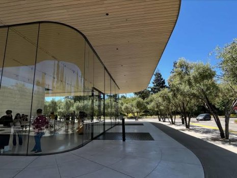
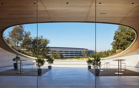
or these elements of rounded corners in apple park?
 

Attachments

  • images.jpeg
    images.jpeg
    46.9 KB · Views: 24
  • 0-78553-apple-park-2-xl.jpg
    0-78553-apple-park-2-xl.jpg
    174.9 KB · Views: 21
  • Image_05.JPG.jpg
    Image_05.JPG.jpg
    288 KB · Views: 22
That's interesting. I've never had any difficulty resizing the windows from corners in macOS 26. I can see how it could be frustrating for people who are struggling with it though.
in the early releases, the radius made it look like the touch target for resizing a window was shifted in but the actual touch targets were closer to where they had been on the more squared windows. you had to adjust where you clicked. That was fixed in one of the point releases.
 
I feel for you. Apple knocks it out of the park some years for some people. Although I don’t think Tahoe will generally be remembered with fondness, I have no doubt that it’s a high watermark for some people.

You can always stay on Tahoe for a year or two while you wait to see if Apple’s next releases suit your needs better. I’ll be keeping my main computers on Sonoma and possibly updating to Golden Gate if I’m satisfied by Apple’s UI changes by release.
Yeah, it's not possible to please everyone. This time it appears to be my turn to be a hater.

I am considering what I do about Golden Gate. I put iOS 27 on my iPhone, and it runs nicely, and some aspects are quite nice, but some feel like a bit of a regression, so it's a mixed bag there. At the moment, I am holding off on the Golden Gate betas, but I know who I am. Curiosity will eventually get the better of me, and I'll jump at some stage. The efficiency gains and exploring the new features will just keep calling me until I cave.
 
  • Like
Reactions: GraueEminenz
Yeah, it's not possible to please everyone. This time it appears to be my turn to be a hater.

I am considering what I do about Golden Gate. I put iOS 27 on my iPhone, and it runs nicely, and some aspects are quite nice, but some feel like a bit of a regression, so it's a mixed bag there. At the moment, I am holding off on the Golden Gate betas, but I know who I am. Curiosity will eventually get the better of me, and I'll jump at some stage. The efficiency gains and exploring the new features will just keep calling me until I cave.
Maybe Golden Gate will be a pleasant surprise when you’re actually using it. Just make sure to keep a backup of your Photo and Music libraries from Tahoe in case you want to revert. Good luck!
 
  • Like
Reactions: Luftkopf
I'm not a fan of the icons, but they don't bug me nearly as much as the rounded corners everywhere in menues. In Tahoe, the menu title (e.g., "File", "Edit"), the drop down menu, and the selected menu item all have four rounded corners, making them look like disconnected elements. I hope they bring back the previous appearance, where a menu title and its drop-down items appear connected.

View attachment 2636726View attachment 2636727
Personally, I really hope they bring them back. I'm a big fan of menu icons, and honestly, I believe their disappearance is more likely a SwiftUI bug than an intentional design decision.

That said, there's a very simple solution that could make everyone happy: add a toggle under System Settings → Appearance. Users who like menu icons could keep them enabled (ideally as the default setting), while those who prefer a cleaner, more minimal look could simply turn them off.

It would be an elegant compromise that gives users a choice instead of forcing a single preference on everyone.
 
Golden Gate… it’s the first macOS name that sounds a bit weird to me, maybe because it is a bridge… but I guess Ill get used to it.

By the way, the way Apple has backtracked with some UI elements is pleasant to see. And when I saw the mention to the windows corners radii, it was inevitable not to think about MR comments and forums lol

C’mon Apple, now bring us back launchpad!

EDIT: Wait a moment. The Liquid Glass slider has only three positions? And the most transparent is still frosted??
Actually the Golden Gate is the name of the span of water and dramatic land on either side that the Golden Gate BRIDGE crosses... 🙂
 
  • Like
Reactions: Populus and chrfr
I wish they would have actually refined Liquid Glass instead of going back to the old sidebar and corner radius. The new (old) sidebar feels completely out of place with the rest of Liquid Glass. I also liked how the content next to the sidebar changed its colors.

The different window corner radius was there for a reason and I think Tahoe looked more consistent. The old corner radius feels out of place with the buttons of the toolbar.

Also I feels sorry for the developers who put in so much work in order to make Liquid Glass work for their application.
It would look cleaner with the buttons more squared as well, like this:

Screenshot 2026-06-09 at 7.19.40 PM.png
 
Maybe Golden Gate will be a pleasant surprise when you’re actually using it. Just make sure to keep a backup of your Photo and Music libraries from Tahoe in case you want to revert. Good luck!
Thank you. Let’s see how it develops by the time it launches, there’s still plenty of tweaking time left.

At the end of the day, if it goes as it has started, I will just learn to deal. It’s still macOS, even if this iteration has moved its interface in more of a safe and boring direction. I’ll still like the way it works even if it looks boring as white ceiling paint.
 
  • Like
Reactions: GraueEminenz
If Apple really listened they would allow us to turn off every aspect of Liquid Glass and while less rounded, still worser than before.
Are the tabs still rounded in Safari?
Is Facebook still going to be torture to use or is Apple going to actually work together with major websites to make sure they still work properly prior to release?
Apple would have been smarter to say, look we screwed up and we're getting rid of everything Tahoe altogether.
 
It looks less bad. But less bad is still bad. I'd rather have good. While "good" means different things to different people, in the context of a GUI, it would be reasonable to define "good" as "following Apple's pre-2013 Human Interface Guidelines (HIG)," because everything that was in the HIG prior to 2013 was based on over four decades of painstaking research into user-friendliness. Tim Cook, being the clueless and mediocre bean-counting suit that he is, allowed Jony Ive to discard all of that in 2013, and replace it with user-unfriendly flat design that was pioneered by Microsoft and based on no user-friendliness research. Liquid Glass is a flat design variant known as "glassmorphism."

Apple needs to work with Scott Forstall again, even if only in a limited capacity, to bring back skeuomorphism, specifically the exact same skeuomorphic graphics and icons that were in iOS 6 and Mac OS X 10.8 Mountain Lion, and to update them for the higher resolution screens of today, and to create new skeuomorphic graphics and icons for things that exist now that didn't exist during the time of those operating systems. Those operating systems closely follow the pre-2013 HIG.

Cook is Apple's CEO, and for an Apple CEO to not know the immense value of the pre-2013 HIG, shows how utterly clueless and mediocre he is. The pre-2013 HIG was one of the most valuable things Apple had in terms of user-friendliness. But Cook doesn't care about providing value to customers because, since he is an MBA degree-holding bean counter, his focus is on providing value to shareholders.
 
Last edited:
I've never heard anyone else mentioning that, but I've also always carried with me the impression that the subordinate menu was traditionally implied to be a contiguous part of the menu, like two differently-shaped regions of a single piece of paper. I'll admit that on reflection it's always been ambiguous.
Having rounded corners on a pulldown menu makes it look like a movable window, but since it's not, this adds a little confusion to the UI.
 
Golden Gate is also a park (which comes a lot closer to the established pattern), about 1,000 acres, with a commanding view of the bridge. My guess is that the locals are more likely to be referring to the park than the bridge when saying 'Golden Gate'
You cannot see the Golden Gate Bridge from Golden Gate Park. You're probably talking about the Presidio or Headlands.
 
It is likely that Apple only changed it because of actual average consumers complaining, not because of people on forum sites or Reddit. I would not call these consumers "haters", they do not usually think about things like this unless it is truly bothersome. I know for sure that in my own experience, mostly in the workplace, non-techie people are not very pleased with the way LG was implemented in both iOS and macOS. I did not hear anywhere near this level of discontent when iOS 7 and Yosemite came out.

I believe Apple products are as successful as they are because they are easy to use and understand for people who are not technically inclined, especially the iPhone, and a lot of the people I've worked with don't even know the control center exists. Yet this was the first time I ever heard them complain.
Apple has been moving away from simplicity for a while now and it hurts the brand, IMO
For instance in Safari in order to clear the history and keep website data you have to hold down the option key while clicking clear history.
Why would any new user know that?
The interface for Music is also terrible, IMO. They should go back to calling it iTunes and make it more intuitive. They should also bring back the iPod!
 
Golden Gate is also a park (which comes a lot closer to the established pattern), about 1,000 acres, with a commanding view of the bridge. My guess is that the locals are more likely to be referring to the park than the bridge when saying 'Golden Gate'
Yes, having been a San Francisco local in the past, residents are more likely to refer to the Golden Gate Bridge as "the bridge", and the park as Golden Gate Park. There's also the big Bay Bridge connecting SF to the East Bay, but when you say "the bridge", usually it's taken to mean the Golden Gate. But there are plenty of times people in the area, especially those living and driving the East Bay Bridge more often than the Golden Gate, also call it the "the bridge". It can get only a little bit confusing, but it's pretty clear when you tell someone in the East Bay "I just drove over the bridge", which one you're talking about.
 
  • Like
Reactions: HazeAndHahmahneez
Register on MacRumors! This sidebar will go away, and you'll see fewer ads.