groove-agent
macrumors 68020
I guess Liquid Ass isn’t that far from aqua.

I guess Liquid Ass isn’t that far from aqua.
Biggest problem: With large radius corners, 75% of the draggable corner area you used to resize them was literally outside the rendered window.Can someone please explain the rounded corners thing to me and why people don’t like it?

 daringfireball.net
Golden Gate… it’s the first macOS name that sounds a bit weird to me, maybe because it is a bridge… but I guess Ill get used to it.

completely agree.They literally went back to the old design. What a damn shame. I thought apple was a forwards thinking company. Not a company stuck in the past. It makes me so upset that we can’t enjoy new experiences because the boomers will complain and ruin it for these of us (i want my old stuff back!!!). I hope the next ceo has more guts than Tim crook

It is likely that Apple only changed it because of actual average consumers complaining, not because of people on forum sites or Reddit. I would not call these consumers "haters", they do not usually think about things like this unless it is truly bothersome. I know for sure that in my own experience, mostly in the workplace, non-techie people are not very pleased with the way LG was implemented in both iOS and macOS. I did not hear anywhere near this level of discontent when iOS 7 and Yosemite came out.Then it is appropriately named for the version where Apple caved in to the haters.

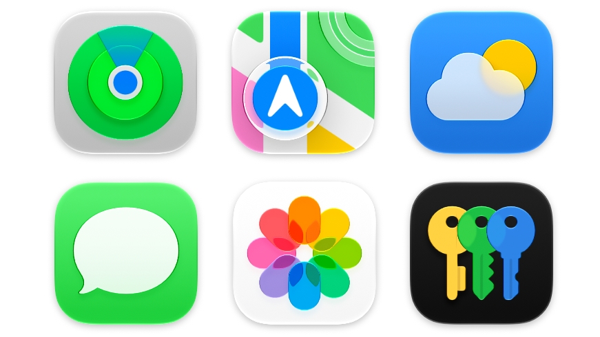
Apple didn't budge on requiring squircle Mac icons, but it did change icon design. Icons have more layers of Liquid Glass to improve detail and sharpness in light, dark, tinted, and clear icon modes.

also i'll never understand why ya'll associate larger corner radii with being childish
What haters? Hating what exactly? It seems like you’re hating the “haters” which is quite ironic.Then it is appropriately named for the version where Apple caved in to the haters.
this is so interesting to me. what toy does it make it look like? why a toy? and if it does make it look like a toy, how does that impact you and your work?the exaggerated rounded corners make it look like a toy
yes yes I hear this one all the time haha. but like, can you show me examples? its just so interesting in a world full of rounded corners, why we associate the rounded corners of a UI window with a toy?Fisher price would a word with you 🤪

It’s called the take away. Apple are getting so bad at innovating they have to periodically downgrade features so they can then make a big announcement when they put them back in.I'm not a fan of the icons, but they don't bug me nearly as much as the rounded corners everywhere in menues. In Tahoe, the menu title (e.g., "File", "Edit"), the drop down menu, and the selected menu item all have four rounded corners, making them look like disconnected elements. I hope they bring back the previous appearance, where a menu title and its drop-down items appear connected.
View attachment 2636726View attachment 2636727
Yes! This!! Totally agree. Bring back the Tahoe Radii!I wish they would have actually refined Liquid Glass instead of going back to the old sidebar and corner radius. The new (old) sidebar feels completely out of place with the rest of Liquid Glass. I also liked how the content next to the sidebar changed its colors.
The different window corner radius was there for a reason and I think Tahoe looked more consistent. The old corner radius feels out of place with the buttons of the toolbar.
Also I feels sorry for the developers who put in so much work in order to make Liquid Glass work for their application.

I’ll thank the US companies (Intel, Apple, HP, Texas Instruments) that created USB C instead I’m thankful that the EU didn’t get its way in 2011, or we’d likely still be stuck with micro USB to this day.Siri its a joke (even more so in the EU... and now incoming rant from the Americans... before you start, say thank you for USB-C, and the fact that its BlueTooth in your AirPods, and that you can soon change the battery, and you don't have to come here if you don't like it, but Samsung, Xiaomi and Google figured it out, im sure you can to Apple)
yes yes I hear this one all the time haha. but like, can you show me examples?
Golden Gate is the name of the strait that the bridge crossesGolden Gate… it’s the first macOS name that sounds a bit weird to me, maybe because it is a bridge… but I guess Ill get used to it.
It makes me so upset that we can’t enjoy new experiences because the boomers will complain and ruin it for these of us (i want my old stuff back!!!).

I’ll reserve judgment until I see it for real but this sounds promising. I agree they need to rollback on the icons in the menus as well but overall if they’ve listened and acted on the negative feedback then they deserve credit for listening.
The main thing I’m excited about is all the big fixes. It’s not “exciting” in marketing terms but the last time they did this (Snow Leopard) it was a huge success. Interesting that both of these “big fix” updates were when Apple dropped support for an old architecture - PowerPC in the case of Snow Leopard and Intel in the case of Golden Gate.
I’m optimistic about the update!

Seems like a lot of backtracking to sequoia, very smart and good looking . I’m happy with it .
When Liquid Glass launched in macOS Tahoe, Apple faced criticism over how the design looked on the Mac. Some people felt that Liquid Glass in macOS Tahoe was an afterthought with little impact from the design update, while others had issues with contrast, readability, rounded corners, and design consistency. There were long complaint threads on the MacRumors forums and on Reddit, and some people refused to update.
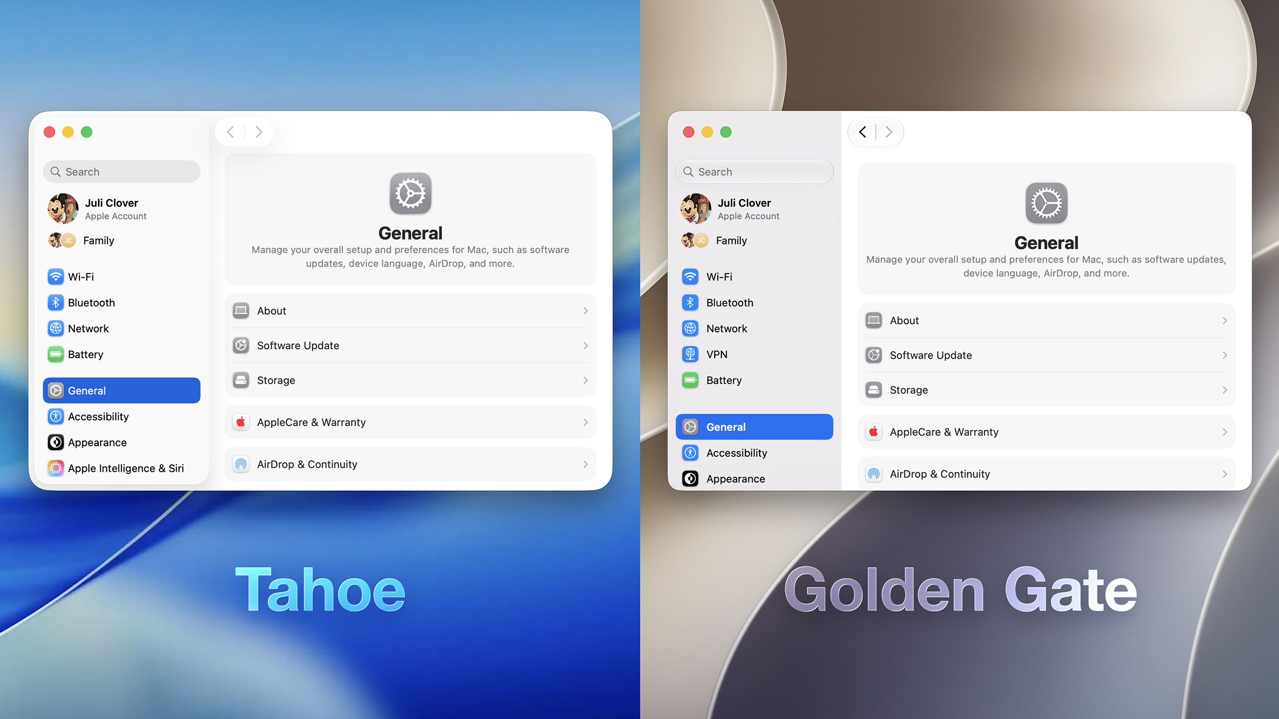
Apple is making several changes to Liquid Glass and the overall macOS Golden Gate design, and while subtle, some of the changes could make Liquid Glass on Mac easier to digest.
Transparency and Diffusion
Apple added a full Liquid Glass slider under System Settings > Appearance. It changes the translucency of Liquid Glass elements, and users can choose a clear version of Liquid Glass that allows some of the background to show through, select a more opaque, tinted version that improves the legibility of text, or choose something in between.
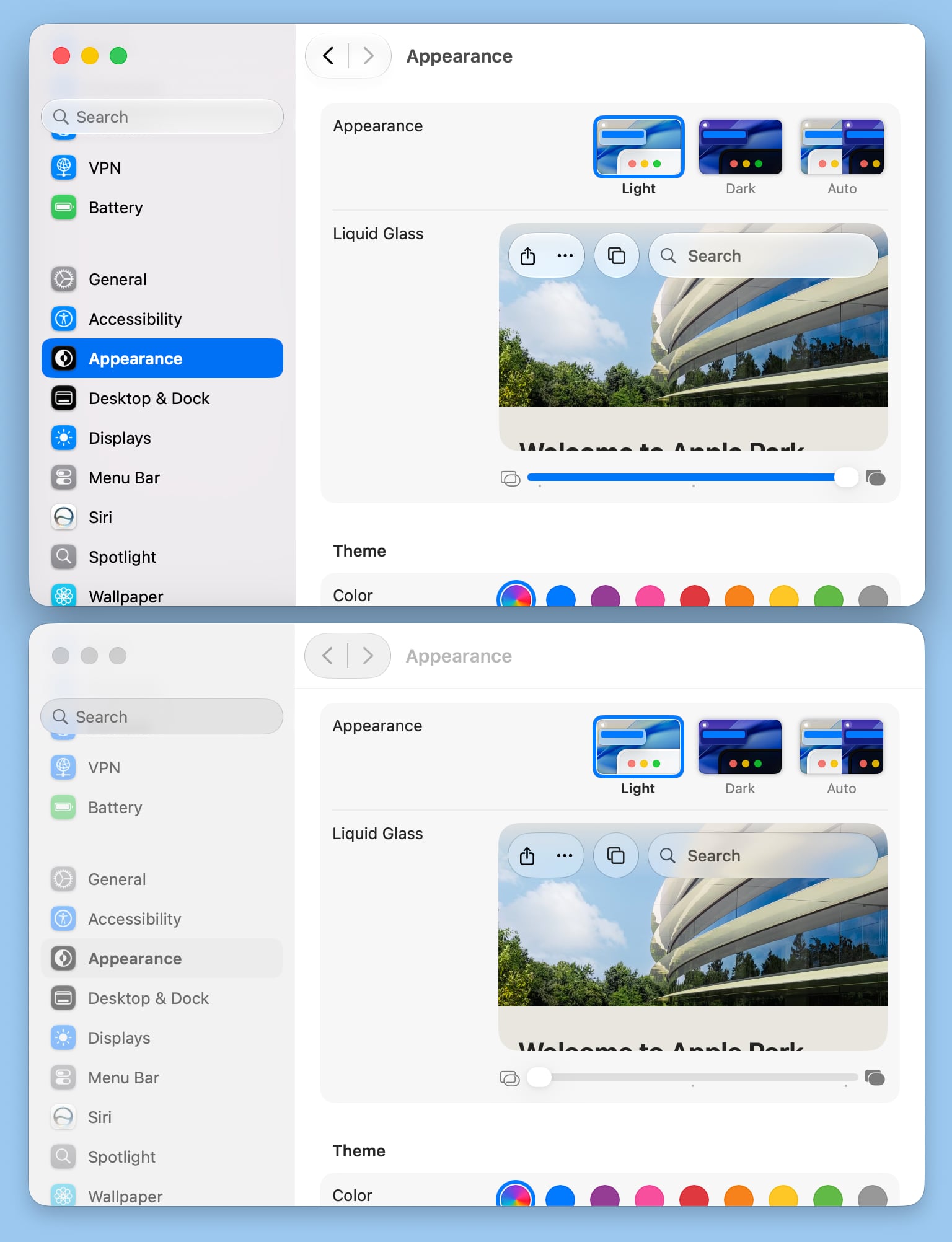
Unfortunately, there is no ultra-clear version of Liquid Glass available with the slider. Even the setting that's as clear as possible does not match the original version of Liquid Glass that Apple showed off at WWDC 2025.
Apple changed the overall Liquid Glass opacity, and it now diffuses complex content more effectively. Apple says a darkened edge and brighter specular highlights establish more depth and separation for the UI.
Toolbars and Window Shapes
Apps have uniform toolbars to make text headings and groups of controls more legible. Windows also all have the same corner radius for more consistency between apps.
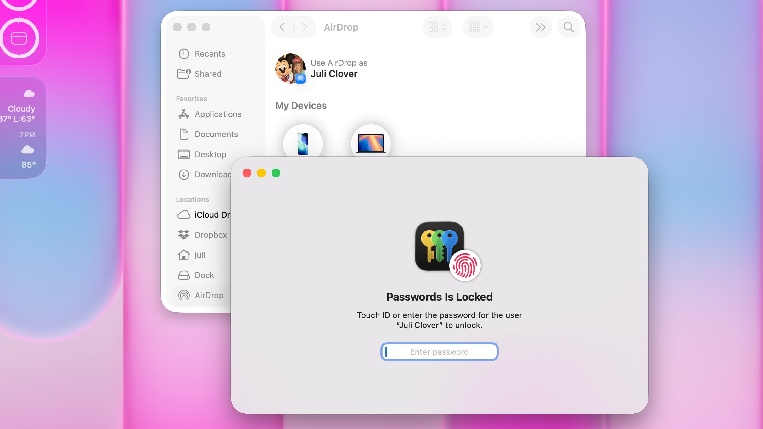
macOS Tahoe
Corners of apps are not as dramatically rounded in macOS Golden Gate, and the difference is noticeable.
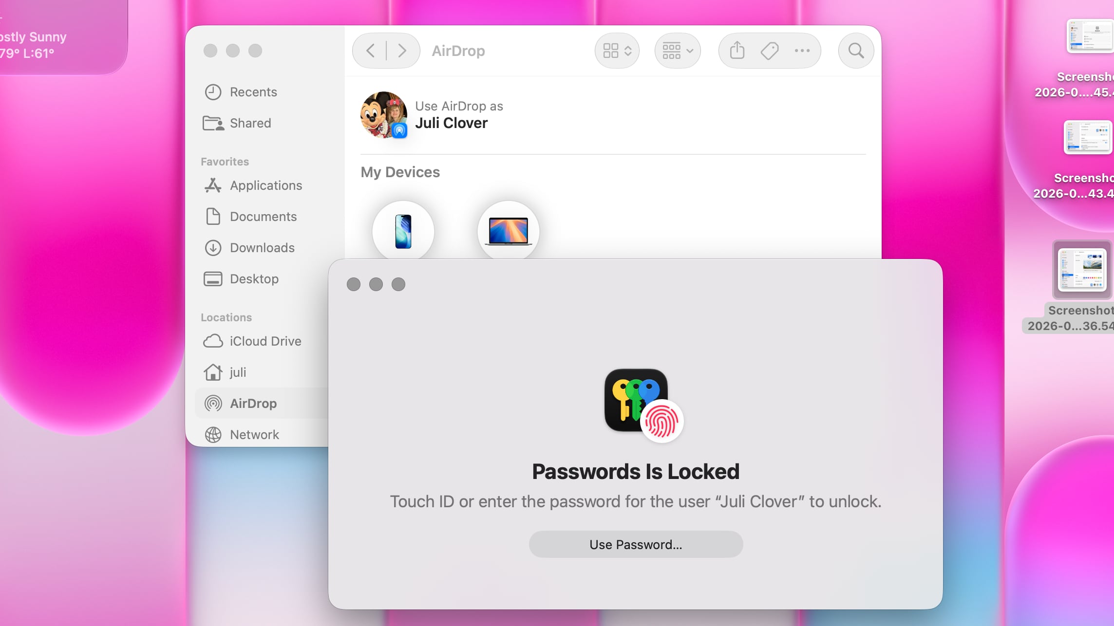
macOS Golden Gate
It's easier to tell when a window is active because of the sidebar design, the opacity update, and changes to window shadows.
Sidebars
Sidebars are no longer floating and are instead edge-to-edge. It's a design that's less distracting and more uniform because there's no unnecessary sidebar shadowing that just takes up space.
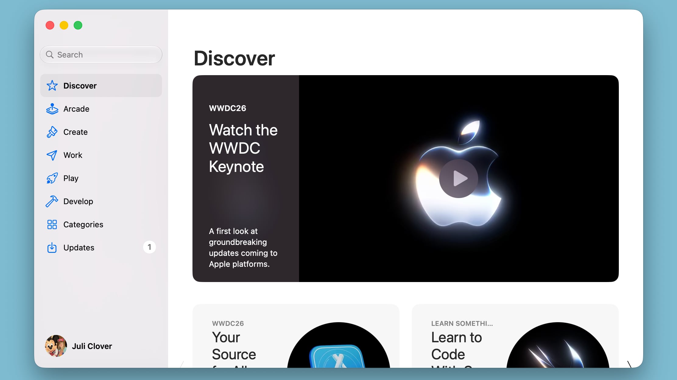
Sidebar icons have color again, which is something Apple removed in macOS Tahoe.
Icons
Apple didn't budge on requiring squircle Mac icons, but it did change icon design. Icons have more layers of Liquid Glass to improve detail and sharpness in light, dark, tinted, and clear icon modes.
Apple is also using icons for some menu bar items to make it easier to find commonly used actions.
HDR
Apple is using HDR for depth and dimension in the macOS Golden Gate interface.
Launch Date
macOS Golden Gate also includes all of the new Siri AI features coming in iOS 27, along with performance improvements that make the Mac feel faster.
The update is limited to developers right now, but Apple plans to release a public beta in July. macOS Golden Gate will launch this fall.
Article Link: All the Liquid Glass Changes in macOS Golden Gate