Not per se. If you mostly look at text: agreed.The Apple Watch is a miniature computer you wear on your wrist. A square shape makes every bit of sense.
But who said it is primarily text to be displayed?
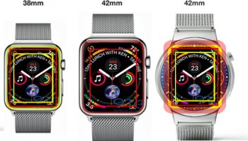
A watchface, for example, is a pretty good example of a bad example to be displayed on rectangular displays.
Since the AW is intended as a sidekick for iPhones (after all, standalone the AW still is not exactly exceedingly useful) I'm assuming text and images are primarily displayed on the these, whereas the AW is displaying other, stripped down information like notifications. These things can - and should, given the AW's small footprint - be displayed in the form of gauges or somewhat iconified; for all of which round shapes are way better suited.
In fact, trying to display anything but very small amounts of text - and naturally this is true to an even higher degree for images - can be considered a design failure.
So it ultimately depends on what data is to be displayed. For text and images rectangular shapes might be better. However, both of which should be avoided on smartwatches as discussed above.
For anything else - in particular gauges of sorts - round shapes are certainly superior.
Just look at the mock-ups above. The round watch is so much more beautiful. Data is presented in gauges - even text - what makes it look just natural.
On the other hand it's quite the opposite when looking at the Apple Watch. It just never looks right. Gimmicky. Outright cheap.
Of course, to some degree this is subjective. For me its pretty clear that I won't consider purchasing the Apple Watch due to its current form factor.
Its not only the rectangular shape, though. There is a number of shortcomings which don't make the Watch particularly appealing to me (curiously, as I'm pretty much a nerd).
Last edited: